
- 전체
- Python 일반
- Python 수학
- Python 그래픽
- Python 자료구조
- Python 인공지능
- Python 인터넷
- Python SAGE
- wxPython
- TkInter
- iPython
- wxPython
- pyQT
- Jython
- django
- flask
- blender python scripting
- python for minecraft
- Python 데이터 분석
- Python RPA
- cython
- PyCharm
- pySide
- kivy (python)
Python 수학 [python 수학] [Python] 막대 그래프 (Bar Chart)
2024.06.08 00:02
[python 수학] [Python] 막대 그래프 (Bar Chart)
지난 포스팅에서는 Python으로 연속형 자료에 대해 히스토그램과 박스 그래프를 그리는 방법을 소개하였습니다.
이번 포스팅에서는 이산형 자료에 대해 범주(category), 계급(class)별로 빈도나 합계 등을 막대로 그려서 비교하는데 유용하게 사용하는 막대 그래프(bar chart)를 Python의 matplotlib, seaborn, pandas를 사용하여 그리는 방법을 소개하겠습니다.
예제로 사용할 데이터셋은 seaborn에 내장되어 있는 tips 데이터셋입니다.
|
# importing packages import numpy as np import pandas as pd
import matplotlib.pyplot as plt import seaborn as sns plt.rcParams['figure.figsize'] = [10, 6]
|
|
# Loading 'tips' dataset from seaborn tips = sns.load_dataset('tips') tips.shape
(244, 7)
tips.head()
|
|
(1) matplotlib으로 막대 그리프 그리기 (bar chart by matplotlib) |
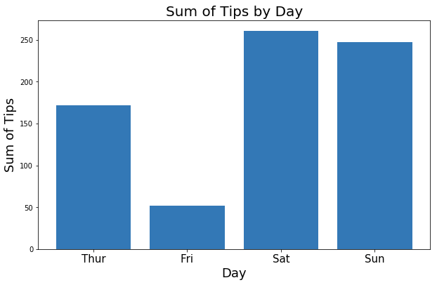
tips DataFrame에서 요일(day)별로 tip 의 합계를 구해서 막대 그래프로 비교를 해보겠습니다.
|
# Summary Statistics tips_sum_by_day = tips.groupby('day').tip.sum() tips_sum_by_day
day
Thur    171.83
Fri      51.96
Sat     260.40
Sun     247.39
Name: tip, dtype: float64
|
|
label = ['Thur', 'Fri', 'Sat', 'Sun'] index = np.arange(len(label))
|
|
# Basic Bar Chart plt.bar(index, tips_sum_by_day) plt.title('Sum of Tips by Day', fontsize=20) plt.xlabel('Day', fontsize=18) plt.ylabel('Sum of Tips', fontsize=18) plt.xticks(index, label, fontsize=15) plt.show()
|
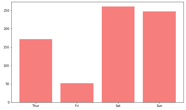
막대 그래프의 막대 색깔(bar color)과 투명도(transparency, alpha)를 조절해보겠습니다.
|
# bar color, transparency plt.bar(label, tips_sum_by_day, color='red', # color alpha=0.5) # transparency plt.show()
|
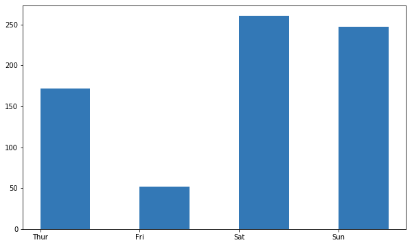
막대그래프의 막대 폭(width)을 좀더 좁게하고, 가운데 정렬 대신에 한쪽 끝으로 정렬(align)을 변경해보겠습니다.
|
# bar width, align plt.bar(label, tips_sum_by_day, width=0.5, # default: 0.8 align='edge') # default: 'center' plt.show()
|
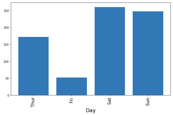
X축의 라벨이 갯수가 많거나 길이가 길 경우에는 X 축 라벨을 비스듬히 눕히거나 90도로 세우는 것이 보기에 더 효과적일 때가 있습니다. X축 라벨을 90도 회전시켜 보겠습니다.
|
# X tick labels rotation plt.bar(index, tips_sum_by_day) plt.xlabel('Day', fontsize=18) plt.xticks(index, label, fontsize=15, rotation=90) # when X tick labels are long plt.show()
|
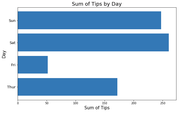
X축의 라벨 개수가 많다면 막대그래프를 아예 가로로 눕혀서 그리는 것이(horizontal bar chart) 보기에 효과적일 때도 있습니다. 옆으로 누운 막대그래프는 plt.barh() 함수를 사용합니다.
|
# Horizontal Bar Chart plt.barh(index, tips_sum_by_day) plt.title('Sum of Tips by Day', fontsize=18) plt.ylabel('Day', fontsize=15) plt.xlabel('Sum of Tips', fontsize=15) plt.yticks(index, label, fontsize=13, rotation=0) plt.show()
|
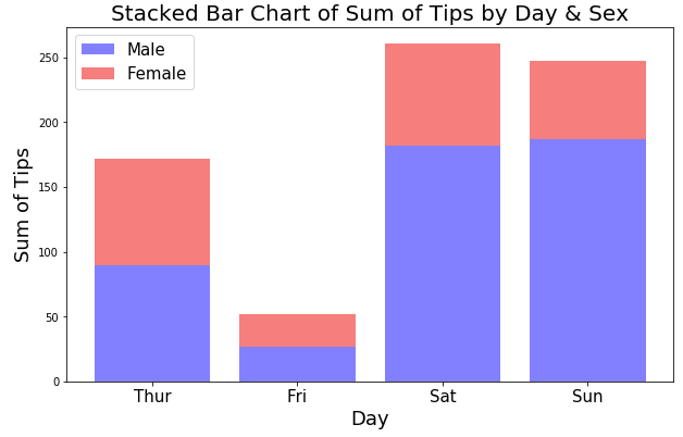
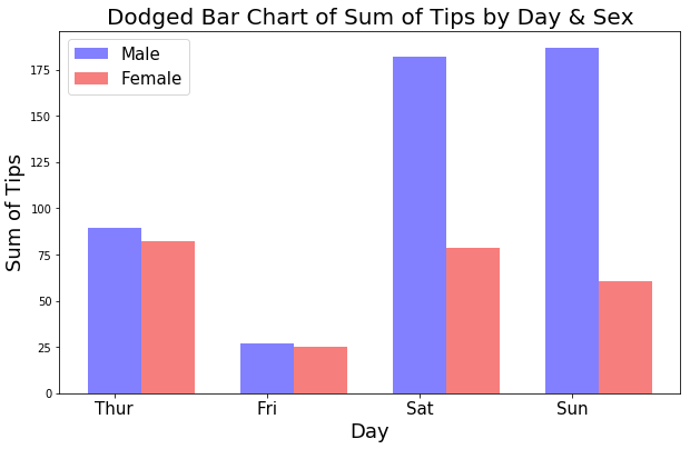
2개의 범주형 변수를 사용하여 각 클래스별로 빈도나 합계를 막대그래프로 비교하려면 (a) 위로 쌓은 막대그래프 (stacked bar chart)나, (b) 옆으로 나란히 놓은 막대그래프 (dodged bar chart)를 사용합니다.
먼저, (a) 요일(day)과 성별(sex)의 두개 범주형 변수의 클래스별로 팁(tip)의 합계를 비교하기 위해 위로 쌓은 막대그래프 (stacked bar chart)를 그려보겠습니다.
|
# summary by group tips_sum_by_day_male = tips[tips['sex'] == 'Male'].groupby('day').tip.sum() tips_sum_by_day_female = tips[tips['sex'] == 'Female'].groupby('day').tip.sum()
print('--Male--') print(tips_sum_by_day_male); print(' ') print('--Female--') print(tips_sum_by_day_female); --Male--
day
Thur     89.41
Fri      26.93
Sat     181.95
Sun     186.78
Name: tip, dtype: float64

--Female--
day
Thur    82.42
Fri     25.03
Sat     78.45
Sun     60.61
Name: tip, dtype: float64
|
|
# Bar Chart by 2 categorical variables # Stacked Bar Chart label = ['Thur', 'Fri', 'Sat', 'Sun'] N = len(tips['day'].unique()) index = np.arange(N) alpha = 0.5
p1 = plt.bar(index, tips_sum_by_day_male, color='b', alpha=alpha) p2 = plt.bar(index, tips_sum_by_day_female, color='r', alpha=alpha, bottom=tips_sum_by_day_male) # stacked bar chart plt.title('Stacked Bar Chart of Sum of Tips by Day & Sex', fontsize=20) plt.ylabel('Sum of Tips', fontsize=18) plt.xlabel('Day', fontsize=18) plt.xticks(index, label, fontsize=15) plt.legend((p1[0], p2[0]), ('Male', 'Female'), fontsize=15) plt.show()
|


다음으로 (b) 요일(day)과 성별(sex)의 두개 범주형 변수의 클래스별로 팁(tip)의 합계를 비교하기 위해 옆으로 나란히 놓은 막대그래프를 그려보겠습니다. 두번째 막대 그래프에서 X축의 위치를 bar_width 만큼 오른쪽으로 바로 붙여서 그려지도록 index+bar_width 로 설정(빨간색 부분)해주면 됩니다.
|
# Dodged Bar Chart (with same X coordinates side by side) bar_width = 0.35 alpha = 0.5
p1 = plt.bar(index, tips_sum_by_day_male, bar_width, color='b', alpha=alpha, label='Male') p2 = plt.bar(index + bar_width, tips_sum_by_day_female, bar_width, color='r', alpha=alpha, label='Female')
plt.title('Dodged Bar Chart of Sum of Tips by Day & Sex', fontsize=20) plt.ylabel('Sum of Tips', fontsize=18) plt.xlabel('Day', fontsize=18) plt.xticks(index, label, fontsize=15) plt.legend((p1[0], p2[0]), ('Male', 'Female'), fontsize=15) plt.show()
|
|
(2) seaborn 으로 막대 그래프 그리기 (bar chart by seaborn) |
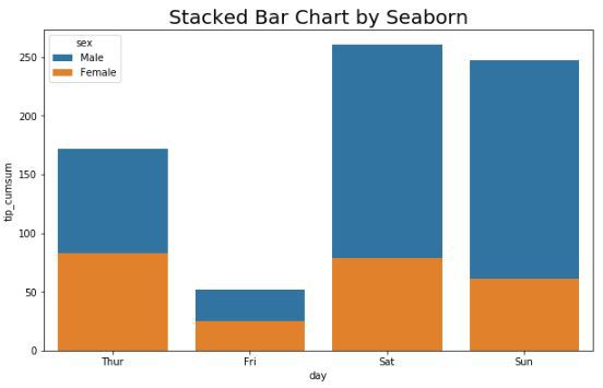
seaborn 패키지를 사용하여 위의 matplotlib 으로 그린 stacked bar chart를 그려보겠습니다. pandas 의 df.plot(kind='bar', stacked=True) 함수처럼 stacked=True 옵션이 seaborn 에는 없는 것 같습니다 (제가 못찾은 걸 수도 있구요). 그래서 workaround 로서 DataFrame에 'day'와 'sex' 기준으로 정렬을 한 후에 누적 합(cumulative sum) 을 구해서, 누적합 칼럼에 대해 dodge=False 로 하여 서로 겹쳐그리게끔 해서 위로 쌓은 누적 막대그래프 (stacked bar plot by seaborn)를 그렸습니다. (3)번의 pandas 대비 많이 복잡합니다. (댓글에 질문 남겨주신분께 감사드립니다. 덕분에 제가 잘못 알고 쓴 부분 수정할 수 있었습니다.)
|
tips_sum_by_day_sex = pd.DataFrame(tips.groupby(['day', 'sex']).tip.sum()) tips_sum_by_day_sex = tips_sum_by_day_sex.reset_index() tips_sum_by_day_sex
# sort dataframe by 'day' and 'sex' in descending order first tips_sum_by_day_sex = tips_sum_by_day_sex.sort_values(by=['day', 'sex'], ascending=False) tips_sum_by_day_sex
# then, calculate cumulative summation by 'day' group tips_sum_by_day_sex['tip_cumsum'] = tips_sum_by_day_sex.groupby(['day'])['tip'].cumsum(axis=0) tips_sum_by_day_sex
# atfer that, sort agian by 'day' and 'sex' in ascending order tips_sum_by_day_sex = tips_sum_by_day_sex.sort_values(by=['day', 'sex'], ascending=True) tips_sum_by_day_sex
|
아래 sns.barplot() 함수에서 y 값에 누적 합 칼럼 (y='tip_cumsum') 을 사용한 점, dodge=False 로 옵션 설정한 점 유의하세요.
|
# Stacked Bar Chart sns.barplot(x='day', y='tip_cumsum', hue='sex', data=tips_sum_by_day_sex, dodge=False) # stacked bar chart plt.title('Stacked Bar Chart by Seaborn', fontsize='20') plt.show()
|
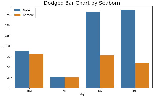
seaborn으로 옆으로 나란히 두 개의 범주형 변수의 클래스별 막대그래프를 그려서 비교를 하려면 dodge=True (default setting) 을 해주면 됩니다.
|
# Dodged Bar Chart sns.barplot(x='day', y='tip', hue='sex', data=tips_sum_by_day_sex) # default : dodge=True plt.title('Dodged Bar Chart by Seaborn', fontsize=20) plt.legend(fontsize=12) plt.show()
|
|
(3) pandas 로 막대 그래프 그리기 (bar chart by pandas) |
pandas로도 막대 그래프를 그릴 수 있는데요, 위의 matplotlib, seaborn으로 그릴 때 사용했던 데이터 집계 테이블 형태가 조금 다르므로 유심히 살펴보고 참고해서 사용하시기 바랍니다.
|
# make a DataFrame tips_sum_by_day = pd.DataFrame(tips.groupby('day').tip.sum()) tips_sum_by_day = tips_sum_by_day.reset_index()
|
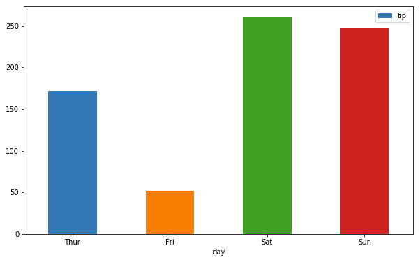
pandas DataFrame에 df.plot.bar() 함수를 사용하거나 df.plot(kind='bar') 를 사용해서 막대그래프를 그립니다. rot 는 X축 라벨의 회전(rotation) 각도를 설정하는데 사용합니다.
|
# basic bar chart with a single column tips_sum_by_day.plot.bar(x='day', y='tip', rot=0) plt.show()
|
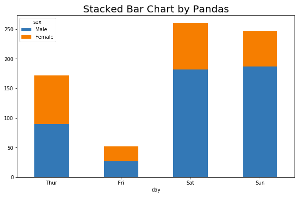
이번에는 pandas로 요일(day)과 성별(sex)의 두개 범주형 변수의 각 클래스별로 팁의 합계(summation of tip)를 집계하여 위로 쌓은 막대그래프(stacked bar chart)를 그려보겠습니다.
|
# making a DataFrame with 'day' and 'sex' groups tips_sum_by_day_sex = pd.DataFrame(tips.groupby(['day', 'sex']).tip.sum()) tips_sum_by_day_sex = tips_sum_by_day_sex.reset_index()
# pivot tips_sum_by_day_sex_pivot = \ tips_sum_by_day_sex.pivot(index='day', columns='sex', values='tip') tips_sum_by_day_sex_pivot
|
|
# Stacked Bar Chart by pandas tips_sum_by_day_sex_pivot.plot.bar(stacked=True, rot=0) plt.title('Stacked Bar Chart by Pandas', fontsize=20) plt.show()
|
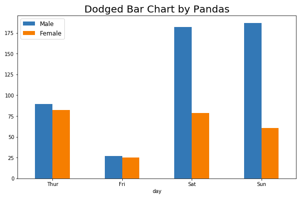
이번에는 pandas로 요일(day)별 성별(sex) 팁의 합계를 옆으로 나란히 막대그래프(dodged bar chart by pandas)로 그려서 비교를 해보겠습니다.
|
# Dodged Bar Chart by pandas tips_sum_by_day_sex_pivot.plot(kind='bar', rot=0) plt.title('Dodged Bar Chart by Pandas', fontsize=20) plt.legend(fontsize='12') plt.show()
|
많은 도움이 되었기를 바랍니다.
출처: https://rfriend.tistory.com/411 [R, Python 분석과 프로그래밍의 친구 (by R Friend):티스토리]
광고 클릭에서 발생하는 수익금은 모두 웹사이트 서버의 유지 및 관리, 그리고 기술 콘텐츠 향상을 위해 쓰여집니다.