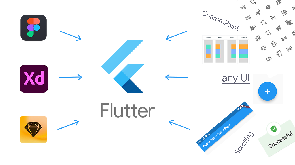
[flutter (플루터 앱 개발)] How to Implement Any UI in Flutter : 플러터에서 모든 UI를 구현하는 방법

How to Implement Any UI in Flutter

Obum
Obum
How to Implement Any UI in Flutter

In this article, you will learn how to convert any user interface image, piece, or screen into Flutter code.

This is not a tutorial on building an app. It is rather a guide that will help you implement any UI you come across into an app you already have. This tutorial also explains a wide variety of UI concepts in Flutter.

Table of Contents

What is Flutter?

Flutter is an open source framework by Google for building beautiful, natively compiled, multi-platform applications from a single codebase. – (source: flutter.dev)

In Flutter, contrary to most frameworks, Dart is the only programming language you use to code. This is an underemphasized benefit of Flutter. Especially for a tool that can build desktop, mobile, and web applications.

Most UI platforms use more than one language. For example, in front-end web development, you have to write HTMLCSS, and JavaScript. For Android, you have to write Kotlin (or Java) and XML. But in Flutter, it's just one language: Dart.

Coupled with the only-one-programming-language benefit, Flutter is simple because everything in Flutter is a widget. For example [AnimatedWidget](https://api.flutter.dev/flutter/widgets/AnimatedWidget-class.html)[BottomNavigationBar](https://api.flutter.dev/flutter/material/BottomNavigationBar-class.html)[Container](https://api.flutter.dev/flutter/widgets/Container-class.html)[Drawer](https://api.flutter.dev/flutter/material/Drawer-class.html)[ElevatedButton](https://api.flutter.dev/flutter/material/ElevatedButton-class.html)[FormField](https://api.flutter.dev/flutter/widgets/FormField-class.html)[Image](https://api.flutter.dev/flutter/widgets/Image-class.html)[Opacity](https://api.flutter.dev/flutter/widgets/Opacity-class.html)[Padding](https://api.flutter.dev/flutter/widgets/Padding-class.html), ...

This is part of what makes Flutter easy to use – it's basically plain English. Widget names reflect what they are and their properties are easy to understand.

Widgets in Flutter

A widget is a Dart class that either extends StatefulWidget or StatelessWidget.

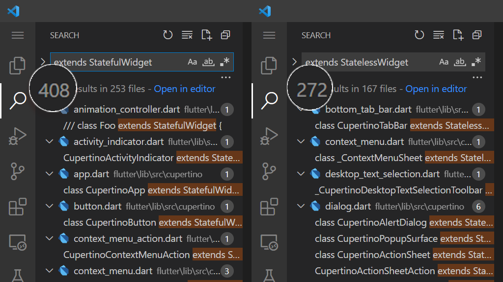
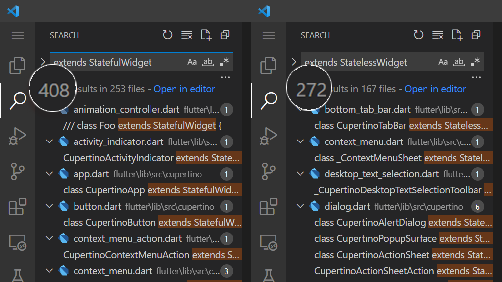
Your local Flutter installation comes with several widgets. To check out the widgets available by default, open the packages folder of your Flutter installation in your preferred editor. Then search across all files for "extends StatefulWidget" and "extends StatelessWidget" and take note of the number of results.
Image

As of Flutter 2.10, you will get 408 StatefulWidgets and 272 StatelessWidgets. That is a total of 680 widgets available for you to use and implement UIs.

These widgets typically have all you need. But at times they may not be enough. pub.dev, Dart and Flutter's package manager, have many more widgets you can use to implement UIs.

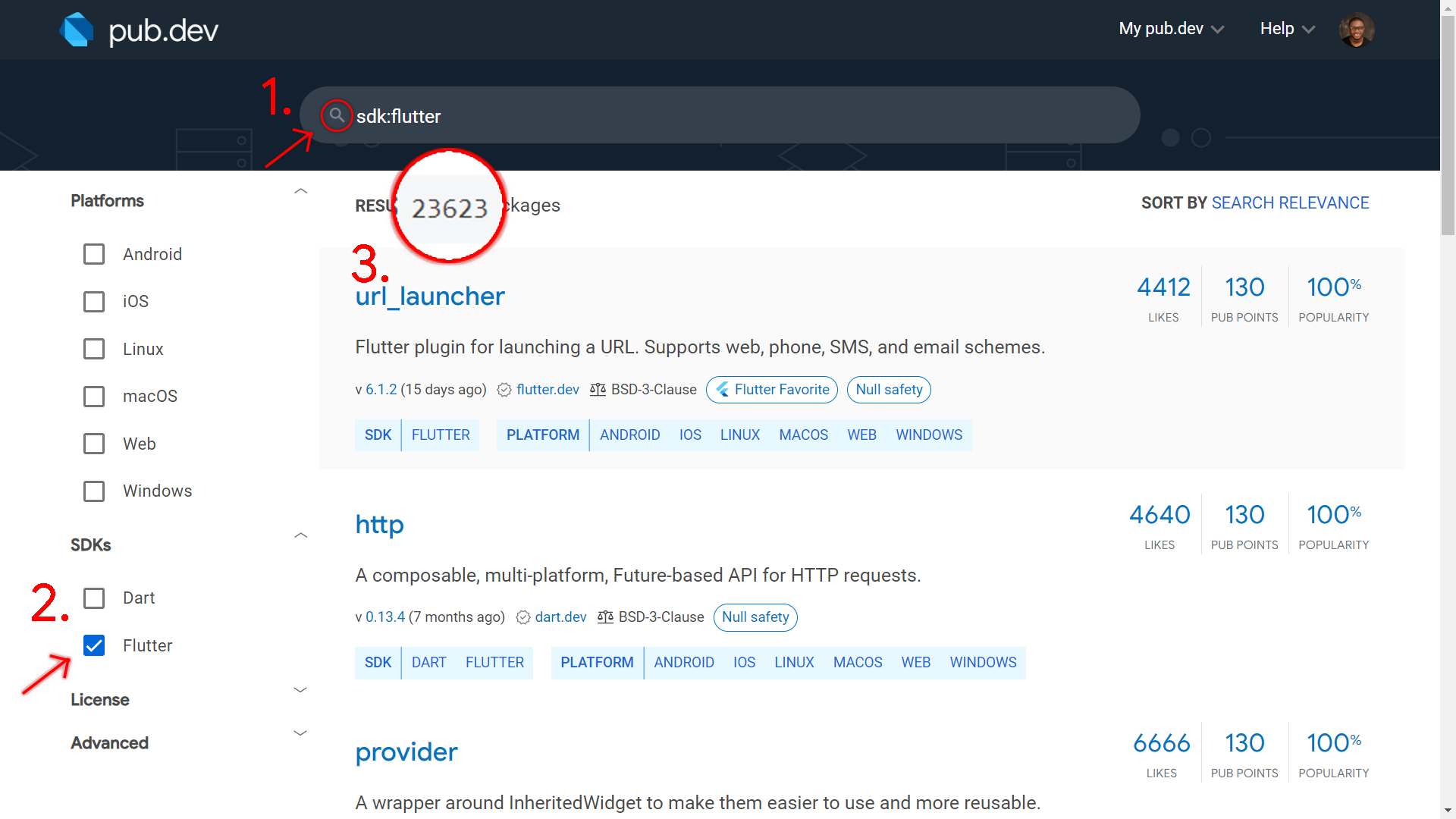
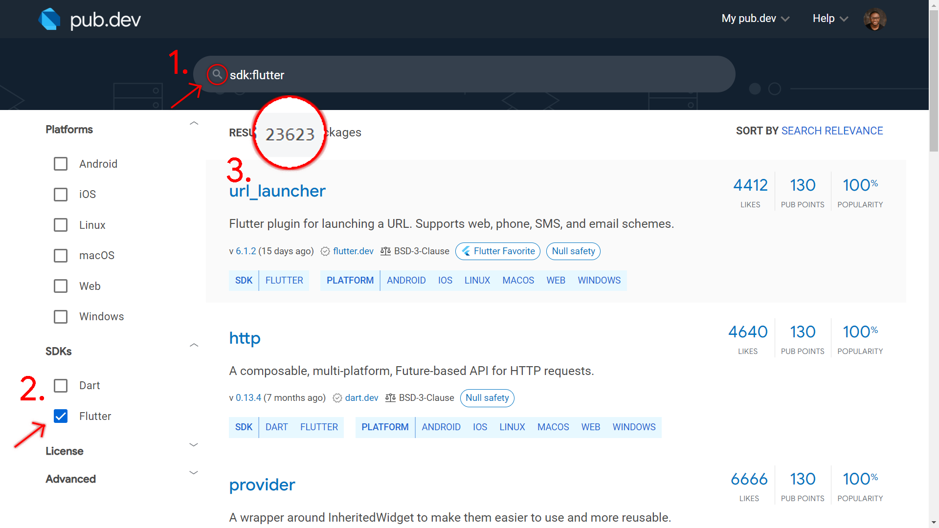
It is difficult to count the widgets in pub.dev. But searching an empty string (don't enter anything in the search bar and then press the search icon) and setting the SDK to Flutter returns the current total number of published packages.
Image

At the time of writing, there are more than 23000 Flutter packages in pub.dev. Each package has at least one widget. This means that you have more than 23000 widgets from pub.dev to implement, in addition to the available 680. This means that you can really implement any UI you want easily in Flutter.

Adding to the many available widgets, you can also create your own widgets as you implement UIs.

The Widget Tree

The following is part of the code you get when you create a new Flutter project and remove the comments:

 
  Widget build(BuildContext context) {
    return Scaffold(
      appBar: AppBar(
        title: Text(widget.title),
      ),
      body: Center(
        child: Column(
          mainAxisAlignment: MainAxisAlignment.center,
          children: <Widget>[
            const Text(
              'You have pushed the button this many times:',
            ),
            Text(
              '$_counter',
              style: Theme.of(context).textTheme.headline4,
            ),
          ],
        ),
      ),
      floatingActionButton: FloatingActionButton(
        onPressed: _incrementCounter,
        tooltip: 'Increment',
        child: const Icon(Icons.add),
      ),
    );
  }

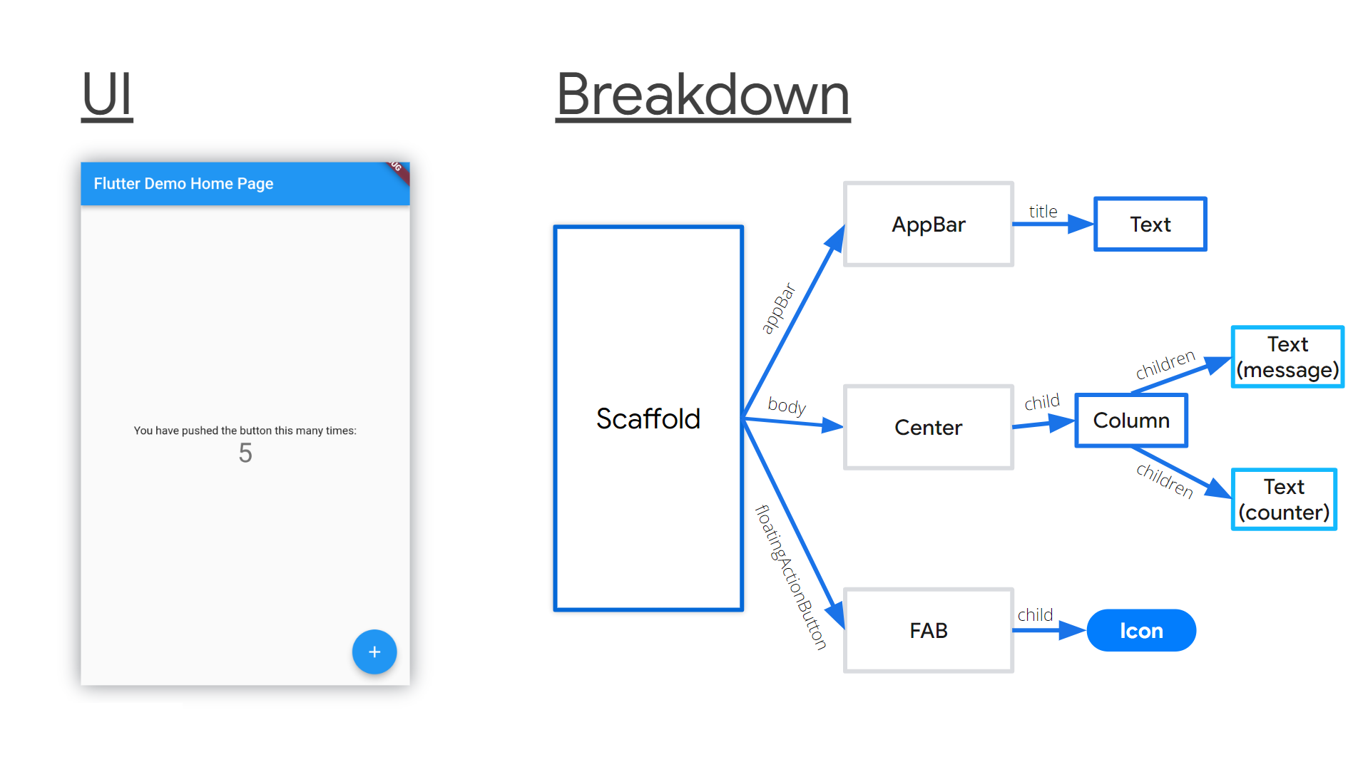
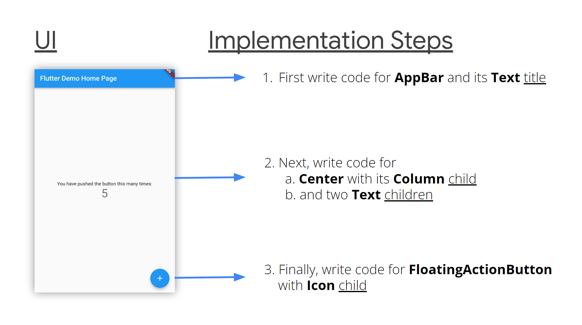
The parent Scaffold takes the appBarbody, and floatingActionButton parameters. In turn, the [AppBar](https://api.flutter.dev/flutter/material/AppBar-class.html) also takes a title parameter that has a Text value.

body takes a Center value that has a Column child. The Column in turn has two Texts as children. The FloatingActionButton takes the onPressed callback, 'Increment' tooltip, and an Icon for a child.
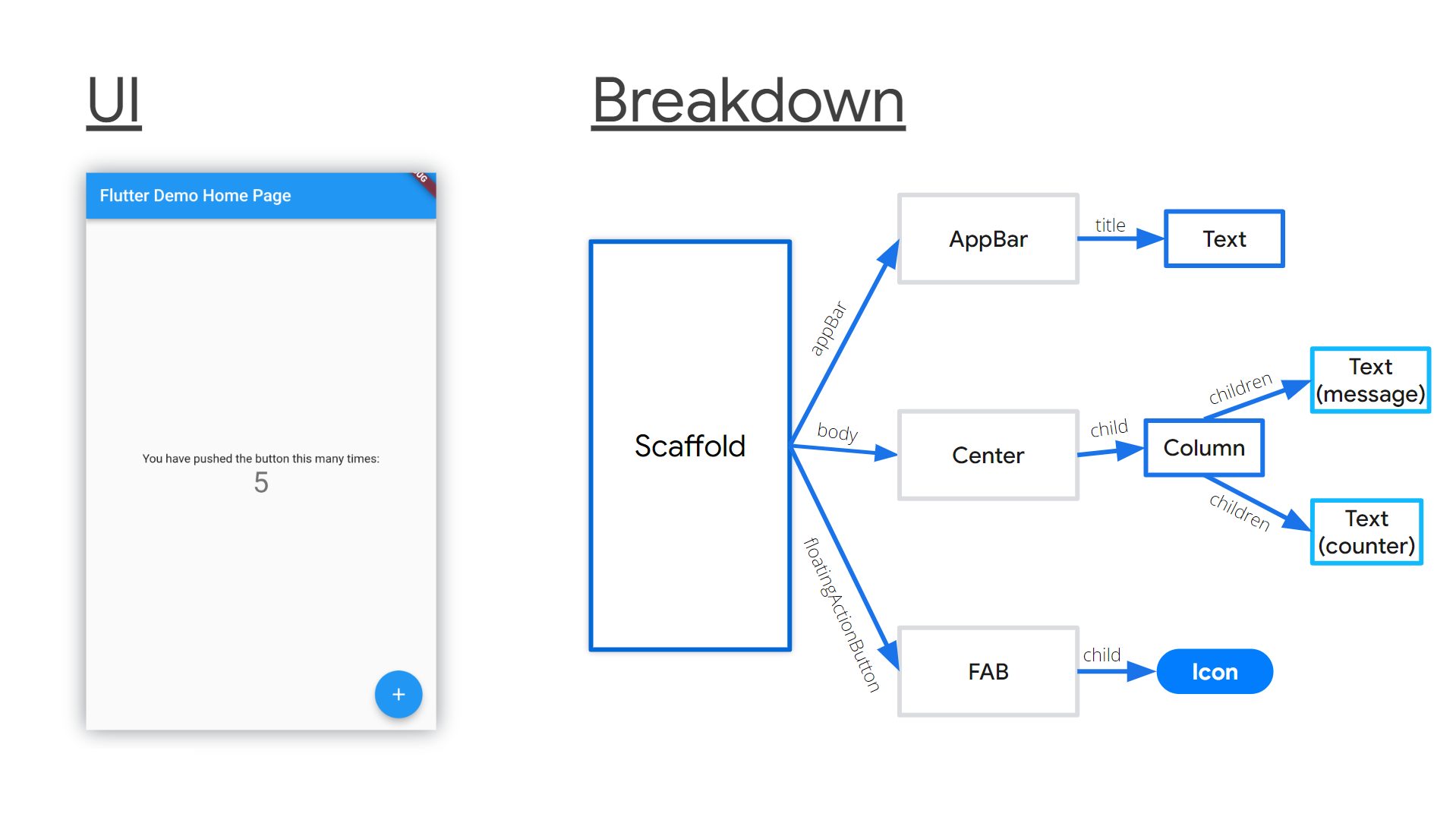
ImageFlutter widget tree breakdown

This is a simple widget tree. It has parents and descendants. child and children are common properties of most Flutter widgets. As widgets continuously take more widget children, your app gradually grows into a large widget tree.

As you implement UIs in Flutter, bear in mind that you are building a widget tree. You will notice that your code indents inwards from the left margin. It seems to develop some kind of virtual greater than sign (of empty space) at the left.

Note: Huge indentation levels are a sign that you need to refactor your code. It means that you need to extract some widget hierarchy into a separate widget.

How to Implement Any UI in Flutter

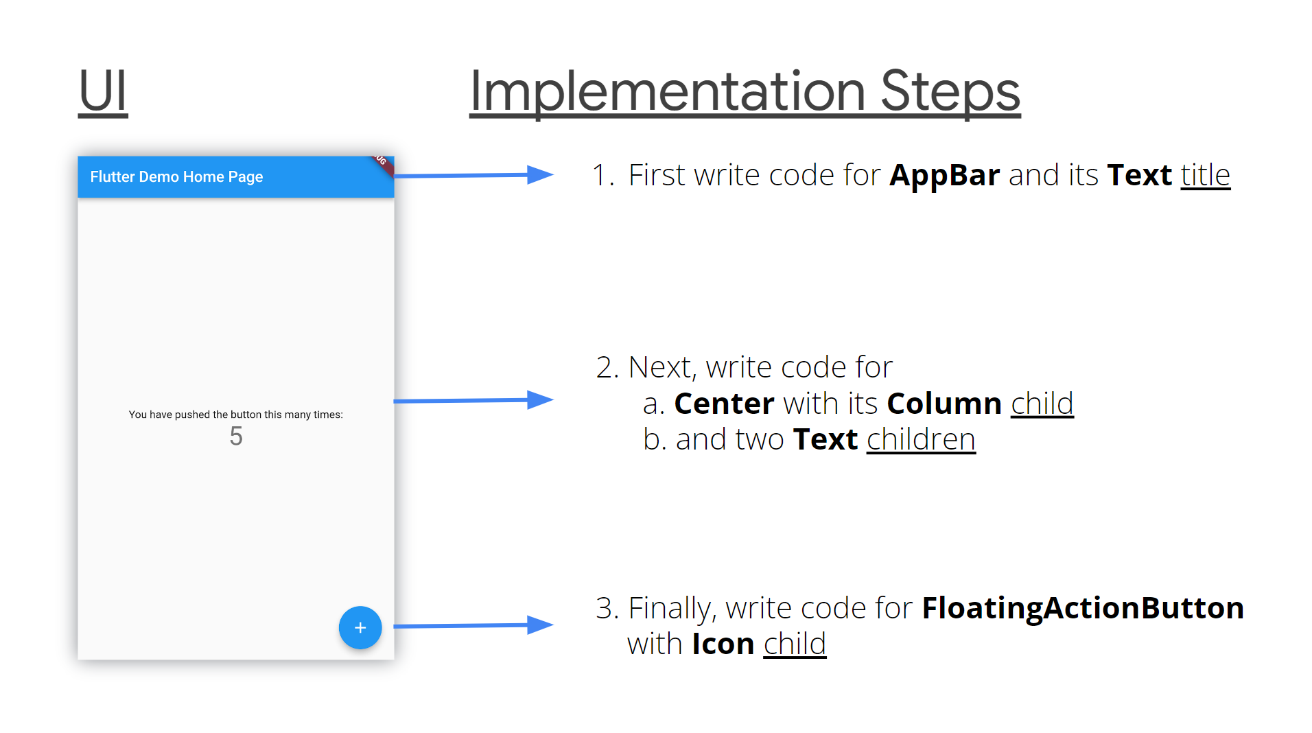
1. Write your code starting at the top left and move down to the bottom right

You'll implement the UI widget after widget according to each element's position in the UI. So you will first write code for things that appear at the top of the UI. Then you keep writing code for the other items moving down the page until you reach the bottom of that UI.
Image

This is intuitive.

On the horizontal axis, go from left to right. If need be, or if it is a right-to-left UI, then implement it from right to left instead.

2. Choose a Widget

Next you'll need to logically determine the widget you want to use for a given UI element. At a bare minimum, for a given UI element, you will use simple widgets you're familiar with based on what their names say they do.

Chances are the name of what the UI component looks like is the name of the widget. If you find it hard to make a choice, a quick online search will give you the answers. Flutter has a great online community.

3. Use widget groups

If a group of UI items is arranged vertically, one after another, use a [Column](https://api.flutter.dev/flutter/widgets/Column-class.html). If they are arranged horizontally, one after another, use a [Row](https://api.flutter.dev/flutter/widgets/Row-class.html). If they are placed on top of each other, use a [Stack](https://api.flutter.dev/flutter/widgets/Stack-class.html), with the floating widgets wrapped in [Positioned](https://api.flutter.dev/flutter/widgets/Positioned-class.html) widgets.

a. Column/Row

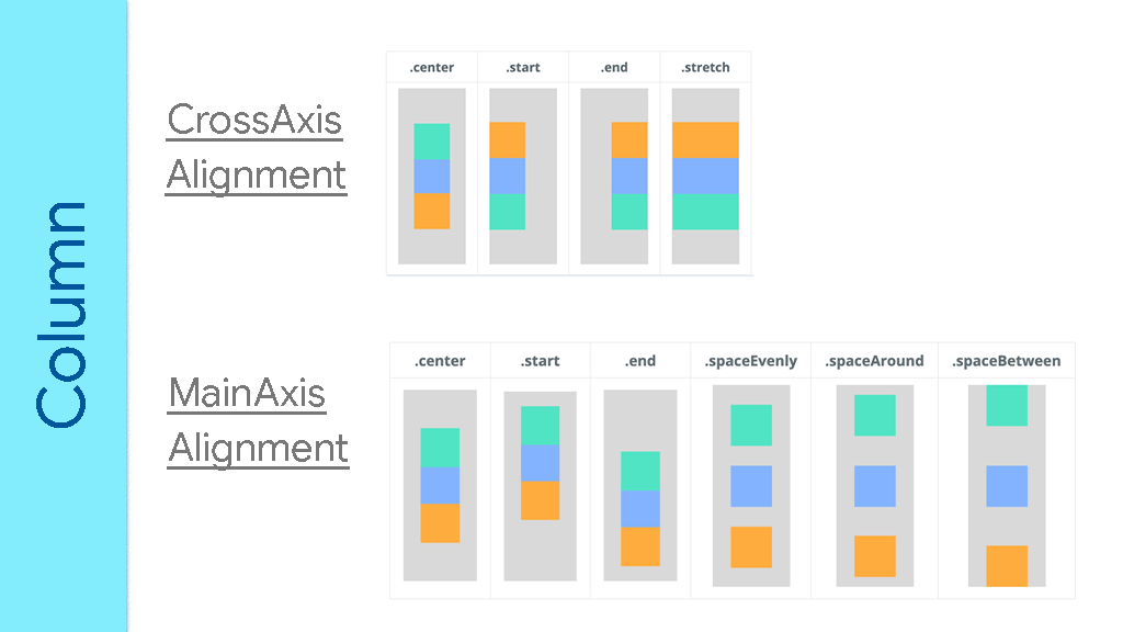
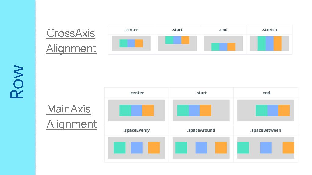
Inside a Column or Row, you can change or adjust how the widgets will align themselves on the main or cross axis. Use their [CrossAxisAlignment](https://api.flutter.dev/flutter/rendering/CrossAxisAlignment.html) and [MainAxisAlignment](https://api.flutter.dev/flutter/rendering/MainAxisAlignment.html) properties for such adjustments.

For the cross axis, you can align to center, end, start, and stretch. For the main axis, you can align to center, end, space around, space between, space evenly, and end.

In a Column, the vertical axis is the main axis while the horizontal axis is the cross axis. In a Row, the horizontal axis is the main axis while the vertical axis is the cross axis.
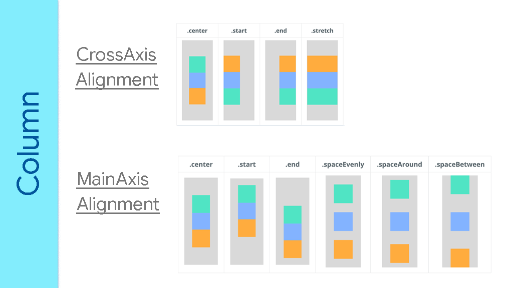
ImageAdapted from https://arzerin.com/2019/11/20/flutter-column/
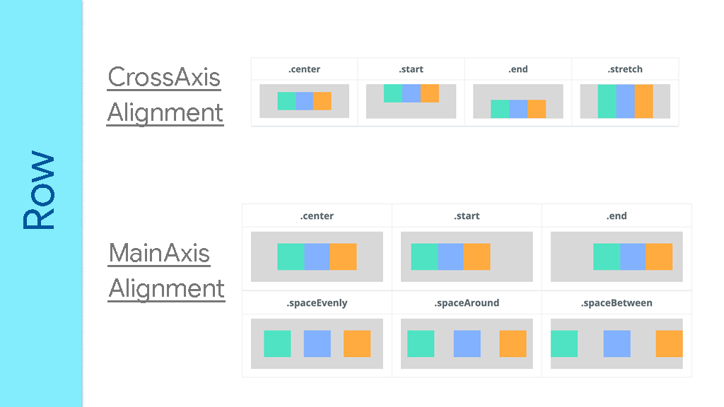
ImageAdapted from https://arzerin.com/2019/11/20/flutter-row/

In Columns and Rows, if you want a particular child widget to take as much available space as possible, wrap that widget inside an [Expanded](https://api.flutter.dev/flutter/widgets/Expanded-class.html) widget. If you are familiar with web frontend, you'll notice that Columns and Rows are like [display: flex;](https://developer.mozilla.org/en-US/docs/Web/CSS/flex) in CSS.

b. Stack Widget

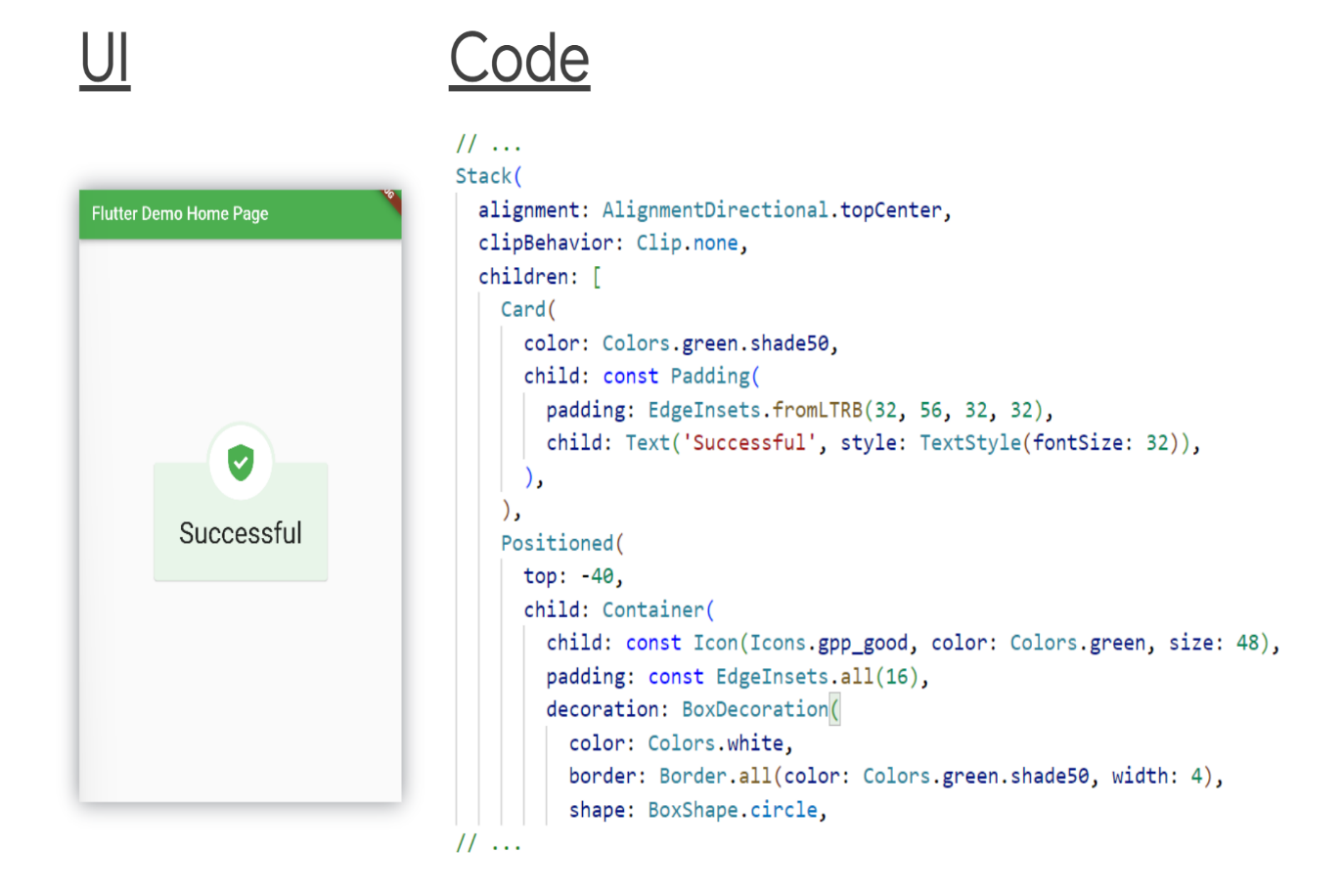
With Stack, the last widget(s) in the children's list appears on top of the earlier children.

You might have to edit the Stack's [alignment](https://api.flutter.dev/flutter/widgets/Stack/alignment.html) to indicate the relative positions of the widgets. Like [topCenter](https://api.flutter.dev/flutter/painting/AlignmentDirectional/topCenter-constant.html)[center](https://api.flutter.dev/flutter/painting/AlignmentDirectional/center-constant.html)[bottomEnd](https://api.flutter.dev/flutter/painting/AlignmentDirectional/bottomEnd-constant.html), and so on.

The Stack's size is calculated based on non-positioned widgets (Widgets in the children list not wrapped in a [Positioned](https://api.flutter.dev/flutter/widgets/Positioned-class.html) parent). When coding, remember that your Stack should either have at least one non-positioned widget, or it should be wrapped in a parent widget that explicitly sets the Stack's size.

Positioned takes any or all of [bottom](https://api.flutter.dev/flutter/widgets/Positioned/bottom.html)[top](https://api.flutter.dev/flutter/widgets/Positioned/top.html)[left](https://api.flutter.dev/flutter/widgets/Positioned/left.html)[right](https://api.flutter.dev/flutter/widgets/Positioned/right.html). They set the child's position relative to the Stack. Negative values move the child in the opposite direction. However, negative values clip parts of the child out. Use [clipBehavior: Clip.none](https://api.flutter.dev/flutter/widgets/Stack/clipBehavior.html) on the Stack to show all the parts of the positioned widget.
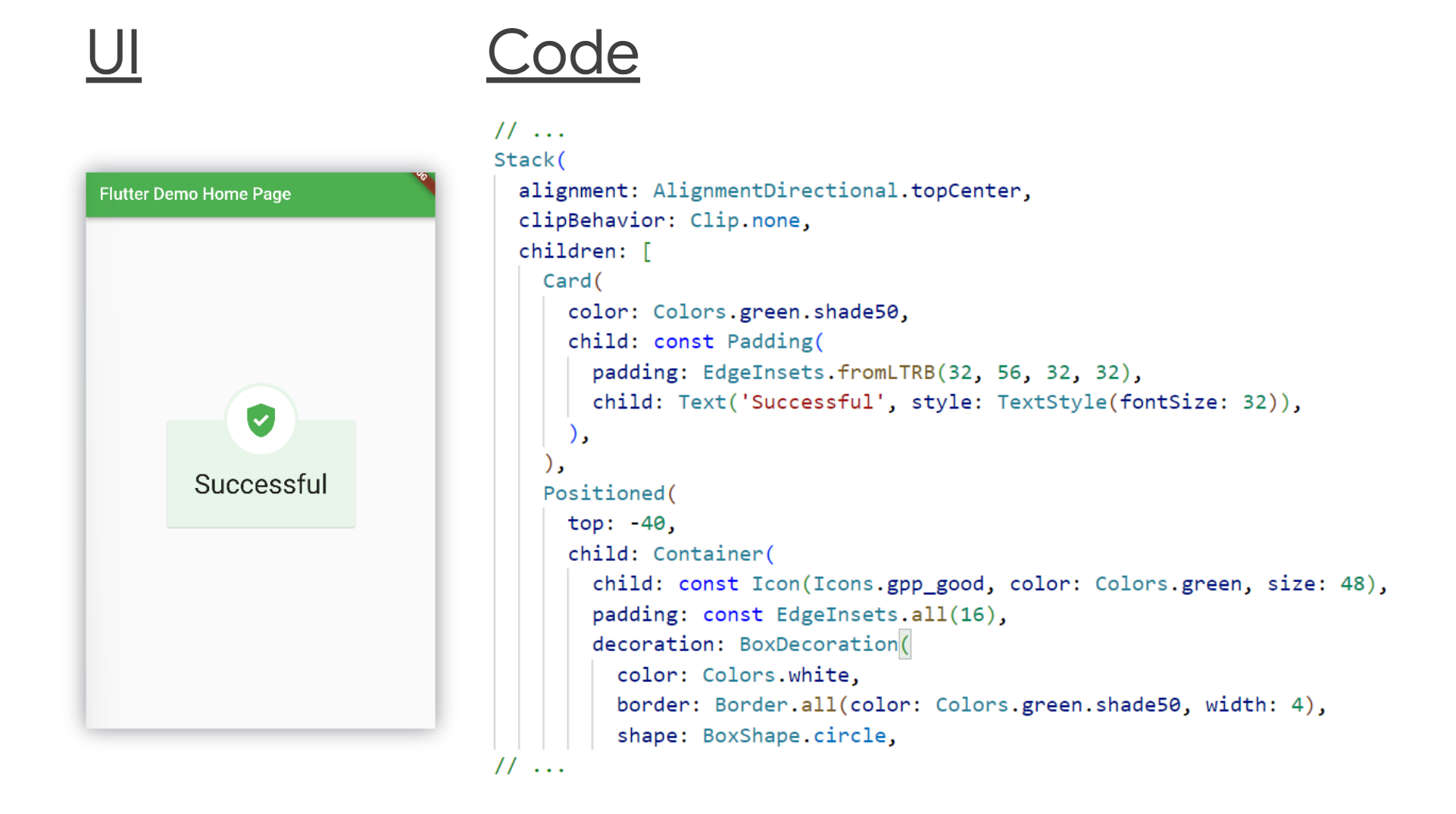
ImageFull code here.

4. Create custom widgets

As you build the widget tree, you will notice two things:

  1. Either a chunk of the tree grows too big and it is a logical unit on its own.
  2. Or some chunks or sets of widgets might repeat themselves with slight changes.

These are two indications that you should refactor your code. It means that you should extract out those widgets and define them in another Dart file.

Your code editor will help you with refactoring. With or without the editor, all you need to do is:

  1. Create a new Dart file. The file name should reflect the new widget's name.
  2. Create a new class that extends StatefulWidget or StatelessWidget, depending on if the new widget has State or not.
  3. Then return the widget chunk from a [build](https://api.flutter.dev/flutter/widgets/StatelessWidget/build.html) method.
  4. (Optional) If need be, your new Dart class can take positional or named parameters to its constructor to customize the widget's look.
// in counter_display.dart
import 'package:flutter/material.dart';

class CounterDisplay extends StatelessWidget {
  
  Widget build(BuildContext context) {
    return Column(
        mainAxisAlignment: MainAxisAlignment.center,
      children: [
        Text('You have pushed the button this many times:'),
        Text('$counter', style: TextStyle(fontSize: 24)),
      ],
    );
  }
}

// in main.dart
//
// ... 
  body: Center(child: CounterDisplay()),
// ...

You will build many custom widgets and they in turn will be descendants to more custom widgets, and that's fine. The widget tree is meant to continuously grow as the need arises.

5. Add more customization

You won't customize widgets only because of refactoring and repetitions (DRY code). You will create custom widgets because of the UI you are implementing.

You will create custom widgets because the many available widgets don't always meet the exact needs of a given UI. You'll need to combine them in some special way to implement a particular UI.

a. Container Widget

[Container](https://api.flutter.dev/flutter/widgets/Container-class.html) is a powerful widget. You can style it in different ways. If you are used to web frontend, you'll notice that it is like a [div](https://developer.mozilla.org/en-US/docs/Web/HTML/Element/div) in HTML.

Container is a base widget. You can use it to create any UI piece.

Some Container parameters are [constraints](https://api.flutter.dev/flutter/widgets/Container/constraints.html)[decoration](https://api.flutter.dev/flutter/widgets/Container/decoration.html)[margin](https://api.flutter.dev/flutter/widgets/Container/margin.html)[padding](https://api.flutter.dev/flutter/widgets/Container/padding.html)[transform](https://api.flutter.dev/flutter/widgets/Container/transform.html), among others. Of course, Container takes a [child](https://api.flutter.dev/flutter/widgets/Container/child.html) which can be any widget.

The decoration property can take a [BoxDecoration](https://api.flutter.dev/flutter/painting/BoxDecoration-class.html), which in turn can take several other properties. This is the heart of Container's flexibility. BoxDecoration takes parameters like [border](https://api.flutter.dev/flutter/painting/BoxDecoration/border.html)[borderRadius](https://api.flutter.dev/flutter/painting/BoxDecoration/borderRadius.html)[boxShadow](https://api.flutter.dev/flutter/painting/BoxDecoration/boxShadow.html)[color](https://api.flutter.dev/flutter/painting/BoxDecoration/color.html)[gradient](https://api.flutter.dev/flutter/painting/BoxDecoration/gradient.html)[image](https://api.flutter.dev/flutter/painting/BoxDecoration/image.html)[shape](https://api.flutter.dev/flutter/painting/BoxDecoration/shape.html), among others.

With these parameters and their values, you can implement any UI to your taste. You can use Container instead of the many material widgets that Flutter comes with. That way your app is to your taste.

b. GestureDetector / InkWell

[GestureDetector](https://api.flutter.dev/flutter/widgets/GestureDetector-class.html) as the name implies detects user interactions. Not every UI piece is a button. And while implementing UIs you will need some widgets to react to user actions. In such a case, use GestureDetector.

GestureDetector can detect different types of gestures: taps, double taps, swipes, ... GestureDetector of course takes a [child](https://api.flutter.dev/flutter/widgets/GestureDetector/child.html) (which can be any widget), and different callbacks for different gestures like [onTap](https://api.flutter.dev/flutter/widgets/GestureDetector/onTap.html)[onDoubleTap](https://api.flutter.dev/flutter/widgets/GestureDetector/onDoubleTap.html)[onPanUpdate](https://api.flutter.dev/flutter/widgets/GestureDetector/onDoubleTap.html) (for swipes), ...

Note: By default, when users interact with the empty spaces in the child of GestureDetectors, the callbacks are not called. If you want your GestureDetector to react to gestures on empty space (within its child), then set the [behavior](https://api.flutter.dev/flutter/widgets/GestureDetector/behavior.html) property of the GestureDetector to [HitTestBehavior.translucent](https://api.flutter.dev/flutter/rendering/HitTestBehavior.html).

GestureDetector(
  // set behavior to detect taps on empty spaces
  behavior: HitTestBehavior.translucent,
  child: Column(
    children: [
      Text('I have space after me ...'),
      SizedBox(height: 32),
      Text('... that can detect taps.'),
    ],
  ),
  onTap: () => print('Tapped on empty space.'),
)

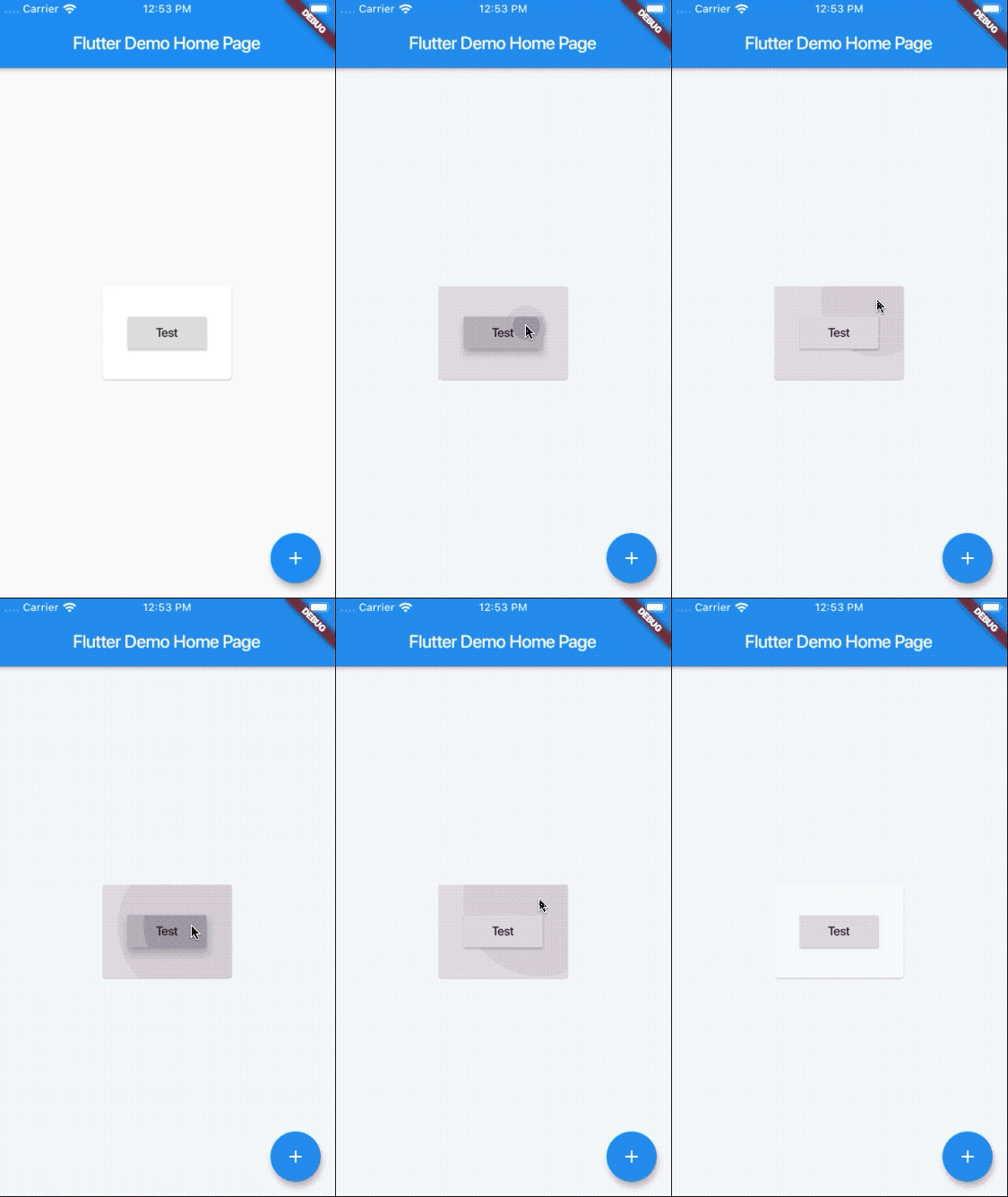
[InkWell](https://api.flutter.dev/flutter/material/InkWell-class.html) is similar to GestureDetector. It responds to some gestures that GestureDetector responds to. However, it shows ripple effects when interacted with (which GestureDetectors don't).
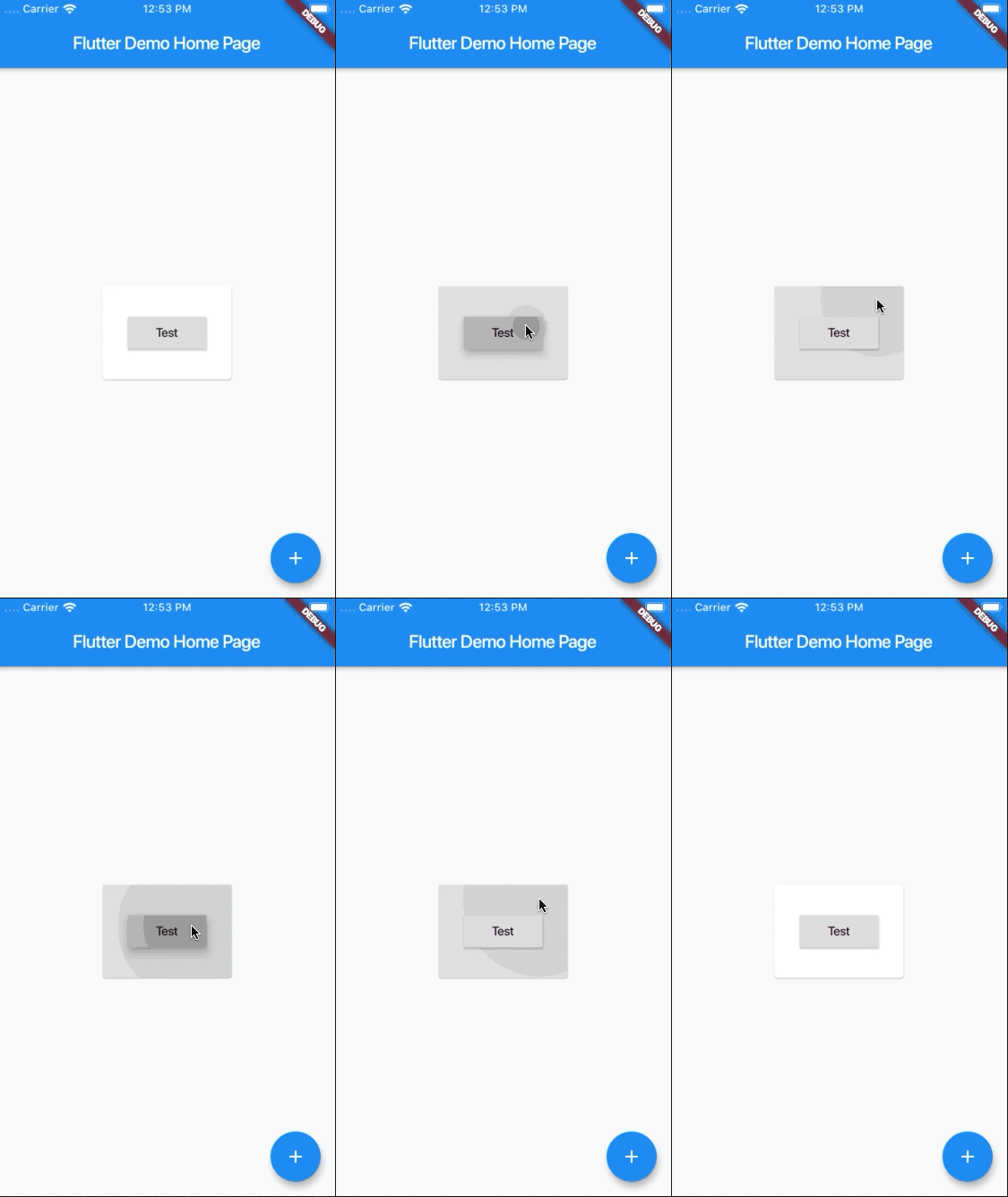
ImageFrom https://stackoverflow.com/q/58285012/13644299

InkWell must have a [Material](https://api.flutter.dev/flutter/material/Material-class.html) ancestor. So, if your topmost widget is [MaterialApp](https://api.flutter.dev/flutter/material/MaterialApp-class.html) you need not worry. Else, wrap the InkWell in a Material.

You should also do this wrapping if you are changing the colors of the InkWell's parent or child. If you don't, the ripple won't show. You also have to set the [color](https://api.flutter.dev/flutter/material/Material/color.html) of the Material widget for the ripple to show. You can set the color to [Colors.transparent](https://api.flutter.dev/flutter/material/Colors/transparent-constant.html) and Flutter will take care of the rest.

How to Implement Scrolling Interfaces

Scrolling is a little delicate topic. By default, widgets don't scroll in Flutter. If your Column or Row will be scrollable, use a [ListView](https://api.flutter.dev/flutter/widgets/ListView-class.html) instead. ListView takes children parameter too.

ListView also has factory constructors like [ListView.builder](https://api.flutter.dev/flutter/widgets/ListView/ListView.builder.html) and [ListView.separated](https://api.flutter.dev/flutter/widgets/ListView/ListView.separated.html). The builder gives you more control over the build process of the children whereas the separated takes into account a Separator (like [Divider](https://api.flutter.dev/flutter/material/Divider-class.html) for example).

By default, ListViews scroll their children vertically. However, you can change the [scrollDirection](https://api.flutter.dev/flutter/widgets/ScrollView/scrollDirection.html) of a ListView to [Axis.horizontal](https://api.flutter.dev/flutter/painting/Axis.html) to scroll its children horizontally.

At times, you might want to use [SingleChildScrollView](https://api.flutter.dev/flutter/widgets/SingleChildScrollView-class.html) instead of ListView. As the name implies, it takes a single [child](https://api.flutter.dev/flutter/widgets/SingleChildScrollView/child.html) and it can scroll. You can pass widget groups as its child.

There are other scrolling widgets.

But take special note of [CustomScrollView](https://api.flutter.dev/flutter/widgets/CustomScrollView-class.html). It gives you huge control of scrolling, unlike the others. It takes [slivers](https://api.flutter.dev/flutter/widgets/CustomScrollView/slivers.html), which in turn are scrolling widgets with powerful scroll mechanisms.

[SliverFillRemaining](https://api.flutter.dev/flutter/widgets/SliverFillRemaining-class.html)[SliverFillViewport](https://api.flutter.dev/flutter/widgets/SliverFillViewport-class.html)[SliverGrid](https://api.flutter.dev/flutter/widgets/SliverGrid-class.html)[SliverList](https://api.flutter.dev/flutter/widgets/SliverList-class.html)[SliverPersistentHeader](https://api.flutter.dev/flutter/widgets/SliverPersistentHeader-class.html) among others, are examples of widgets you include in the list of slivers. Most of these widgets take a delegate, which handles how scrolling occurs.

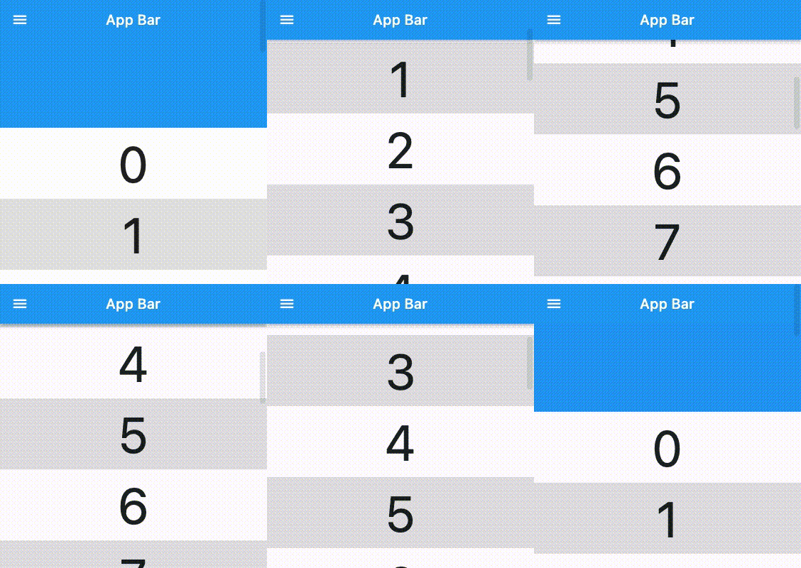
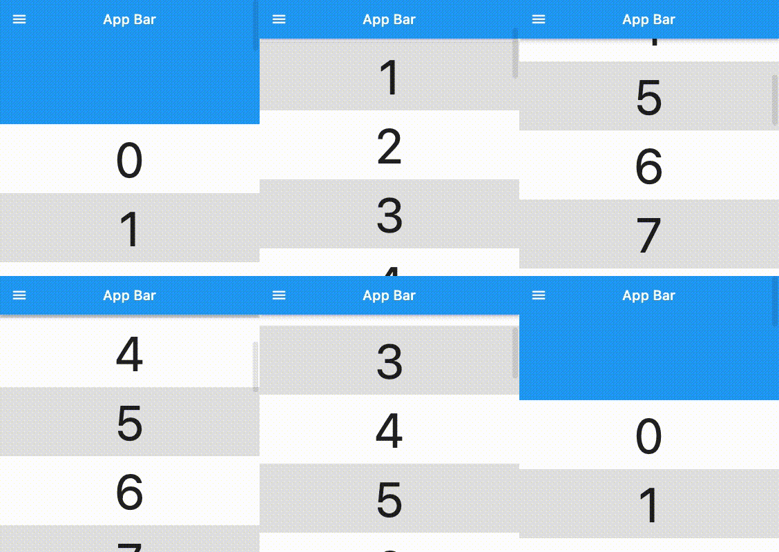
A good case to use CustomScrollView is with [SliverAppBar](https://api.flutter.dev/flutter/material/SliverAppBar-class.html), where you want the AppBar to be expanded by default and shrunk on scroll.
Image

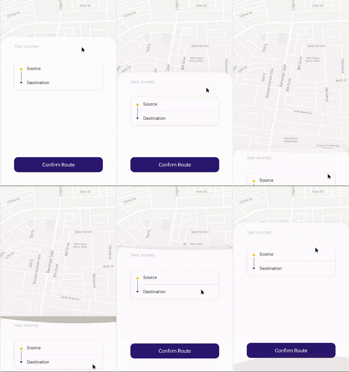
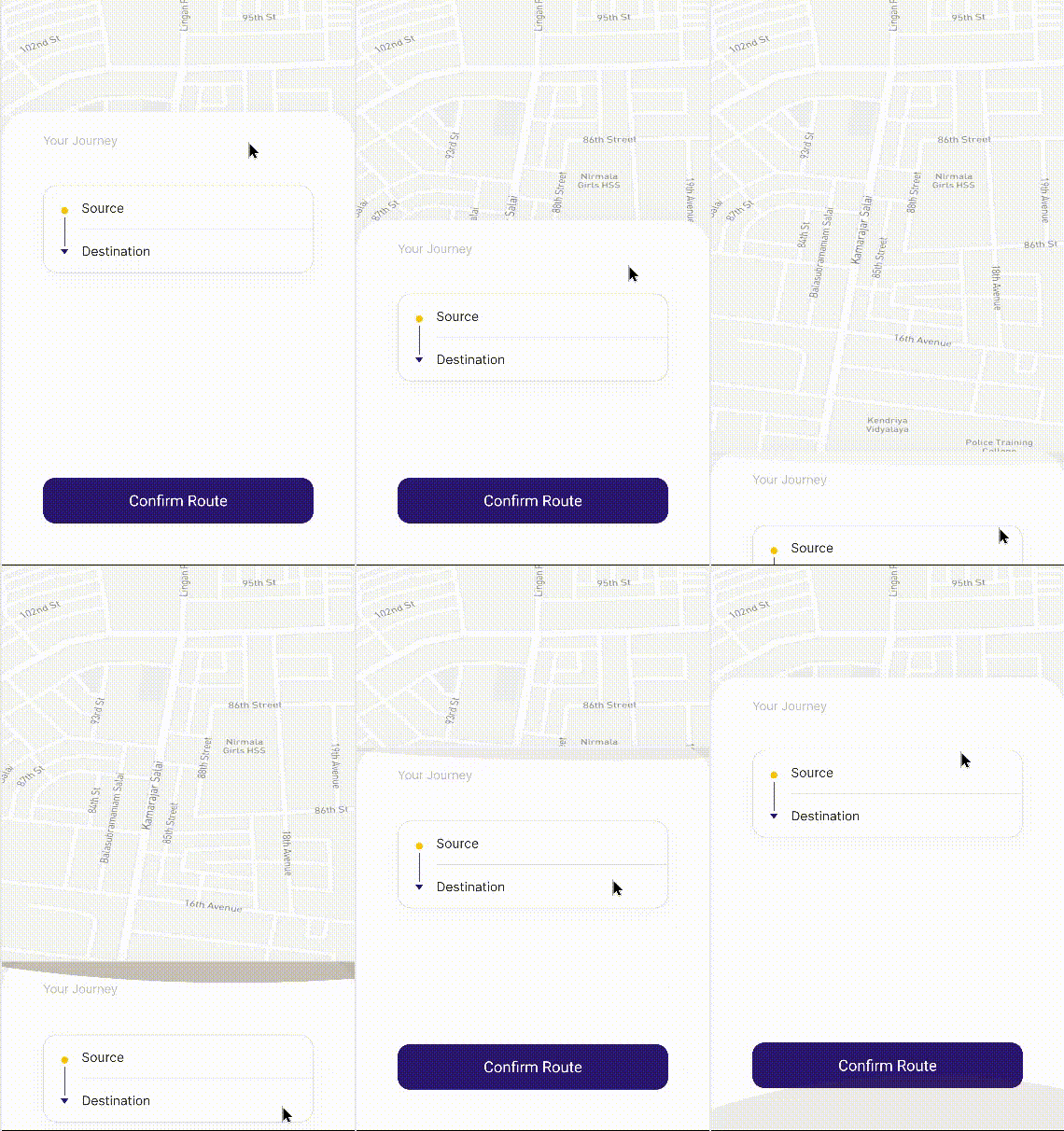
Another example could be with a [DraggableScrollableSheet](https://api.flutter.dev/flutter/widgets/DraggableScrollableSheet-class.html) where you keep some action button sticked to the bottom.
Image

About CustomPaint

This is where Flutter gave ultimate flexibility to the UI world.

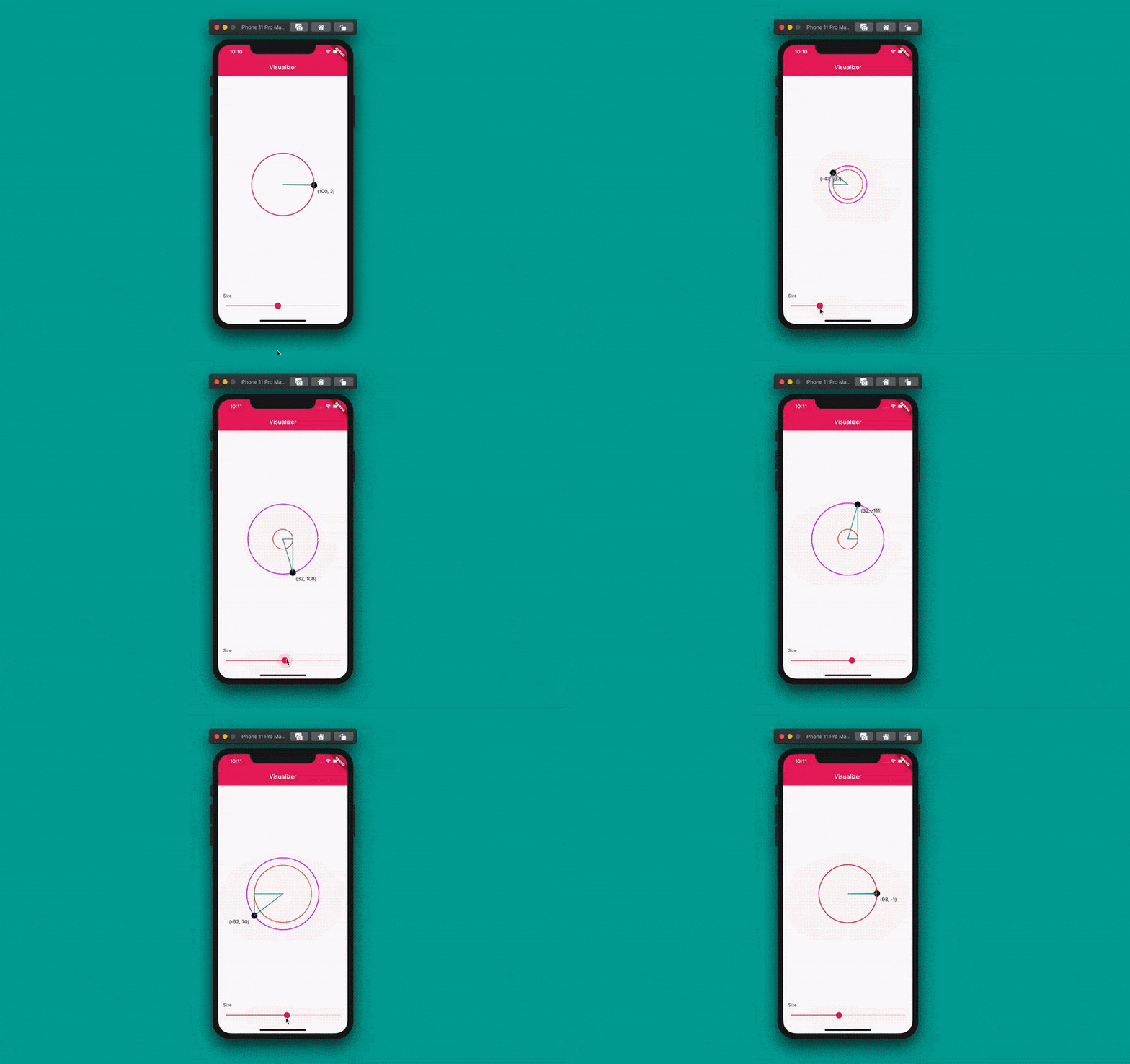
[CustomPaint](https://api.flutter.dev/flutter/widgets/CustomPaint-class.html) is to Flutter what the _Canvas API_ is to HTML or SVG is to images.

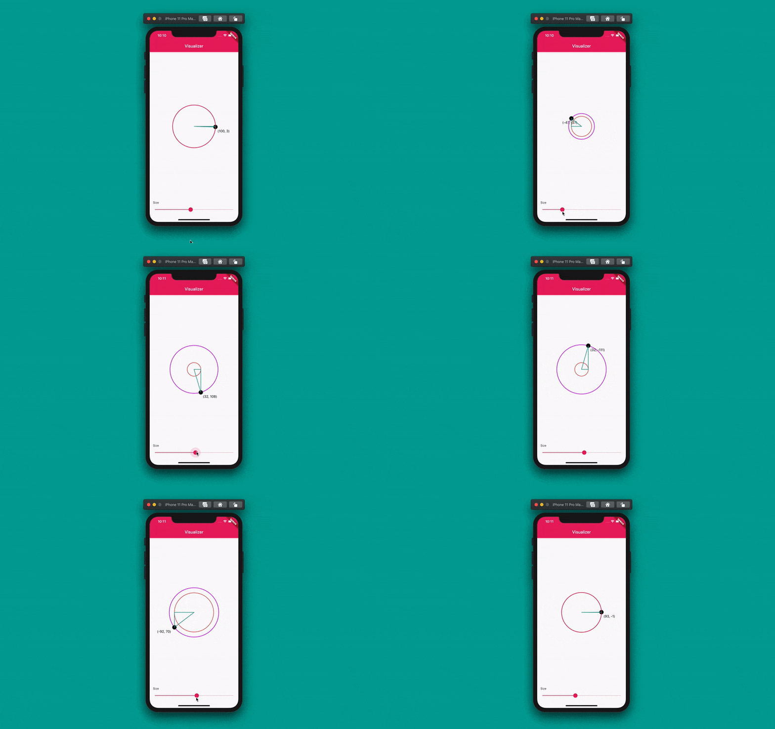
CustomPaint is a widget in Flutter that gives you the ability to design and draw without limitations. It gives you a canvas on which you can draw with a [painter](https://api.flutter.dev/flutter/widgets/CustomPaint/painter.html).
ImageFrom https://blog.codemagic.io/flutter-custom-painter/

You will rarely use CustomPaint. But be aware that it exists. Because there might be very complex UIs that widget combinations might not implement them and you will have no choice than drawing with CustomPaint.

When that time comes, it won't be hard for you because you are already familiar with other widgets.

Summary

For a given UI piece, choose a widget, write its code, build the widget with other widgets, and see what great UI you are implementing with Flutter.

Implementing UIs is a major part of mobile, web, and desktop app development. Flutter is a UI toolkit that build cross-platform for those platforms. Flutter's declarative nature and its widget abundance make UI implementation simple.

Keep implementing UIs in Flutter. As you do, it will become second nature to you. And you will be able to implement any UI in Flutter.


Obum
Obum

(Obumuneme Nwabude) || Full-Stack Blockchain, Mobile, & Web Developer || Google Developer Expert (GDE) Dart & Flutter.


[출처] https://www.freecodecamp.org/news/how-to-implement-any-ui-in-flutter/


플러터에서 모든 UI를 구현하는 방법

오붐
오붐
플러터에서 모든 UI를 구현하는 방법

이 글에서는 사용자 인터페이스 이미지, 조각 또는 화면을 Flutter 코드 로 변환하는 방법을 알아봅니다 .

이것은 앱을 만드는 튜토리얼이 아닙니다. 오히려 여러분이 이미 가지고 있는 앱에 여러분이 마주치는 모든 UI를 구현하는 데 도움이 되는 가이드입니다. 이 튜토리얼은 또한 Flutter의 다양한 UI 개념을 설명합니다.

목차

플러터란 무엇인가?

Flutter는 단일 코드베이스에서 아름답고 네이티브 컴파일된 다중 플랫폼 애플리케이션을 구축하기 위한 Google의 오픈 소스 프레임워크입니다. – (출처 : flutter.dev )

Flutter에서는 대부분 프레임워크와 달리 Dart가 코딩에 사용하는 유일한 프로그래밍 언어입니다. 이는 Flutter의 과소평가된 이점입니다. 특히 데스크톱, 모바일 및 웹 애플리케이션을 빌드할 수 있는 도구의 경우 더욱 그렇습니다.

대부분 UI 플랫폼은 두 개 이상의 언어를 사용합니다. 예를 들어, 프런트엔드 웹 개발에서는 HTML , CSS , JavaScript를 작성해야 합니다 . Android 의 경우 Kotlin (또는 Java )과 XML을 작성해야 합니다 . 하지만 Flutter에서는 Dart라는 하나의 언어만 사용합니다.

단 하나의 프로그래밍 언어라는 이점과 더불어, Flutter는 모든 것이 위젯이기 때문에 간단합니다. 예를 들어 [AnimatedWidget](https://api.flutter.dev/flutter/widgets/AnimatedWidget-class.html)[BottomNavigationBar](https://api.flutter.dev/flutter/material/BottomNavigationBar-class.html)[Container](https://api.flutter.dev/flutter/widgets/Container-class.html)[Drawer](https://api.flutter.dev/flutter/material/Drawer-class.html)[ElevatedButton](https://api.flutter.dev/flutter/material/ElevatedButton-class.html)[FormField](https://api.flutter.dev/flutter/widgets/FormField-class.html)[Image](https://api.flutter.dev/flutter/widgets/Image-class.html)[Opacity](https://api.flutter.dev/flutter/widgets/Opacity-class.html)[Padding](https://api.flutter.dev/flutter/widgets/Padding-class.html), ...

이것이 Flutter를 사용하기 쉽게 만드는 부분입니다. 기본적으로 평범한 영어입니다. 위젯 이름은 위젯의 본질을 반영하며 속성은 이해하기 쉽습니다.

플러터의 위젯

위젯은 StatefulWidget 또는 StatelessWidget을 확장하는 Dart 클래스 입니다 .

로컬 Flutter 설치에는 여러 위젯이 제공됩니다. 기본적으로 사용 가능한 위젯을 확인하려면 선호하는 편집기에서 Flutter 설치의 패키지 폴더를 엽니다. 그런 다음 모든 파일에서 "extends StatefulWidget" 및 "extends StatelessWidget"을 검색하여 결과 수를 기록합니다.

영상

Flutter 2.10 부터 408개의 StatefulWidget과 272개의 StatelessWidget을 얻게 됩니다 . 즉, UI를 사용하고 구현할 수 있는 총 680개의 위젯이 제공됩니다.

이러한 위젯에는 일반적으로 필요한 모든 것이 있습니다. 하지만 때로는 충분하지 않을 수도 있습니다. Dart와 Flutter의 패키지 관리자인 pub.dev 에는 UI를 구현하는 데 사용할 수 있는 위젯이 훨씬 더 많이 있습니다.

pub.dev에서 위젯을 세는 것은 어렵습니다. 하지만 빈 문자열을 검색하고(검색창에 아무것도 입력하지 않고 검색 아이콘을 누르세요) SDK를 Flutter로 설정하면 현재 게시된 패키지의 총 수가 반환됩니다.

영상

이 글을 쓸 당시 pub.dev에는 23,000개가 넘는 Flutter 패키지가 있었습니다. 각 패키지에는 최소한 하나의 위젯이 있습니다. 즉, 사용 가능한 680개 외에도 pub.dev에서 구현해야 할 위젯이 23,000개가 넘습니다. 즉, Flutter에서 원하는 모든 UI를 쉽게 구현할 수 있습니다.

사용 가능한 위젯이 다양할 뿐만 아니라, UI를 구현하면서 나만의 위젯을 만들 수도 있습니다.

위젯 트리

다음은 새로운 Flutter 프로젝트를 생성하고 주석을 제거하면 생성되는 코드의 일부입니다.

 
  Widget build(BuildContext context) {
    return Scaffold(
      appBar: AppBar(
        title: Text(widget.title),
      ),
      body: Center(
        child: Column(
          mainAxisAlignment: MainAxisAlignment.center,
          children: <Widget>[
            const Text(
              'You have pushed the button this many times:',
            ),
            Text(
              '$_counter',
              style: Theme.of(context).textTheme.headline4,
            ),
          ],
        ),
      ),
      floatingActionButton: FloatingActionButton(
        onPressed: _incrementCounter,
        tooltip: 'Increment',
        child: const Icon(Icons.add),
      ),
    );
  }

부모는 , 및 매개변수를 Scaffold취합니다 . 차례로 는 값이 있는 매개변수 도 취합니다 .appBarbodyfloatingActionButton[AppBar](https://api.flutter.dev/flutter/material/AppBar-class.html)titleText

bodyCenter는 . 를 갖는 값을 취합니다 Column child. 는 Column차례로 Text. 로 두 개의 s를 갖습니다 children. 는 콜백, 'Increment' 및 . 를 위한 . 를 FloatingActionButton취합니다 .onPressedtooltipIconchild

영상플러터 위젯 트리 분석

이것은 간단한 위젯 트리입니다. 부모와 자식이 있으며 대부분 Flutter 위젯의 공통 속성 child입니다 children. 위젯이 지속적으로 더 많은 위젯 자식을 가지면서 앱은 점차 큰 위젯 트리로 성장합니다.

Flutter에서 UI를 구현할 때 위젯 트리를 빌드하고 있다는 점을 명심하세요. 코드가 왼쪽 여백에서 안쪽으로 들여쓰기되는 것을 알 수 있습니다. 왼쪽에 일종의 가상 더 큰 기호(빈 공간)가 생기는 것 같습니다.

참고: 들여쓰기 수준이 크다면 코드를 리팩토링해야 한다는 신호입니다. 즉, 위젯 계층을 별도의 위젯으로 추출해야 한다는 뜻입니다.

플러터에서 모든 UI를 구현하는 방법

1. 왼쪽 상단에서 시작하여 오른쪽 하단으로 코드를 작성합니다.

UI에서 각 요소의 위치에 따라 UI 위젯을 하나씩 구현합니다. 따라서 먼저 UI 상단에 나타나는 항목에 대한 코드를 작성합니다. 그런 다음 해당 UI 하단에 도달할 때까지 페이지 아래로 이동하는 다른 항목에 대한 코드를 계속 작성합니다.

영상

이는 직관적입니다.

수평 축에서 왼쪽에서 오른쪽으로 가세요. 필요하다면, 또는 오른쪽에서 왼쪽으로 UI가 있다면, 대신 오른쪽에서 왼쪽으로 구현하세요.

2. 위젯 선택

다음으로 주어진 UI 요소에 사용할 위젯을 논리적으로 결정해야 합니다. 최소한 주어진 UI 요소에 대해 이름에서 알 수 있듯이 익숙한 간단한 위젯을 사용하게 됩니다.

UI 구성 요소의 이름은 위젯의 이름일 가능성이 큽니다. 선택하기 어렵다면 빠른 온라인 검색으로 답을 얻을 수 있습니다. Flutter에는 훌륭한 온라인 커뮤니티가 있습니다.

3. 위젯 그룹 사용

UI 항목 그룹이 수직으로 하나씩 배열되어 있는 경우 .을 사용합니다 [Column](https://api.flutter.dev/flutter/widgets/Column-class.html). 수평으로 하나씩 배열되어 있는 경우 .을 사용합니다 [Row](https://api.flutter.dev/flutter/widgets/Row-class.html). 서로 위에 배치되어 있는 경우 .을 사용 [Stack](https://api.flutter.dev/flutter/widgets/Stack-class.html)하고 떠다니는 위젯을 [Positioned](https://api.flutter.dev/flutter/widgets/Positioned-class.html)위젯으로 감쌉니다.

a. 열/행

Column또는 내부에서 Row위젯이 주축 또는 교차축에 어떻게 정렬되는지 변경하거나 조정할 수 있습니다. 이러한 조정에는 [CrossAxisAlignment](https://api.flutter.dev/flutter/rendering/CrossAxisAlignment.html)및 속성을 사용합니다.[MainAxisAlignment](https://api.flutter.dev/flutter/rendering/MainAxisAlignment.html)

교차 축의 경우, 중앙, 끝, 시작 및 늘림에 정렬할 수 있습니다. 주 축의 경우, 중앙, 끝, 주변 간격, 간격 사이, 균일한 간격 및 끝에 정렬할 수 있습니다.

a에서 Column수직축은 주축이고 수평축은 교차축입니다. a에서 Row수평축은 주축이고 수직축은 교차축입니다.

영상https://arzerin.com/2019/11/20/flutter-column/에서 발췌

영상https://arzerin.com/2019/11/20/flutter-row/에서 가져옴

Columns와 s 에서 Row특정 자식 위젯이 가능한 한 많은 사용 가능한 공간을 차지하도록 하려면 해당 위젯을 위젯 안에 래핑합니다 [Expanded](https://api.flutter.dev/flutter/widgets/Expanded-class.html). 웹 프런트엔드에 익숙하다면 Columns와 s가 CSS와 Row비슷하다는 것을 알 수 있을 것입니다.[display: flex;](https://developer.mozilla.org/en-US/docs/Web/CSS/flex)

b. 스택 위젯

를 사용하면 목록 Stack에 있는 마지막 위젯이 children이전 자식 위젯 위에 표시됩니다.

[alignment](https://api.flutter.dev/flutter/widgets/Stack/alignment.html)위젯의 상대적 위치를 나타내기 위해 Stack을 편집해야 할 수도 있습니다 . [topCenter](https://api.flutter.dev/flutter/painting/AlignmentDirectional/topCenter-constant.html)[center](https://api.flutter.dev/flutter/painting/AlignmentDirectional/center-constant.html)[bottomEnd](https://api.flutter.dev/flutter/painting/AlignmentDirectional/bottomEnd-constant.html), 등등.

'의 크기 Stack는 위치가 지정되지 않은 위젯(부모에 래핑되지 않은 자식 목록의 위젯 [Positioned](https://api.flutter.dev/flutter/widgets/Positioned-class.html))을 기준으로 계산됩니다. 코딩할 때는 Stack적어도 하나의 위치가 지정되지 않은 위젯이 있어야 하거나 '의 크기를 명시적으로 설정하는 부모 위젯에 래핑되어야 한다는 점을 기억하세요 Stack.

Positioned[bottom](https://api.flutter.dev/flutter/widgets/Positioned/bottom.html)[top](https://api.flutter.dev/flutter/widgets/Positioned/top.html)[left](https://api.flutter.dev/flutter/widgets/Positioned/left.html), . 중 하나 또는 전부를 취합니다 [right](https://api.flutter.dev/flutter/widgets/Positioned/right.html). 이들은 자식의 위치를 Stack​​. 에 상대적으로 설정합니다. 음수 값은 자식을 반대 방향으로 이동합니다. 그러나 음수 값은 자식의 일부를 잘라냅니다. [clipBehavior: Clip.none](https://api.flutter.dev/flutter/widgets/Stack/clipBehavior.html)에서 사용하여 Stack배치된 위젯의 모든 부분을 표시합니다.

영상전체 코드는 여기에서 확인하세요 .

4. 사용자 정의 위젯 만들기

위젯 트리를 구축하면 두 가지 사실이 눈에 띄게 됩니다.

  1. 나무의 한 덩어리가 너무 커져서 그 자체로 논리적인 단위가 되는 경우입니다.
  2. 또는 위젯의 일부 덩어리나 세트가 약간의 변경만으로 반복될 수도 있습니다.

이것들은 당신 이 코드를 리팩토링 해야 한다는 두 가지 표시입니다 . 즉, 당신은 그 위젯들을 추출하여 다른 Dart 파일에 정의해야 한다는 것을 의미합니다.

코드 편집기는 리팩토링에 도움이 됩니다. 편집기가 있든 없든, 해야 할 일은 다음과 같습니다.

  1. 새 Dart 파일을 만듭니다. 파일 이름은 새 위젯의 이름을 반영해야 합니다.
  2. 새 위젯에 State가 있는지 여부 에 따라 StatefulWidget 또는 StatelessWidget을 확장하는 새 클래스를 만듭니다 .
  3. 그런 다음 메서드에서 위젯 청크를 반환합니다 [build](https://api.flutter.dev/flutter/widgets/StatelessWidget/build.html).
  4. (선택 사항) 필요한 경우 새 Dart 클래스는 생성자에 위치 또는 명명된 매개변수를 가져와 위젯의 모양을 사용자 지정할 수 있습니다.
// in counter_display.dart
import 'package:flutter/material.dart';

class CounterDisplay extends StatelessWidget {
  
  Widget build(BuildContext context) {
    return Column(
        mainAxisAlignment: MainAxisAlignment.center,
      children: [
        Text('You have pushed the button this many times:'),
        Text('$counter', style: TextStyle(fontSize: 24)),
      ],
    );
  }
}

// in main.dart
//
// ... 
  body: Center(child: CounterDisplay()),
// ...

여러분은 많은 사용자 정의 위젯을 만들 것이고, 그것들은 차례로 더 많은 사용자 정의 위젯의 자손이 될 것입니다. 괜찮습니다. 위젯 트리는 필요에 따라 지속적으로 성장하도록 되어 있습니다.

5. 더 많은 사용자 정의 추가

리팩토링과 반복(DRY 코드) 때문에만 위젯을 사용자 정의하지 않을 것입니다 . 구현하는 UI 때문에 사용자 정의 위젯을 만들 것입니다.

사용 가능한 많은 위젯이 항상 주어진 UI의 정확한 요구를 충족하지 못하기 때문에 사용자 지정 위젯을 만들 것입니다. 특정 UI를 구현하려면 특별한 방식으로 위젯을 결합해야 합니다.

a. 컨테이너 위젯

[Container](https://api.flutter.dev/flutter/widgets/Container-class.html)강력한 위젯입니다. 다양한 방식으로 스타일을 지정할 수 있습니다. 웹 프런트엔드에 익숙하다면 [div](https://developer.mozilla.org/en-US/docs/Web/HTML/Element/div)HTML과 비슷하다는 것을 알 수 있을 것입니다.

Container기본 위젯입니다. 이를 사용하여 모든 UI 조각을 만들 수 있습니다.

경축! 아무것도 안하여 에스천사게임즈가 새로운 모습으로 재오픈 하였습니다.
어린이용이며, 설치가 필요없는 브라우저 게임입니다.
https://s1004games.com

일부 Container매개변수는 [constraints](https://api.flutter.dev/flutter/widgets/Container/constraints.html)[decoration](https://api.flutter.dev/flutter/widgets/Container/decoration.html)[margin](https://api.flutter.dev/flutter/widgets/Container/margin.html)[padding](https://api.flutter.dev/flutter/widgets/Container/padding.html)[transform](https://api.flutter.dev/flutter/widgets/Container/transform.html), 등이 있습니다. 물론, 위젯이 될 수 있는 를 Container사용합니다 .[child](https://api.flutter.dev/flutter/widgets/Container/child.html)

속성 decoration은 를 취할 수 있으며 , 이는 다시 여러 다른 속성을 취할 수 있습니다. 이것이 '의 유연성 [BoxDecoration](https://api.flutter.dev/flutter/painting/BoxDecoration-class.html)의 핵심입니다 . , 등 의 매개변수를 취합니다 .ContainerBoxDecoration[border](https://api.flutter.dev/flutter/painting/BoxDecoration/border.html)[borderRadius](https://api.flutter.dev/flutter/painting/BoxDecoration/borderRadius.html)[boxShadow](https://api.flutter.dev/flutter/painting/BoxDecoration/boxShadow.html)[color](https://api.flutter.dev/flutter/painting/BoxDecoration/color.html)[gradient](https://api.flutter.dev/flutter/painting/BoxDecoration/gradient.html)[image](https://api.flutter.dev/flutter/painting/BoxDecoration/image.html)[shape](https://api.flutter.dev/flutter/painting/BoxDecoration/shape.html)

이러한 매개변수와 값을 사용하면 취향에 맞는 UI를 구현할 수 있습니다. Flutter가 제공하는 많은 소재 위젯Container 대신 사용할 수 있습니다 . 이렇게 하면 앱이 취향에 맞게 됩니다.

b. GestureDetector / InkWell

[GestureDetector](https://api.flutter.dev/flutter/widgets/GestureDetector-class.html)이름에서 알 수 있듯이 사용자 상호작용을 감지합니다. 모든 UI 조각이 버튼은 아닙니다. UI를 구현하는 동안 사용자 동작에 반응하는 위젯이 필요합니다. 그런 경우 GestureDetector.

GestureDetector탭, 두 번 탭, 스와이프 등 다양한 유형의 제스처를 감지할 수 있습니다. 물론 (모든 위젯이 될 수 있음)과 , GestureDetector[child](https://api.flutter.dev/flutter/widgets/GestureDetector/child.html)스와이프의 경우)와 같이 다양한 제스처에 대한 다양한 콜백을 [onTap](https://api.flutter.dev/flutter/widgets/GestureDetector/onTap.html)사용 합니다.[onDoubleTap](https://api.flutter.dev/flutter/widgets/GestureDetector/onDoubleTap.html)[onPanUpdate](https://api.flutter.dev/flutter/widgets/GestureDetector/onDoubleTap.html)

참고: 기본적으로 사용자가 s의 빈 공간과 상호 작용할 때 child콜백 GestureDetector은 호출되지 않습니다. 빈 공간( GestureDetector에서 제스처에 반응하도록 하려면 의 속성을 설정 합니다 .child[behavior](https://api.flutter.dev/flutter/widgets/GestureDetector/behavior.html)GestureDetector[HitTestBehavior.translucent](https://api.flutter.dev/flutter/rendering/HitTestBehavior.html)

GestureDetector(
  // set behavior to detect taps on empty spaces
  behavior: HitTestBehavior.translucent,
  child: Column(
    children: [
      Text('I have space after me ...'),
      SizedBox(height: 32),
      Text('... that can detect taps.'),
    ],
  ),
  onTap: () => print('Tapped on empty space.'),
)

[InkWell](https://api.flutter.dev/flutter/material/InkWell-class.html)와 유사합니다 GestureDetector일부 제스처 에 반응합니다. 그러나 상호 작용할 때 파장GestureDetector 효과가 나타납니다 ( s는 그렇지 않습니다).GestureDetector

영상https://stackoverflow.com/q/58285012/13644299에서

InkWell조상 이 있어야 합니다 [Material](https://api.flutter.dev/flutter/material/Material-class.html). 따라서 최상위 위젯이 있다면 [MaterialApp](https://api.flutter.dev/flutter/material/MaterialApp-class.html)걱정할 필요가 없습니다. 그렇지 InkWell않으면 Material.

InkWell's parent 또는 의 색상을 변경하는 경우에도 이 래핑을 수행해야 합니다 child. 그렇지 않으면 리플이 표시되지 않습니다. 리플을 표시하려면 위젯 [color](https://api.flutter.dev/flutter/material/Material/color.html)의 를 설정해야 합니다. 를 Material설정하면 Flutter가 나머지를 처리합니다.color[Colors.transparent](https://api.flutter.dev/flutter/material/Colors/transparent-constant.html)

스크롤링 인터페이스를 구현하는 방법

스크롤은 약간 민감한 주제입니다. 기본적으로 위젯은 Flutter에서 스크롤되지 않습니다. Column또는 가 Row스크롤 가능 하면 [ListView](https://api.flutter.dev/flutter/widgets/ListView-class.html)대신 를 사용합니다. 매개변수도 ListView사용합니다 .children

ListView[ListView.builder](https://api.flutter.dev/flutter/widgets/ListView/ListView.builder.html)또한 및 와 같은 팩토리 생성자가 있습니다 [ListView.separated](https://api.flutter.dev/flutter/widgets/ListView/ListView.separated.html). 는 builder자식의 빌드 프로세스를 더 많이 제어할 수 있는 반면 는 구분 기호 (예: 와 같은 ) separated를 고려합니다 .[Divider](https://api.flutter.dev/flutter/material/Divider-class.html)

기본적으로 ListViews는 자식을 수직으로 스크롤합니다. 그러나 [scrollDirection](https://api.flutter.dev/flutter/widgets/ScrollView/scrollDirection.html)a의 를 변경 ListView하여 [Axis.horizontal](https://api.flutter.dev/flutter/painting/Axis.html)자식을 수평으로 스크롤할 수 있습니다.

때때로 . [SingleChildScrollView](https://api.flutter.dev/flutter/widgets/SingleChildScrollView-class.html)대신 을 사용하고 싶을 수도 있습니다 ListView. 이름에서 알 수 있듯이, 단일을 사용 [child](https://api.flutter.dev/flutter/widgets/SingleChildScrollView/child.html)하고 스크롤할 수 있습니다. 위젯 그룹을 .으로 전달할 수 있습니다 child.

다른 스크롤링 위젯도 있습니다 .

하지만 특별히 에 유의하세요 [CustomScrollView](https://api.flutter.dev/flutter/widgets/CustomScrollView-class.html). 다른 것과 달리 스크롤을 엄청나게 제어할 수 있습니다. [slivers](https://api.flutter.dev/flutter/widgets/CustomScrollView/slivers.html), 이는 강력한 스크롤 메커니즘을 갖춘 스크롤 위젯입니다.

[SliverFillRemaining](https://api.flutter.dev/flutter/widgets/SliverFillRemaining-class.html)[SliverFillViewport](https://api.flutter.dev/flutter/widgets/SliverFillViewport-class.html)[SliverGrid](https://api.flutter.dev/flutter/widgets/SliverGrid-class.html)[SliverList](https://api.flutter.dev/flutter/widgets/SliverList-class.html)[SliverPersistentHeader](https://api.flutter.dev/flutter/widgets/SliverPersistentHeader-class.html)등이 목록 에 포함하는 위젯의 예입니다 slivers. 이러한 위젯의 대부분은 스크롤이 발생하는 방식을 처리하는 대리자를 사용합니다 .

사용하기 좋은 예로 는 AppBar를 기본적으로 확장하고 스크롤하면 축소하려는 경우 CustomScrollView입니다 .[SliverAppBar](https://api.flutter.dev/flutter/material/SliverAppBar-class.html)

영상

[DraggableScrollableSheet](https://api.flutter.dev/flutter/widgets/DraggableScrollableSheet-class.html)또 다른 예로는 하단에 어떤 동작 버튼을 붙여 놓는 경우 가 있습니다 .

영상

CustomPaint 소개

여기가 바로 플러터가 UI 세계에 최고의 유연성을 제공한 곳입니다.

[CustomPaint](https://api.flutter.dev/flutter/widgets/CustomPaint-class.html)플러터에 대한 _ Canvas API _는 HTML에 대한 것이고 SVG는 이미지에 대한 것입니다.

CustomPaint는 제한 없이 디자인하고 그릴 수 있는 기능을 제공하는 Flutter의 위젯입니다. .으로 그릴 수 있는 캔버스를 제공합니다 [painter](https://api.flutter.dev/flutter/widgets/CustomPaint/painter.html).

영상https://blog.codemagic.io/flutter-custom-painter/에서

CustomPaint를 거의 사용하지 않을 것입니다. 하지만 그것이 존재한다는 것을 알아두십시오. 위젯 조합이 그것을 구현하지 못할 수 있는 매우 복잡한 UI가 있을 수 있고, .으로 그리는 것 외에는 선택의 여지가 없을 것입니다 CustomPaint.

그때가 되면 다른 위젯에 이미 익숙해져서 어렵지 않을 겁니다.

요약

주어진 UI 부분에 대해 위젯을 선택하고, 코드를 작성하고, 다른 위젯과 함께 위젯을 빌드한 다음 Flutter로 어떤 멋진 UI를 구현하고 있는지 확인하세요.

UI 구현은 모바일, 웹 및 데스크톱 앱 개발의 주요 부분입니다. Flutter는 이러한 플랫폼을 위한 크로스 플랫폼을 구축하는 UI 툴킷입니다. Flutter의 선언적 특성과 풍부한 위젯은 UI 구현을 간단하게 만듭니다.

Flutter에서 UI를 계속 구현하세요. 그렇게 하면 두 번째 본성이 될 것입니다. 그리고 Flutter에서 모든 UI를 구현할 수 있을 것입니다.


오붐
오붐

(Obumuneme Nwabude) || 풀스택 블록체인, 모바일 및 웹 개발자 || Google 개발자 전문가(GDE) Dart 및 Flutter.


[출처] https://www.freecodecamp.org/news/how-to-implement-any-ui-in-flutter/


Flutter로 UI를 구현하는 방법

 
플러터 코드 변환


이 글에서는 이미지를 포함한 모든 종류의 UI를 Flutter 코드로 변환하는 방법에 대해 소개할 예정입니다. 미리 말하자면 이 글은 앱 개발 튜토리얼이 아니며, 다양한 UI의 기본적인 개념과 구현 방법을 간략히 소개하는 가이드입니다.


Flutter 소개

Flutter(플러터)는 하나의 코드 베이스로 모바일, 웹, 데스크톱에서 네이티브로 컴파일되는 구글의 아름다운 UI 툴킷입니다.  (출처 : flutter-ko.dev)


웹 프런트엔드 개발에 HTML, CSS, Javascript가 쓰이고, 안드로이드 개발에 Kotlin(또는 Java)과 XML이 사용되는 등 대부분의 프레임워크에는 다수의 개발 언어가 요구됩니다. 하지만 데스크탑, 모바일, 웹 애플리케이션을 모두 개발할 수 있는 Flutter는 오로지 Dart를 기반으로 하며, Flutter 앱 내에서 볼 수 있는 이미지, 아이콘, 글자 등 모든 것이 위젯 형태로 구성되어있습니다.


예를 들어 AnimatedWidget, BottomNavigationBar, Container, Drawer, ElevatedButton, FormField, Image, Opacity, Padding 등의 위젯이 준비되어 있으며, 보통 사용자들이 쉽게 이해할 수 있도록 위젯 이름이 만들어집니다.


Flutter의 위젯들

Flutter에서 위젯은 StatefulWidget[1] 또는 StatelessWidget[2]을 상속(extend)하는 Dart의 클래스입니다. Flutter 2.10을 기준으로 Flutter를 설치하면 기본적으로 위젯 680개(StatefulWidgets 408개, StatelessWidget 272개)가 제공됩니다.


flutter 위젯


사용자가 필요로 하는 대부분의 기능은 기본 위젯으로 구현 가능하지만, 더 많은 위젯이 필요하다면 pub.dev(Dart와 Flutter의 패키지 매니저)에서 찾을 수 있습니다.


pub.dev 위젯


글 작성 시점 기준(역자 주: 6월 초) pub.dev에 등록된 위젯은 약 23,000개나 되기 때문에 상상 가능한 대부분의 UI를 손쉽게 구현할 수 있습니다. 물론 필요에 따라 완전히 새로운 위젯을 직접 만드는 것도 가능합니다.


위젯 트리

Flutter의 위젯들은 기본적으로 트리 형태의 구조를 따릅니다.


@override
 Widget build(BuildContext context) {
   return Scaffold(
     appBar: AppBar(
       title: Text(widget.title),
     ),
     body: Center(
       child: Column(
         mainAxisAlignment: MainAxisAlignment.center,
         children: <Widget>[
           const Text(
             'You have pushed the button this many times:',
           ),
           Text(
             '$_counter',
             style: Theme.of(context).textTheme.headline4,
           ),
         ],
       ),
     ),
     floatingActionButton: FloatingActionButton(
       onPressed: _incrementCounter,
       tooltip: 'Increment',
       child: const Icon(Icons.add),
     ),
   );
 }
Plaintext

신규 Flutter 프로젝트의 placeholder 중 일부


위의 코드를 보면 Scaffold가 부모(parent)로서 appBar, body, floatingActionButton 파라미터를 받는 것을 확인할 수 있습니다. 그리고 AppBar는 텍스트값을 가진 Title을 파라미터로 다시 받는 연속적인 트리 구조입니다.


위젯 트리 구조
Flutter 위젯 트리 구조 예시


위젯 트리는 부모(parent)[3]와 자손(descendants)[4] 또는 자식(child/children)으로 구분되는 계층 구조로 이루어져 있습니다. 이런 트리 구조에서는 자식 위젯이 많아질수록 위젯 트리가 점차 넓어지는데, 신경 쓰지 않고 개발하다 보면 코드에 들여쓰기가 계속 중첩되어 마치 “>” 부등호를 옆에 두고 코드를 작성하는 모양이 되기도 합니다.


팁 : 과도한 들여쓰기는 코드를 리팩터링해야 한다는 신호입니다. 일부 위젯 계층을 떼어내어 별도의 위젯으로 추출해야 할 수 있습니다.


Flutter에서 UI를 구현하는 방법

1. 개발 방향

각각의 위젯마다 화면에 적절한 배치 위치가 다르기 때문에 상단에 구현되는 항목들에 대한 코드를 먼저 작성한 후 아래 방향으로 개발을 진행해야 합니다.


Flutter UI


가로 방향은 지금 여러분이 이 글을 읽는 것처럼 왼쪽에서 오른쪽으로 코드를 작성하면 됩니다. 단, 오른쪽에서 왼쪽으로(RTL, right-to-left) 개발이 요구되는 경우에는 요건에 맞춰 개발하면 됩니다.


2. 위젯 선택하기

개발 방향을 숙지한 이후에는 구현하는 UI에 맞는 위젯을 선정해야 합니다. Flutter에서 위젯의 이름은 그 기능과 모양을 사용자들이 이해하기 쉽도록 작명됩니다. 그렇기 때문에 정확히 어떤 위젯을 사용할지 모르는 채로 프로젝트를 시작했더라도 간단한 검색을 통해 적합한 위젯을 찾을 수 있습니다.


3. 위젯 그룹 사용하기

위젯들을 그룹화해서 세로로 정렬하려면 Column을, 가로로 정렬은 Row를 사용하면 됩니다. 그리고 만약 위젯들이 서로 겹쳐야 하는 구조라면 StackPositioned를 사용하면 됩니다.


a. Column/Row

Column과 Row는 CSS의 display: flex;와 유사한 개념입니다. Column이나 Row 안에서는 MainAxisAlignmentCrossAxisAlignment 프로퍼티를 통해 위젯이 주축(Main axis) 또는 횡축(Cross axis)에서 정렬되는 방식을 조정할 수 있습니다. 횡축의 정렬 방식은 Center, Start, End, Stretch가 있고, 주축에는 Center, Start, End, SpaceEvenly, SpaceAround, SpaceBetweeen 방식이 있습니다.


주축과 횡축은 위젯에 따라 달라질 수 있습니다. Column에서는 세로축이 주축이고 가로축이 횡축입니다. 반대로 Row에서는 가로축이 주축, 세로축이 횡축입니다.


위젯 column
<출처: https://arzerin.com/2019/11/20/flutter-column/>
위젯 Row
 <출처: https://arzerin.com/2019/11/20/flutter-row/>


Column 혹은 Row에서 어떤 특정한 자식 위젯에 최대 가용 면적을 할당하려면 해당 위젯을 Expanded 위젯으로 감싸면 됩니다.


b. Stack 위젯

Stack은 자식(Children) 프로퍼티에 정의된 위젯 목록 중 가장 상위 항목이 가장 아래에 깔리고 하위 위젯일수록 위에 위치하도록 위젯들을 겹칩니다. Stack 안에서 위젯들의 배치는 alignment 프로퍼티의 topCenter, center, bottomEnd로 조정할 수 있습니다.


Stack의 크기는 배치되지 않은(non-positioned)[5] 위젯을 기준으로 계산됩니다. 따라서 stack 안에 최소 한 개의 배치되지 않은 위젯이 있어야 하고, 만약 그렇지 않다면 반드시 크기를 명시하는 부모 위젯으로 stack을 감싸야 합니다.


Positionedbottom, top, left, right 프로퍼티를 이용해서 하위 위젯의 위치를 stack에 맞춰 조정할 수 있습니다. 여기서 주의할 점은 프로퍼티 값을 음수로 설정해서 위젯을 역방향으로 배치하는 경우 위젯의 일부가 잘려 나갈 수 있다는 것입니다. Positioned 된 위젯이 잘리지 않게 하려면 반드시 clipBehavior: Clip.none 프로퍼티를 별도로 설정해야 합니다.


하위 위젯 위치
Full code here.


4. 리팩터링을 위한 위젯 생성 방법

위젯 트리에서 아래 두 가지 상황이 발생한다면 리팩터링을 고려해야 합니다.

  1. 트리의 일부분이 과도하게 확장되어있고, 문제의 부분만을 떼어놔도 독립적 유닛으로 인정될 수 있는 경우
  2. 일부 위젯들이 사소하게만 수정된 채 반복 사용되는 경우


간략한 리팩터링 절차는 아래와 같습니다.


  1. 신규 생성되는 위젯의 이름을 반영하는 Dart 파일을 생성합니다.
  2. 위젯에 상태(State)[6] 관리 필요 여부에 따라 StatefulWidget 또는 StatelessWidget를 상속(extends)하는 신규 클래스를 생성합니다.
  3. 빌드 메서드(build method)를 통해 위젯을 생성합니다.
  4. (선택 사항) 임의 파라미터(Optional Parameter)[7]를 추가합니다.


// in counter_display.dart
import 'package:flutter/material.dart';

class CounterDisplay extends StatelessWidget {
  @override
  Widget build(BuildContext context) {
    return Column(
  	  mainAxisAlignment: MainAxisAlignment.center,
      children: [
        Text('You have pushed the button this many times:'),
        Text('$counter', style: TextStyle(fontSize: 24)),
      ],
    );
  }
}

// in main.dart
//
// ...
  body: Center(child: CounterDisplay()),
// ...
Plaintext


5. 위젯 커스터마이징 방법

23,000개 이상의 위젯에서도 원하는 UI 컴포넌트를 찾지 못해서 커스텀 위젯을 생성해야 하는 경우도 있습니다.


a. Contrainer 위젯

HTML의 div와 유사한 Flutter의 Container 위젯을 이용하면 다양한 UI를 구현할 수 있습니다. 컨테이너의 프로퍼티는 대표적으로 constraints, decoration, margin, padding, transform 등이 있는데, 그중에서도 decoration 하위의 BoxDecoration을 이용하면 컨테이너 위젯의 모양을 사용자의 요구에 따라 자유롭게 변경할 수 있습니다.


b. GestureDetector / InkWell

GestureDetector는 탭이 한 번만 감지되면 onTap에 할당된 기능을 실행하고, 두 번 감지되면 onDoubleTap의 기능을 실행하는 등 감지되는 사용자 동작에 따라 다른 콜백[8]을 실행해서 위젯과 사용자가 상호작용하도록 합니다.


팁 : 사용자가 GestureDetector의 하위 영역에 있는 빈 공간을 터치할 때는 별도의 콜백[8]이 호출되지 않습니다. 이에 반응하도록 하려면 HitTestBehavior 프로퍼티를 transpective로 설정해야 합니다.


GestureDetector(
 // set behavior to detect taps on empty spaces
 behavior: HitTestBehavior.translucent,
 child: Column(
   children: [
     Text('I have space after me ...'),
     SizedBox(height: 32),
     Text('... that can detect taps.'),
   ],
 ),
 onTap: () => print('Tapped on empty space.'),
)
Plaintext

GestureDetector의 사용 예시


InkWell은 사용자의 동작을 감지하고 기능을 실행한다는 점에서 GestureDetector와 유사합니다. 하지만 상대적으로 제한적인 수의 동작에만 반응하며, 물결이 퍼져나가는 애니메이션을 구현할 수 있다는 차이가 있습니다.


사용자 동작 감지
<출처: https://stackoverflow.com/q/58285012/13644299>


또한, InkWell을 사용하기 위해서는 반드시 상위에 Material을 두어야 하기 때문에 MaterialApp[9] 이 InkWell의 조상이 아닌 경우에는 반드시 Material로 감싸는 처리가 필요합니다.


스크롤링 인터페이스 구현 방법

대부분의 위젯들은 스크롤을 지원하지 않기 때문에 스크롤 인터페이스 구현을 위해서는 ListView와 같은 위젯을 사용해야 합니다.


ListViews 스크롤 방향은 기본적으로 수직 방향입니다. 만약 가로 스크롤이 필요하다면 scrollDirection 프로퍼티 설정을 Axis.horizontal로 변경해야 합니다. 이 외에도 많은 스크롤링 위젯이 있지만, 그중에서 slivers를 통해 강력한 스크롤 메커니즘을 제공하는 CustomScrollViewSliverAppBarDraggableScrollableSheet를 간략히 소개하겠습니다.


SliverAppBar는 사용자가 스크롤을 할 때 이에 맞춰 앱바의 크기가 줄어드는 효과를 구현합니다. DraggableScrollableSheet는 사용자의 스크롤과 무관하게 액션 버튼을 앱 하단에 고정시키는 효과를 구현합니다.


스크롤링 인터페이스 예시1
CustomScrollView 예시


스크롤링 인터페이스 예시2
DraggableScrollableSheet 예시


커스텀페인트란?

CustomPaintpainter 프로퍼티를 이용해서 자유자재로 UI를 그릴 수 있는 캔버스를 제공하는 위젯으로 HTML의 Canvas API와 유사합니다.


커스텀 페인트
<출처: https://blog.codemagic.io/flutter-custom-painter/>


CustomPaint는 사용 빈도가 높지 않기 때문에 이 글에서는 UI 구현에 상당히 높은 유연성을 주는 요소로 정도로 알아두고 넘어가겠습니다.


요약

모바일, 웹, PC의 플랫폼을 망라하는 애플리케이션 개발에서 UI 구현은 가장 핵심이 되는 개발 요소 중 하나입니다. 여기에 있어 선언형 UI 프레임워크이자 크로스 플랫폼 개발 툴인 Flutter를 사용하면 몇 가지 위젯의 조합을 통해 다양한 플랫폼에서 작동하는 애플리케이션의 UI를 손쉽게 구현할 수 있습니다.


본 웹사이트는 광고를 포함하고 있습니다.
광고 클릭에서 발생하는 수익금은 모두 웹사이트 서버의 유지 및 관리, 그리고 기술 콘텐츠 향상을 위해 쓰여집니다.
번호 제목 글쓴이 날짜 조회 수

등록된 글이 없습니다.

대표 김성준 주소 : 경기 용인 분당수지 U타워 등록번호 : 142-07-27414
통신판매업 신고 : 제2012-용인수지-0185호 출판업 신고 : 수지구청 제 123호 개인정보보호최고책임자 : 김성준 sjkim70@stechstar.com
대표전화 : 010-4589-2193 [fax] 02-6280-1294 COPYRIGHT(C) stechstar.com ALL RIGHTS RESERVED