
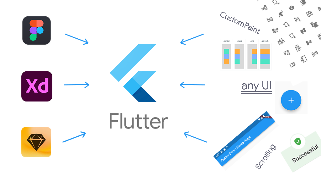
In this article, you will learn how to convert any user interface image, piece, or screen into Flutter code.
This is not a tutorial on building an app. It is rather a guide that will help you implement any UI you come across into an app you already have. This tutorial also explains a wide variety of UI concepts in Flutter.
Table of Contents
- What is Flutter?
- Widgets in Flutter
- The Widget Tree
- How to Implement any UI in Flutter
1. Implement Top Left; Down Right
2. Choose a Widget
3. Use widget groups
a. Column/Row
b. Stack Widget
4. Create custom widgets
5. Add more customization
a. Container Widget
b. GestureDetector / InkWell - How to Implement Scrolling Interfaces
- About CustomPaint
- Summary
What is Flutter?
Flutter is an open source framework by Google for building beautiful, natively compiled, multi-platform applications from a single codebase. – (source: flutter.dev)
In Flutter, contrary to most frameworks, Dart is the only programming language you use to code. This is an underemphasized benefit of Flutter. Especially for a tool that can build desktop, mobile, and web applications.
Most UI platforms use more than one language. For example, in front-end web development, you have to write HTML, CSS, and JavaScript. For Android, you have to write Kotlin (or Java) and XML. But in Flutter, it's just one language: Dart.
Coupled with the only-one-programming-language benefit, Flutter is simple because everything in Flutter is a widget. For example [AnimatedWidget](https://api.flutter.dev/flutter/widgets/AnimatedWidget-class.html), [BottomNavigationBar](https://api.flutter.dev/flutter/material/BottomNavigationBar-class.html), [Container](https://api.flutter.dev/flutter/widgets/Container-class.html), [Drawer](https://api.flutter.dev/flutter/material/Drawer-class.html), [ElevatedButton](https://api.flutter.dev/flutter/material/ElevatedButton-class.html), [FormField](https://api.flutter.dev/flutter/widgets/FormField-class.html), [Image](https://api.flutter.dev/flutter/widgets/Image-class.html), [Opacity](https://api.flutter.dev/flutter/widgets/Opacity-class.html), [Padding](https://api.flutter.dev/flutter/widgets/Padding-class.html), ...
This is part of what makes Flutter easy to use – it's basically plain English. Widget names reflect what they are and their properties are easy to understand.
Widgets in Flutter
A widget is a Dart class that either extends StatefulWidget or StatelessWidget.
Your local Flutter installation comes with several widgets. To check out the widgets available by default, open the packages folder of your Flutter installation in your preferred editor. Then search across all files for "extends StatefulWidget" and "extends StatelessWidget" and take note of the number of results.
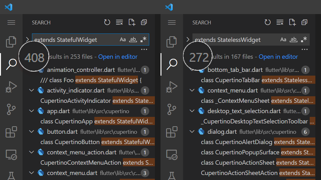
As of Flutter 2.10, you will get 408 StatefulWidgets and 272 StatelessWidgets. That is a total of 680 widgets available for you to use and implement UIs.
These widgets typically have all you need. But at times they may not be enough. pub.dev, Dart and Flutter's package manager, have many more widgets you can use to implement UIs.
It is difficult to count the widgets in pub.dev. But searching an empty string (don't enter anything in the search bar and then press the search icon) and setting the SDK to Flutter returns the current total number of published packages.
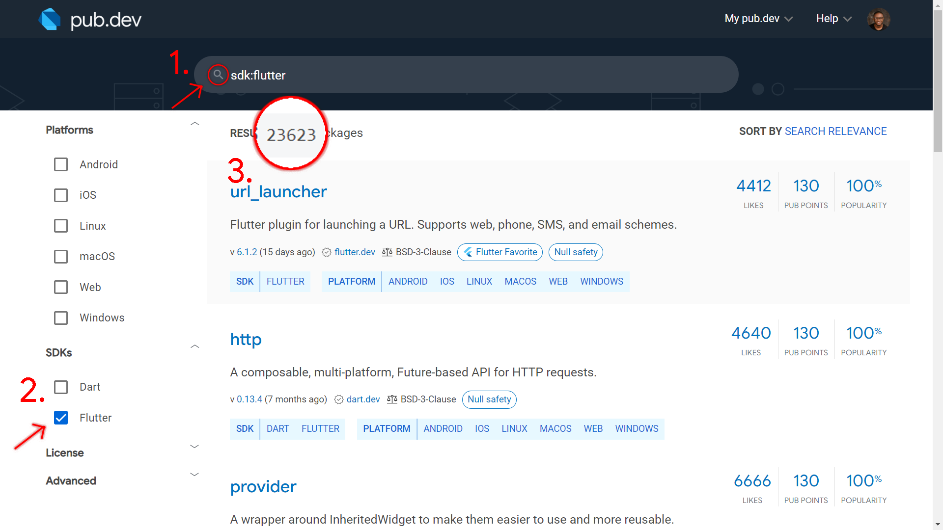
At the time of writing, there are more than 23000 Flutter packages in pub.dev. Each package has at least one widget. This means that you have more than 23000 widgets from pub.dev to implement, in addition to the available 680. This means that you can really implement any UI you want easily in Flutter.
Adding to the many available widgets, you can also create your own widgets as you implement UIs.
The Widget Tree
The following is part of the code you get when you create a new Flutter project and remove the comments:
Widget build(BuildContext context) {
return Scaffold(
appBar: AppBar(
title: Text(widget.title),
),
body: Center(
child: Column(
mainAxisAlignment: MainAxisAlignment.center,
children: <Widget>[
const Text(
'You have pushed the button this many times:',
),
Text(
'$_counter',
style: Theme.of(context).textTheme.headline4,
),
],
),
),
floatingActionButton: FloatingActionButton(
onPressed: _incrementCounter,
tooltip: 'Increment',
child: const Icon(Icons.add),
),
);
}
The parent Scaffold takes the appBar, body, and floatingActionButton parameters. In turn, the [AppBar](https://api.flutter.dev/flutter/material/AppBar-class.html) also takes a title parameter that has a Text value.
body takes a Center value that has a Column child. The Column in turn has two Texts as children. The FloatingActionButton takes the onPressed callback, 'Increment' tooltip, and an Icon for a child.
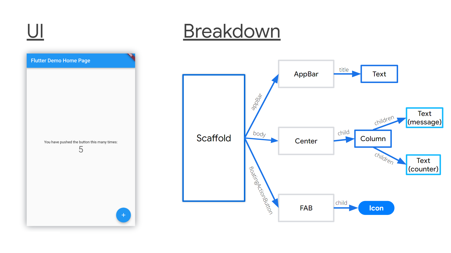 Flutter widget tree breakdown
This is a simple widget tree. It has parents and descendants. child and children are common properties of most Flutter widgets. As widgets continuously take more widget children, your app gradually grows into a large widget tree.
As you implement UIs in Flutter, bear in mind that you are building a widget tree. You will notice that your code indents inwards from the left margin. It seems to develop some kind of virtual greater than sign (of empty space) at the left.
Note: Huge indentation levels are a sign that you need to refactor your code. It means that you need to extract some widget hierarchy into a separate widget.
How to Implement Any UI in Flutter
1. Write your code starting at the top left and move down to the bottom right
You'll implement the UI widget after widget according to each element's position in the UI. So you will first write code for things that appear at the top of the UI. Then you keep writing code for the other items moving down the page until you reach the bottom of that UI.
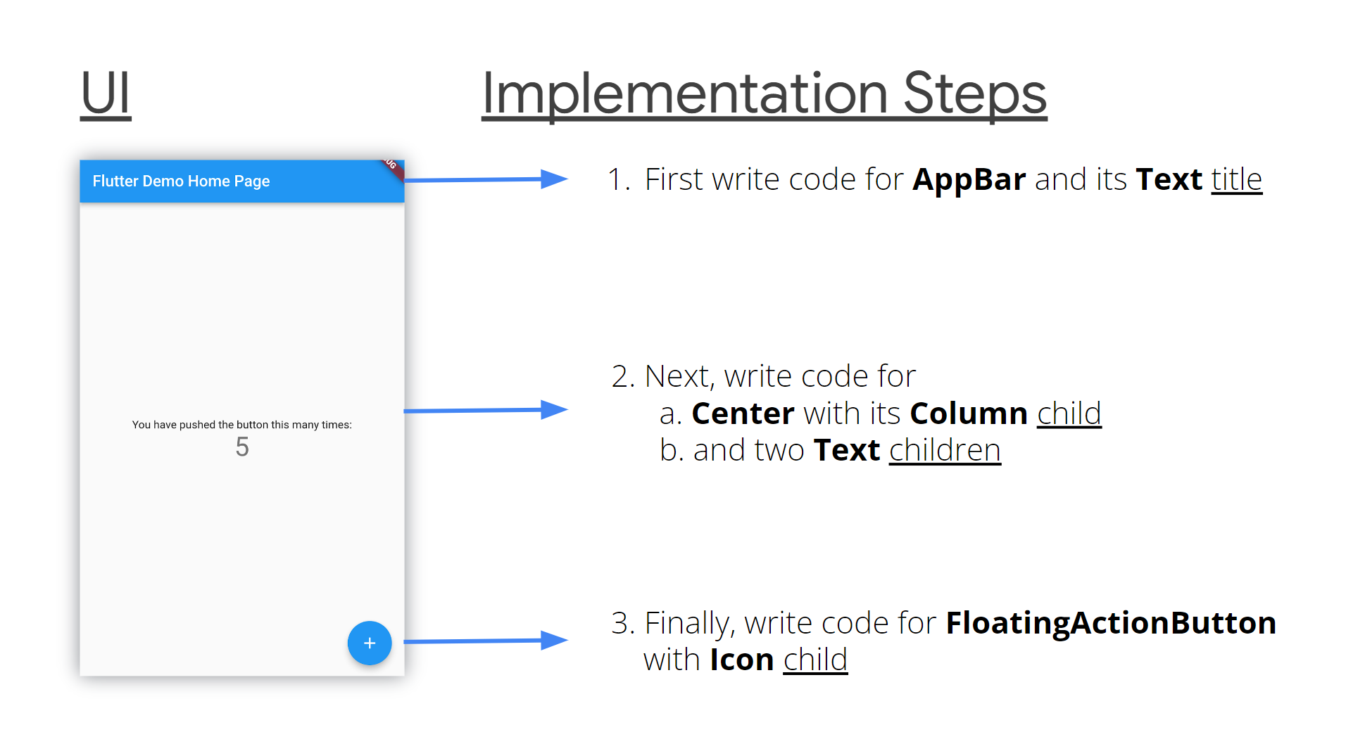
This is intuitive.
On the horizontal axis, go from left to right. If need be, or if it is a right-to-left UI, then implement it from right to left instead.
2. Choose a Widget
Next you'll need to logically determine the widget you want to use for a given UI element. At a bare minimum, for a given UI element, you will use simple widgets you're familiar with based on what their names say they do.
Chances are the name of what the UI component looks like is the name of the widget. If you find it hard to make a choice, a quick online search will give you the answers. Flutter has a great online community.
3. Use widget groups
If a group of UI items is arranged vertically, one after another, use a [Column](https://api.flutter.dev/flutter/widgets/Column-class.html). If they are arranged horizontally, one after another, use a [Row](https://api.flutter.dev/flutter/widgets/Row-class.html). If they are placed on top of each other, use a [Stack](https://api.flutter.dev/flutter/widgets/Stack-class.html), with the floating widgets wrapped in [Positioned](https://api.flutter.dev/flutter/widgets/Positioned-class.html) widgets.
a. Column/Row
Inside a Column or Row, you can change or adjust how the widgets will align themselves on the main or cross axis. Use their [CrossAxisAlignment](https://api.flutter.dev/flutter/rendering/CrossAxisAlignment.html) and [MainAxisAlignment](https://api.flutter.dev/flutter/rendering/MainAxisAlignment.html) properties for such adjustments.
For the cross axis, you can align to center, end, start, and stretch. For the main axis, you can align to center, end, space around, space between, space evenly, and end.
In a Column, the vertical axis is the main axis while the horizontal axis is the cross axis. In a Row, the horizontal axis is the main axis while the vertical axis is the cross axis.
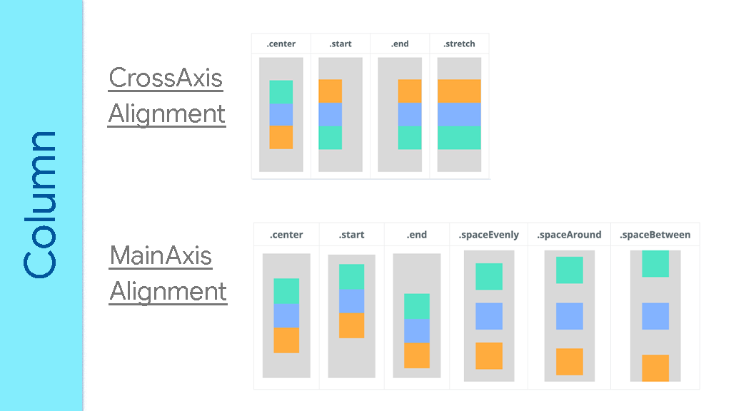 Adapted from https://arzerin.com/2019/11/20/flutter-column/
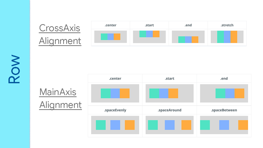 Adapted from https://arzerin.com/2019/11/20/flutter-row/
In Columns and Rows, if you want a particular child widget to take as much available space as possible, wrap that widget inside an [Expanded](https://api.flutter.dev/flutter/widgets/Expanded-class.html) widget. If you are familiar with web frontend, you'll notice that Columns and Rows are like [display: flex;](https://developer.mozilla.org/en-US/docs/Web/CSS/flex) in CSS.
b. Stack Widget
With Stack, the last widget(s) in the children's list appears on top of the earlier children.
You might have to edit the Stack's [alignment](https://api.flutter.dev/flutter/widgets/Stack/alignment.html) to indicate the relative positions of the widgets. Like [topCenter](https://api.flutter.dev/flutter/painting/AlignmentDirectional/topCenter-constant.html), [center](https://api.flutter.dev/flutter/painting/AlignmentDirectional/center-constant.html), [bottomEnd](https://api.flutter.dev/flutter/painting/AlignmentDirectional/bottomEnd-constant.html), and so on.
The Stack's size is calculated based on non-positioned widgets (Widgets in the children list not wrapped in a [Positioned](https://api.flutter.dev/flutter/widgets/Positioned-class.html) parent). When coding, remember that your Stack should either have at least one non-positioned widget, or it should be wrapped in a parent widget that explicitly sets the Stack's size.
Positioned takes any or all of [bottom](https://api.flutter.dev/flutter/widgets/Positioned/bottom.html), [top](https://api.flutter.dev/flutter/widgets/Positioned/top.html), [left](https://api.flutter.dev/flutter/widgets/Positioned/left.html), [right](https://api.flutter.dev/flutter/widgets/Positioned/right.html). They set the child's position relative to the Stack. Negative values move the child in the opposite direction. However, negative values clip parts of the child out. Use [clipBehavior: Clip.none](https://api.flutter.dev/flutter/widgets/Stack/clipBehavior.html) on the Stack to show all the parts of the positioned widget.
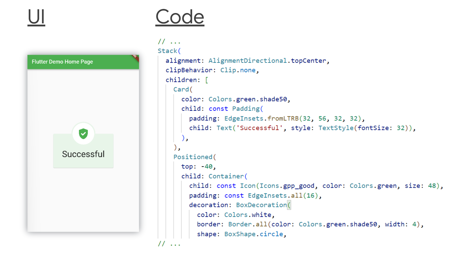 Full code here.
4. Create custom widgets
As you build the widget tree, you will notice two things:
- Either a chunk of the tree grows too big and it is a logical unit on its own.
- Or some chunks or sets of widgets might repeat themselves with slight changes.
These are two indications that you should refactor your code. It means that you should extract out those widgets and define them in another Dart file.
Your code editor will help you with refactoring. With or without the editor, all you need to do is:
- Create a new Dart file. The file name should reflect the new widget's name.
- Create a new class that extends StatefulWidget or StatelessWidget, depending on if the new widget has State or not.
- Then return the widget chunk from a
[build](https://api.flutter.dev/flutter/widgets/StatelessWidget/build.html)method. - (Optional) If need be, your new Dart class can take positional or named parameters to its constructor to customize the widget's look.
// in counter_display.dart
import 'package:flutter/material.dart';
class CounterDisplay extends StatelessWidget {
Widget build(BuildContext context) {
return Column(
mainAxisAlignment: MainAxisAlignment.center,
children: [
Text('You have pushed the button this many times:'),
Text('$counter', style: TextStyle(fontSize: 24)),
],
);
}
}
// in main.dart
//
// ...
body: Center(child: CounterDisplay()),
// ...
You will build many custom widgets and they in turn will be descendants to more custom widgets, and that's fine. The widget tree is meant to continuously grow as the need arises.
5. Add more customization
You won't customize widgets only because of refactoring and repetitions (DRY code). You will create custom widgets because of the UI you are implementing.
You will create custom widgets because the many available widgets don't always meet the exact needs of a given UI. You'll need to combine them in some special way to implement a particular UI.
a. Container Widget
[Container](https://api.flutter.dev/flutter/widgets/Container-class.html) is a powerful widget. You can style it in different ways. If you are used to web frontend, you'll notice that it is like a [div](https://developer.mozilla.org/en-US/docs/Web/HTML/Element/div) in HTML.
Container is a base widget. You can use it to create any UI piece.
Some Container parameters are [constraints](https://api.flutter.dev/flutter/widgets/Container/constraints.html), [decoration](https://api.flutter.dev/flutter/widgets/Container/decoration.html), [margin](https://api.flutter.dev/flutter/widgets/Container/margin.html), [padding](https://api.flutter.dev/flutter/widgets/Container/padding.html), [transform](https://api.flutter.dev/flutter/widgets/Container/transform.html), among others. Of course, Container takes a [child](https://api.flutter.dev/flutter/widgets/Container/child.html) which can be any widget.
The decoration property can take a [BoxDecoration](https://api.flutter.dev/flutter/painting/BoxDecoration-class.html), which in turn can take several other properties. This is the heart of Container's flexibility. BoxDecoration takes parameters like [border](https://api.flutter.dev/flutter/painting/BoxDecoration/border.html), [borderRadius](https://api.flutter.dev/flutter/painting/BoxDecoration/borderRadius.html), [boxShadow](https://api.flutter.dev/flutter/painting/BoxDecoration/boxShadow.html), [color](https://api.flutter.dev/flutter/painting/BoxDecoration/color.html), [gradient](https://api.flutter.dev/flutter/painting/BoxDecoration/gradient.html), [image](https://api.flutter.dev/flutter/painting/BoxDecoration/image.html), [shape](https://api.flutter.dev/flutter/painting/BoxDecoration/shape.html), among others.
With these parameters and their values, you can implement any UI to your taste. You can use Container instead of the many material widgets that Flutter comes with. That way your app is to your taste.
b. GestureDetector / InkWell
[GestureDetector](https://api.flutter.dev/flutter/widgets/GestureDetector-class.html) as the name implies detects user interactions. Not every UI piece is a button. And while implementing UIs you will need some widgets to react to user actions. In such a case, use GestureDetector.
GestureDetector can detect different types of gestures: taps, double taps, swipes, ... GestureDetector of course takes a [child](https://api.flutter.dev/flutter/widgets/GestureDetector/child.html) (which can be any widget), and different callbacks for different gestures like [onTap](https://api.flutter.dev/flutter/widgets/GestureDetector/onTap.html), [onDoubleTap](https://api.flutter.dev/flutter/widgets/GestureDetector/onDoubleTap.html), [onPanUpdate](https://api.flutter.dev/flutter/widgets/GestureDetector/onDoubleTap.html) (for swipes), ...
Note: By default, when users interact with the empty spaces in the child of GestureDetectors, the callbacks are not called. If you want your GestureDetector to react to gestures on empty space (within its child), then set the [behavior](https://api.flutter.dev/flutter/widgets/GestureDetector/behavior.html) property of the GestureDetector to [HitTestBehavior.translucent](https://api.flutter.dev/flutter/rendering/HitTestBehavior.html).
GestureDetector(
  // set behavior to detect taps on empty spaces
  behavior: HitTestBehavior.translucent,
  child: Column(
    children: [
      Text('I have space after me ...'),
      SizedBox(height: 32),
      Text('... that can detect taps.'),
    ],
  ),
  onTap: () => print('Tapped on empty space.'),
)
[InkWell](https://api.flutter.dev/flutter/material/InkWell-class.html) is similar to GestureDetector. It responds to some gestures that GestureDetector responds to. However, it shows ripple effects when interacted with (which GestureDetectors don't).
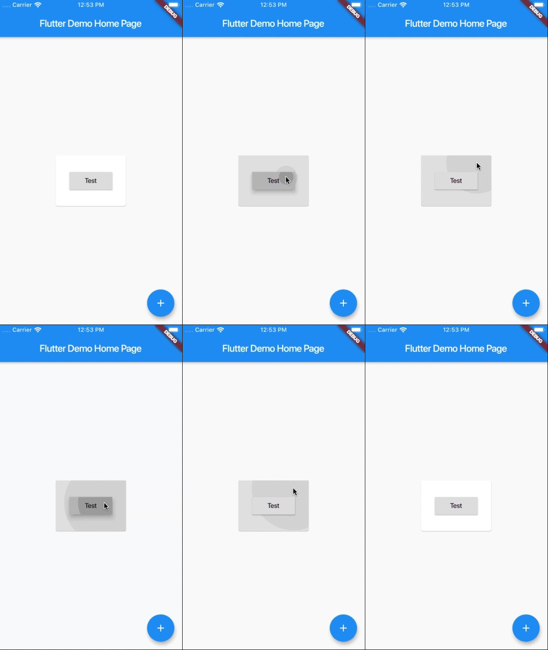 From https://stackoverflow.com/q/58285012/13644299
InkWell must have a [Material](https://api.flutter.dev/flutter/material/Material-class.html) ancestor. So, if your topmost widget is [MaterialApp](https://api.flutter.dev/flutter/material/MaterialApp-class.html) you need not worry. Else, wrap the InkWell in a Material.
You should also do this wrapping if you are changing the colors of the InkWell's parent or child. If you don't, the ripple won't show. You also have to set the [color](https://api.flutter.dev/flutter/material/Material/color.html) of the Material widget for the ripple to show. You can set the color to [Colors.transparent](https://api.flutter.dev/flutter/material/Colors/transparent-constant.html) and Flutter will take care of the rest.
How to Implement Scrolling Interfaces
Scrolling is a little delicate topic. By default, widgets don't scroll in Flutter. If your Column or Row will be scrollable, use a [ListView](https://api.flutter.dev/flutter/widgets/ListView-class.html) instead. ListView takes children parameter too.
ListView also has factory constructors like [ListView.builder](https://api.flutter.dev/flutter/widgets/ListView/ListView.builder.html) and [ListView.separated](https://api.flutter.dev/flutter/widgets/ListView/ListView.separated.html). The builder gives you more control over the build process of the children whereas the separated takes into account a Separator (like [Divider](https://api.flutter.dev/flutter/material/Divider-class.html) for example).
By default, ListViews scroll their children vertically. However, you can change the [scrollDirection](https://api.flutter.dev/flutter/widgets/ScrollView/scrollDirection.html) of a ListView to [Axis.horizontal](https://api.flutter.dev/flutter/painting/Axis.html) to scroll its children horizontally.
At times, you might want to use [SingleChildScrollView](https://api.flutter.dev/flutter/widgets/SingleChildScrollView-class.html) instead of ListView. As the name implies, it takes a single [child](https://api.flutter.dev/flutter/widgets/SingleChildScrollView/child.html) and it can scroll. You can pass widget groups as its child.
There are other scrolling widgets.
But take special note of [CustomScrollView](https://api.flutter.dev/flutter/widgets/CustomScrollView-class.html). It gives you huge control of scrolling, unlike the others. It takes [slivers](https://api.flutter.dev/flutter/widgets/CustomScrollView/slivers.html), which in turn are scrolling widgets with powerful scroll mechanisms.
[SliverFillRemaining](https://api.flutter.dev/flutter/widgets/SliverFillRemaining-class.html), [SliverFillViewport](https://api.flutter.dev/flutter/widgets/SliverFillViewport-class.html), [SliverGrid](https://api.flutter.dev/flutter/widgets/SliverGrid-class.html), [SliverList](https://api.flutter.dev/flutter/widgets/SliverList-class.html), [SliverPersistentHeader](https://api.flutter.dev/flutter/widgets/SliverPersistentHeader-class.html) among others, are examples of widgets you include in the list of slivers. Most of these widgets take a delegate, which handles how scrolling occurs.
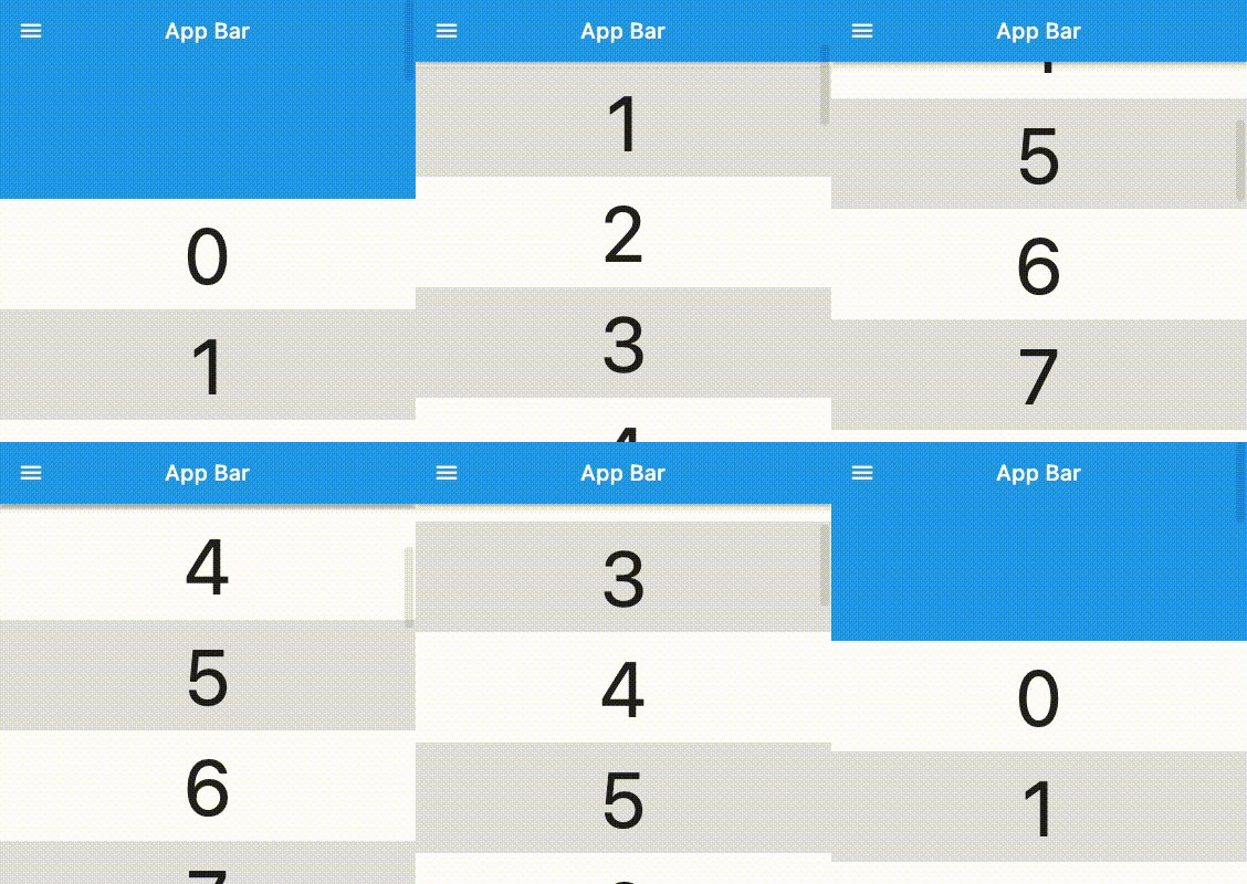
A good case to use CustomScrollView is with [SliverAppBar](https://api.flutter.dev/flutter/material/SliverAppBar-class.html), where you want the AppBar to be expanded by default and shrunk on scroll.
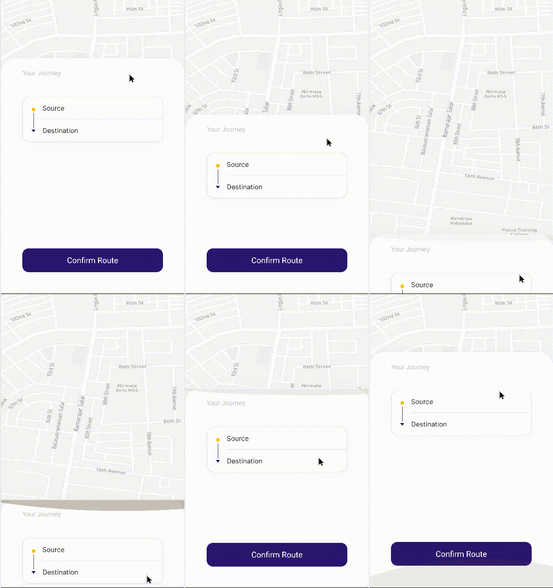
Another example could be with a [DraggableScrollableSheet](https://api.flutter.dev/flutter/widgets/DraggableScrollableSheet-class.html) where you keep some action button sticked to the bottom.
About CustomPaint
This is where Flutter gave ultimate flexibility to the UI world.
[CustomPaint](https://api.flutter.dev/flutter/widgets/CustomPaint-class.html) is to Flutter what the _Canvas API_ is to HTML or SVG is to images.
CustomPaint is a widget in Flutter that gives you the ability to design and draw without limitations. It gives you a canvas on which you can draw with a [painter](https://api.flutter.dev/flutter/widgets/CustomPaint/painter.html).
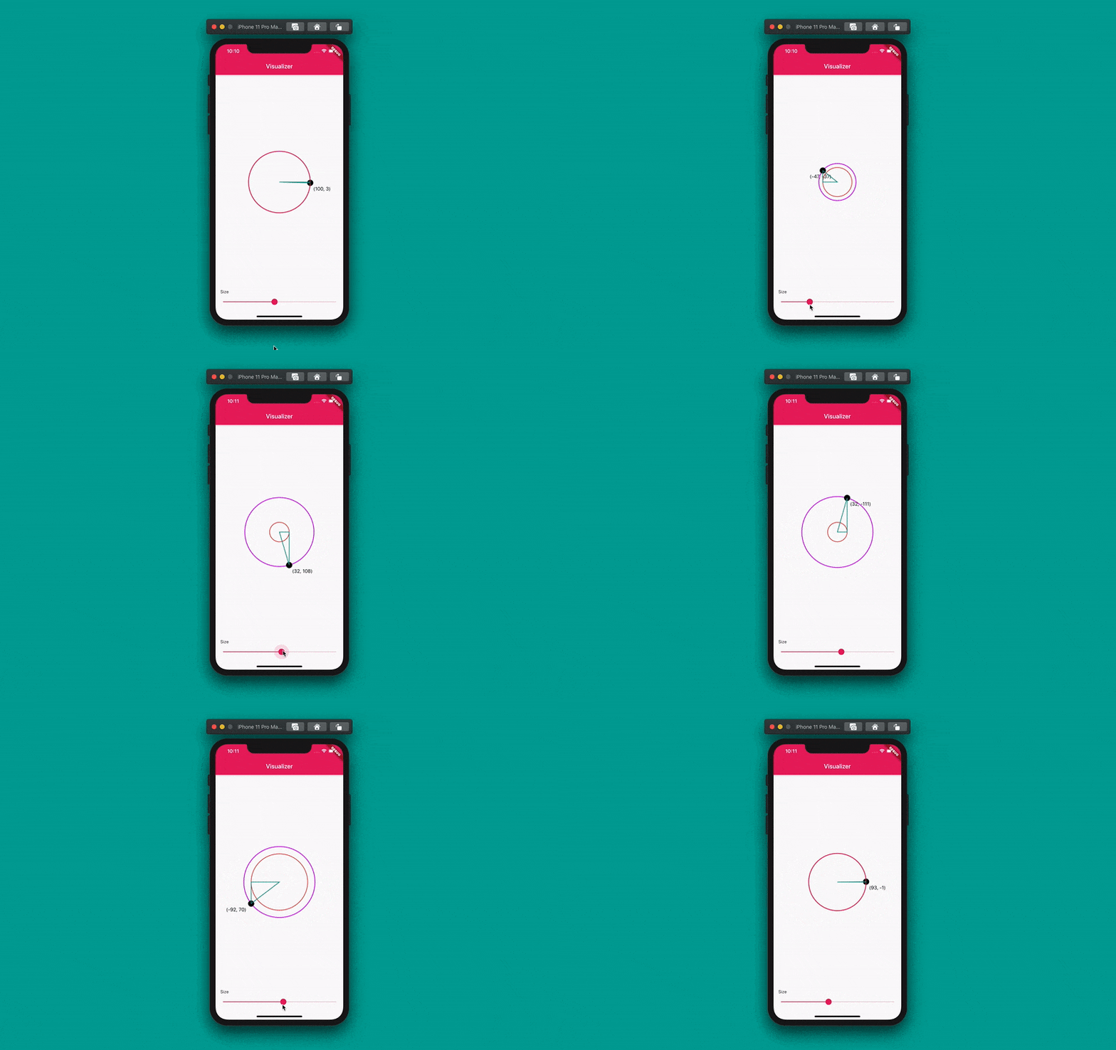 From https://blog.codemagic.io/flutter-custom-painter/
You will rarely use CustomPaint. But be aware that it exists. Because there might be very complex UIs that widget combinations might not implement them and you will have no choice than drawing with CustomPaint.
When that time comes, it won't be hard for you because you are already familiar with other widgets.
Summary
For a given UI piece, choose a widget, write its code, build the widget with other widgets, and see what great UI you are implementing with Flutter.
Implementing UIs is a major part of mobile, web, and desktop app development. Flutter is a UI toolkit that build cross-platform for those platforms. Flutter's declarative nature and its widget abundance make UI implementation simple.
Keep implementing UIs in Flutter. As you do, it will become second nature to you. And you will be able to implement any UI in Flutter.


