
- 전체
- HTML
- Web Design (웹디자인)
- XE 응용 개발
- wordpress plugin dev
- Javascript & JavaScript Application
- MEAN Stack : full stack javascript
- angular js & ionic framework
- bootstrap
- WebGL, Three.js and Babylon.js
- restful api design
- mobile web
- node.js 응용
- Cloud Service 응용
- 웹 어셈블리 개발 [WASM, WebAssembly]
- 마이크로서비스, MSA (microservice architecture)
- WebGL / WebGPU
- next.js 개발
- micro frontend (마이크로프론트앤드)
- 전자상거래/쇼핑몰
- 서버 클라우드 (aws, azure, google)
Web Design (웹디자인) CSS :: 버튼(Button) 예쁘게 꾸미기, 여러개의 버튼 그룹화 하기
2020.08.26 14:41
CSS :: 버튼(Button) 예쁘게 꾸미기, 여러개의 버튼 그룹화 하기
CSS 버튼 예쁘게 만들기
WEB 개발을 하다보면 버튼은 자주 사용하게 됩니다. 이건 제가 자주 사용하는 방법인데, 버튼을 좀 더 예쁘게(?) 표현할때 많이 사용합니다. 결과물부터 확인해보면 아래 사진과 같습니다.
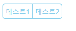
기본 상태일때...
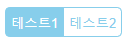
마우스를 올렸을때...
지금부터 어떻게 만드는지 알아보도록 하겠습니다.
버튼 생성
<html>
<head>
<title>Button Test</title>
</head>
<body>
<div id="btn_group">
<button id="test_btn1">테스트1</button>
<button id="test_btn2">테스트2</button>
</div>
</body>
</html>
일단 2개의 버튼을 만듭니다.
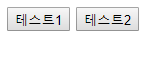
이제 스타일을 입혀봅시다.
버튼 사이 간격 없애기
일단 2개의 버튼사이에 간격이 보이는데 이쁘지 않기 때문에, margin을 이용해서 없애보도록 하겠습니다.
왼쪽 버튼은 오른쪽 마진값(margin-rihgt)을 음수를 넣어줍니다. 반대로 오른쪽 버튼의 경우는 왼쪽 마진값(left-margin)에 음수를 넣어줍니다. 값은 적당히 잘 넣어주세요... 이뻐보이게!
<html>
<head>
<title>Button Test</title>
<style>
#test_btn1{
margin-right:-4px;
}
#test_btn2{
margin-left:-3px;
}
</style>
</head>
<body>
<div id="btn_group">
<button id="test_btn1">테스트1</button>
<button id="test_btn2">테스트2</button>
</div>
</body>
</html>
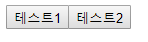
버튼 사이의 간격이 사라졌습니다. 그 다음은 칙칙한 회색에 각져있는 버튼의 스타일을 변경해보도록 합시다.
버튼 배경색상과 글씨 색상 바꾸기
<html>
<head>
<title>Button Test</title>
<style>
#test_btn1{
margin-right:-4px;
}
#test_btn2{
margin-left:-3px;
}
#btn_group button{
border: 1px solid skyblue;
background-color: rgba(0,0,0,0);
color: skyblue;
padding: 5px;
}
</style>
</head>
<body>
<div id="btn_group">
<button id="test_btn1">테스트1</button>
<button id="test_btn2">테스트2</button>
</div>
</body>
</html>
글씨 색상은 마음에 드는 색상으로 하시면 됩니다. 저는 예제로 만드는거라 skyblue 색상으로 하겠습니다.
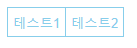
조금씩 버튼이 예뻐지고 있습니다. 이렇게 끝내기는 아쉽기 때문에, 버튼 모서리를 둥글게 표현하도록 해봅시다.
모서리 둥글게 만들기
<html>
<head>
    <title>Button Test</title>
    <style>
        #test_btn1{
            border-top-left-radius: 5px;
            border-bottom-left-radius: 5px;
            margin-right:-4px;
        }
        #test_btn2{
            border-top-right-radius: 5px;
            border-bottom-right-radius: 5px;
            margin-left:-3px;
        }
        #btn_group button{
            border: 1px solid skyblue;
            background-color: rgba(0,0,0,0);
            color: skyblue;
            padding: 5px;
        }
    </style>
</head>
<body>
    <div id="btn_group">
        <button id="test_btn1">테스트1</button>
        <button id="test_btn2">테스트2</button>
    </div>
</body>
</html>
border-radius 속성을 이용합니다. 이 속성을 이용하면, 모서리를 둥글게 만들 수 있습니다. 하지만, 저는 왼쪽버튼은 왼쪽 모서리만, 오른쪽 버튼은 오른쪽 모서리만 둥글게 하고 싶기 때문에 border-top-left-radius, border-bottom-left-radius, border-top-right-radius, border-bottom-right-radius를 이용합니다.
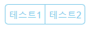


이제 거의다 왔습니다. 마지막으로 버튼의 생명을 넣어주기 위해 hover 속성을 넣어줍니다.
hover 넣어주기
<html>
<head>
    <title>Button Test</title>
    <style>
        #test_btn1{
            border-top-left-radius: 5px;
            border-bottom-left-radius: 5px;
            margin-right:-4px;
        }
        #test_btn2{
            border-top-right-radius: 5px;
            border-bottom-right-radius: 5px;
            margin-left:-3px;
        }
        #btn_group button{
            border: 1px solid skyblue;
            background-color: rgba(0,0,0,0);
            color: skyblue;
            padding: 5px;
        }
        #btn_group button:hover{
            color:white;
            background-color: skyblue;
        }
    </style>
</head>
<body>
    <div id="btn_group">
        <button id="test_btn1">테스트1</button>
        <button id="test_btn2">테스트2</button>
    </div>
</body>
</html>
겉모습은 같을테지만, 마우스를 올리면 배경색이 채워지고 글씨는 하얗게 변하는 것을 확인 할 수 있습니다.
아래에 본글에서 사용한 css 속성을 정리했습니다.
사용한 속성
버튼 테두리 둥글게 만들기 위한 속성
border-top-left-radius
border-bottom-left-radius
border-top-right-radius
border-bottom-right-radius
테두리 스타일을 입히기 위한 속성
border
버튼 배경색상을 입히기 위한 속성
background-color
버튼 글씨 색상을 입히기 위한 속성
color
간격을 조절하기 위한 속성
padding
margin-left
margin-right
출처: https://hongku.tistory.com/300 [IT에 취.하.개.]
광고 클릭에서 발생하는 수익금은 모두 웹사이트 서버의 유지 및 관리, 그리고 기술 콘텐츠 향상을 위해 쓰여집니다.
댓글 0
| 번호 | 제목 | 글쓴이 | 날짜 | 조회 수 |
|---|---|---|---|---|
| 1 |
[MSA] 마이크로서비스 디자인 패턴
 | 졸리운_곰 | 2021.02.21 | 460 |