AGPL-3.0 가이드
Free Software Foundation은 2007년 AGPL-3.0을 공개하였다. AGPL-3.0은 GPL-3.0에 네트워크로 상호 작용하는 소프트웨어의 소스 코드도 공개해야 한다는 조항을 추가한 라이선스이다.
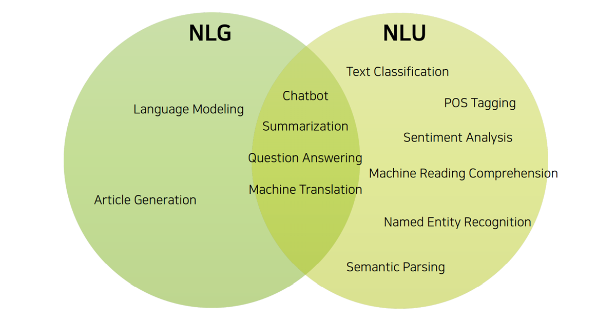
우리가 일상적으로 사용하는 언어(자연어)는 컴퓨터가 바로 이해할 수 없습니다. 그렇기에 이를 컴퓨터가 이해할 수 있는 방식으로 다시 처리하는 과정이 필요합니다. 이를 ‘자연어 처리’ 기술이라고 하죠. 자연어 처리(Natural Language Processing)는 사람이 이해하는 자연어를 컴퓨터가 이해할 수 있는 값으로 변환하는 과정입니다. 나아가 컴퓨터가 이해하는 값을 사람이 이해할 수 있도록 다시 바꾸는 과정까지도 포함합니다.
– 자연어 이해(NLU, Natural Language Understanding)
– 자연어 생성(NLG, Natural Language Generation)
자연어 처리는 왜 이렇게 어려울까?
하지만 인간의 언어를 컴퓨터에게 전달하고, 컴퓨터의 언어를 인간이 이해할 수 있게 바꾸는 이 과정은 여간 쉬운 일이 아닙니다. 이는 언어 자체가 갖고 있는 여러 특징 때문인데요. 예시 문장을 보면서 그 이유를 알아봅시다.
1. 모호성(Ambiguity)
1) 표현의 중의성
차를 마시러 공원에 가는 차 안에서 나는 그녀에게 차였다.
위 문장을 영어 번역기에 입력했을 때, 우리가 이해한 것을 정확하게 구현하는 영어 문장을 과연 확인할 수 있을까요? 인간의 언어에는 ‘차’와 같이, 소리와 모양은 동일하지만 맥락에 따라 의미가 달라지는 단어들이 있습니다. 우리는 이 문장을 보고 직관적으로 맥락을 파악해내지만, 컴퓨터는 그렇게 할 수 없죠.

2) 문장 내 정보 부족
나는 철수를 안 때렸다.
위 문장은 여러 가지 의미로 해석될 수 있습니다. 언어는 효율성 극대화를 위해 커뮤니케이션 과정에서 많은 정보가 생략되기도 합니다. 하지만 컴퓨터는 자연어를 인간처럼 이해하는데 한계가 있기 때문에, 정보의 생략이 많을수록 자연어 처리는 굉장히 어려워집니다.

2. 같은 정보를 다르게 표현하기(Paraphrase)

[문장 1] 여자가 김치를 어떤 남자에게 집어 던지고 있다.

[문장 2] 여자가 어떤 남자에게 김치로 때리고 있다.

[문장 3] 여자가 김치로 싸대기를 날리고 있다.

[문장 4] 여자가 배추 김치 한 포기로 남자를 때리고 있다.
위의 이미지를 여러 문장으로 표현해보았습니다. 모두 다른 문장이지만, 하나의 이미지를 묘사하고 있죠. 이처럼 문장의 표현방식이 다양하고 비슷한 의미의 단어들이 존재하기 때문에 자연어 처리는 까다롭습니다.
언어는 생명체와 같아서 효율성을 극대화하기 위한 방향으로 계속해서 진화합니다. 그 과정에서 최대한 짧은 문장에 많은 정보를 담고, 굳이 언급할 필요 없는 정보는 생략하죠. 단, 생략된 맥락을 기계는 인간만큼 단번에 이해할 수 없다는 것이 자연어 처리가 어려운 이유입니다.
자연어 처리에 딥러닝을 접목하는 이유는?
그렇다면 자연어 처리에 딥러닝 기술을 접목하는 이유는 무엇일까요? 기존의 전통적인 자연어 처리 방식은 언어가 가진 모호성이나 중의성 등의 문제를 해결하기 어려웠습니다.
예를 들어, <빨강>, <분홍>, <파랑>이라는 3개의 단어를 컴퓨터에게 입력한다고 해볼까요? 전통적인 자연어 처리 과정에서는 <빨강>과 <분홍>, <파랑>이 각각 동일하게 다른 의미를 지닌 정보로 취급됩니다. 그러나 사람인 우리는 <빨강>과 <분홍>이 어떤 포함 관계에 속하는 유사성을 지닌 단어임을 직관적으로 이해하죠.

딥러닝을 기반으로 하는 자연어 처리에서는 <빨강>과 <분홍>을 <파랑>과 비교하여 더 가깝고 유사한 관계에 있는 정보라 처리합니다. 다시 말해서, 컴퓨터가 언어에서 연속적인 가치(Continuous Value)를 발견하고 언어를 처리할 수 있게 됩니다. 기존의 자연어 처리 방식이 지녔던 단점을 한층 보완하고, 보다 인간이 이해하는 방식과 유사하게 처리할 수 있습니다.
왜 ‘한국어’ 자연어 처리는 유독 어렵게 느껴질까?
복잡하고 까다로운 자연어 처리, 그런데 ‘한국어’ 를 처리하는 과정은 유독 어렵다고 느껴집니다. 실제로도 쉬운 작업이 절대 아니고요. 이는 각 나라별 언어가 가지고 있는 특징이 다르기 때문인데요. 한국어는 어간에 접사가 붙어 의미와 문법적 기능이 변화하는 ‘교착어’에 속합니다. 교착어만의 특징을 한 번 알아볼까요?
1) 접사 추가에 따른 의미 발생
예를 들어보겠습니다. 한국어로 ‘사과’라는 단어와 접사를 붙여 문장을 만들어 보세요. ‘사과(어간)’ + ‘를(접사)’일 때는 ‘사과’가 목적어가 되지만, ‘사과(어간)’ + ‘가(접사)’일 때는 ‘사과’가 주어가 되어 같은 언어도 문법적 기능이 달라지는 걸 볼 수 있죠. 이는 교착어인 한국어의 대표적인 특징입니다.
2) 유연한 단어 순서
나는 밥을 먹으러 간다.

밥을 먹으러 나는 간다.

나는 간다, 밥을 먹으러.
한국어는 단어의 순서를 바꾸어도 전체 맥락을 이해하는데 전혀 문제가 없습니다. 몇 가지 경우를 제외하면, 어순이 바뀌어도 문법적인 오류가 없는 올바른 문장이라 볼 수 있습니다. 이러한 언어적 특징은 인간에게는 편리하지만, 컴퓨터에게는 매우 어렵습니다. 어순이 제각각이지만 의미는 동일한 이 문장들을 동일한 정보로 처리하는 것이 쉽지 않기 때문입니다. 한국어의 자연어 처리가 유독 더 어려운 이유입니다.
3) 모호한 띄어쓰기 규칙
근대 이전까지 동양의 언어에는 ‘띄어쓰기’ 개념이 존재하지 않았습니다. 서양문화권에서는 중세부터 띄어쓰기가 확립된 것과 비교해보면 늦은 편이죠. 한국어는 맞춤법 상 띄어쓰기 규칙이 정해져 있기는 하나, 띄어쓰기를 지키지 않아도 문장의 맥락을 이해하는데 큰 무리가 없는 언어입니다. 문제는 사람들이 띄어쓰기를 지키지 않고 뭉텅이로 작성한 텍스트를 컴퓨터가 정확하게 인식하는 것이 매우 어렵다는 점이죠.
4) 평서문과 의문문의 차이 없음, 주어 부재
점심 먹었어. (I had lunch.)

점심 먹었어? (Did you have lunch?)
어순의 변화 없이, 주어가 생략되어도 한국어는 이해하는데 큰 문제가 없습니다. 하지만 똑같은 의미의 문장을 영어에서 한국어로 컴퓨터가 번역하는 것과, 한국어에서 영어로 변환하는 데에는 큰 차이가 있습니다. 동일한 문장에 마침표 대신 물음표를 붙이고, 주어에 대한 정보를 생략하더라도 한국어에서는 문장이 완성됩니다. 따라서, 컴퓨터가 숨겨진 맥락이나 의미를 파악하는데 더 까다로울 수밖에 없습니다.
[출처] https://fastcampus.co.kr/story_article_nlp

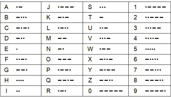
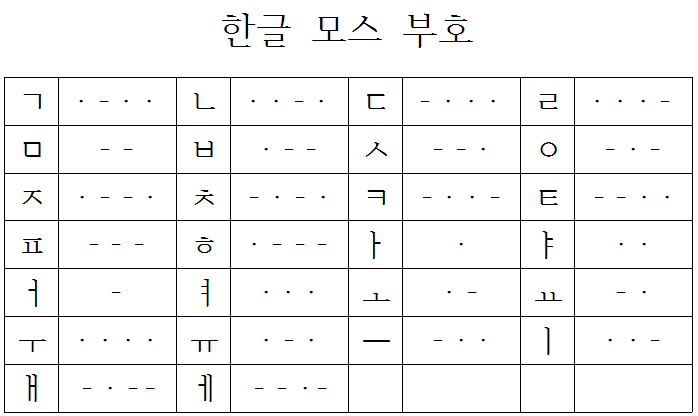
· · – · · – – · · · · – · – · · · · · · – – · · – · · – – – · · – – – · – · · · · · · – – · – – · · · · · · – · – · – · · – · – · · · · – · · · – · · · · · · – · – – · · – · · · – · · · · · – · – · · · · – · · – – · · · – – – · · · – · – · · – · – – · · · · – · · – · · – – · · · ·
나무위키, 여러분이 가꾸어 나가는 지식의 나무[2]
– · – · – – · – – · · – · – · – – · – – · · · · · – – – · · · · · · – – – · · · – · – · – – · – – · ·
– · – · – – · – – · · – · · · – – – – · – · – – · – – · – – – · · · · · – · · – – – – ·
· · · · – · – – – – · – · – · – · · · · – – · · · · – · · · · · · – – – – – · – · – · – · – – – – · · · · – · – –
CQD CQD SOS SOS CQD CQD DE MGY POSITION 41.46N 50.14W
타이타닉의 구조요청 신호


마이SQL은 세계에서 가장 광범위하게 사용되는 오픈소스 데이터베이스이며, 전체 데이터베이스의 인기 순위에서는 (근소한 차이로) 2위에 올라 있다. 마이SQL은 효과적인 관계형 데이터베이스 관리 시스템으로 오랫동안 인기 있는 애플리케이션의 중심에 위치해왔다. 그러나 사용하기가 까다로울 수 있고 성능을 개선할 수 있는 여지도 많다. 지난 몇 년 동안 몇 가지 중요한 개발도 이뤄졌다. 여기서는 바론 슈와르츠가 쓴 마이SQL 성능 튜닝 팁의 업데이트 내용을 다룬다.
스키마 설계는 데이터베이스에 해야 하는 매우 중요한 일 중 하나다. 교차 관계형 데이터베이스 기술 원칙은 1970년대에 표준형이 나왔다. 마이SQL은 버전 5.6에서 기본 스토리지 엔진을 이노DB(InnoDB)로 전환했으므로 스키마 설계는 더욱 중요해졌다.
이유가 무엇일까? 이노DB에서는 모든 것이 기본 키(primary key)다. 이는 이노DB가 데이터를 정리하는 방식과 관련된다. 이노DB에서 기본 키는 군집화되고 모든 보조 키(secondary key)는 기본 키에 엔트리 포인터를 추가한다. 스키마 설계에서 이 부분을 감안하지 않으면 성능 측면에서 불이익을 받게 된다. 데이터는 B-트리 인덱스를 사용해서 저장되므로 데이터를 순서가 정해진 방식으로(즉, 유사 순차 값) 삽입하면 기본 키의 단편화가 방지되고 따라서 리프 노드를 찾는 데 필요한 I/O 작업이 감소한다.
순차 기본 키가 맞지 않는 경우도 있다. 대표적인 예가 범용 고유 식별자(Universally Unique IDentifier), 줄여서 UUID다. UUID와 기본 키에 대한 더 심층적인 내용은 여기서 볼 수 있다. 대부분 경우에는 순차 기본 키를 사용하는 것이 좋다.
보조 키는 백그라운드 프로세스에 의해 업데이트되며 성능 영향은 흔히 생각하는 것만큼 크지 않다. 대신 보조 키를 추가하면 스토리지 요구사항이 증가하므로 디스크 사용량 측면의 문제가 있다. 인덱스가 없는 필드에 대한 필터링은 쿼리가 실행될 때마다 전체 테이블 스캔을 유발할 수 있다. 물론 이 경우 막대한 성능 영향이 발생한다. 따라서 보조 키는 없는 것보다는 있는 편이 낫다.
단, 데이터베이스의 과도한 인덱싱은 피해야 한다. 많은 인덱스를 실행해도 원하는 성능 개선을 얻지 못할 수 있기 때문이다. 또한 부가적인 인덱스는 스토리지 비용을 높일 수 있고, 이노DB가 인덱스를 최신 상태로 유지하기 위해 많은 백그라운드 작업을 해야 한다.
이노DB는 인덱스에서 바로 행을 찾아서 제공할 수 있는 반면 보조 키는 기본 키를 가리키고 기본 키에는 행 자체가 포함돼 있다. 또한 이노DB 버퍼 풀이 충분히 크다면 대부분의 데이터를 메모리에 유지할 수 있다. 또한 쿼리에서 개별적인 열별 키보다 대체로 더 효과적인 복합 키를 사용할 수도 있다. 마이SQL은 테이블 액세스당 하나의 인덱스를 사용할 수 있으므로 WHERE x=1 and y=2와 같은 절로 쿼리를 실행하는 경우 x, y에 대한 인덱스를 두는 것이 전체 열에 대한 개별 인덱스를 두는 것보다 낫다.
또한 x, y에 대한 복합 인덱스는 다음 쿼리의 성능도 개선할 수 있다.
마이SQL은 커버링 인덱스를 사용하고 이 인덱스에서 메모리에 있는 y를 제공한다. 실무에서 복합 인덱스를 사용할 기회가 있으면 사용해 성능을 개선할 수 있다. 인덱스를 설계할 때는 이 인덱스가 읽히는 방식, 즉 항상 왼쪽에서 오른쪽 방향으로 읽힌다는 점을 염두에 둬야 한다. 다음 쿼리를 보자.
여기서 a, b에 대한 인덱스는 쿼리에 도움이 될 것이다. 그러나 다음과 같은 형식을 보자.
인덱스는 쓸모가 없고 전체 테이블 스캔을 유발한다. 항상 왼쪽부터 인덱스를 읽는다는 개념은 일부 다른 사례에도 적용된다. 예를 들어 다음 쿼리를 보자.
여기에는 열 b에 의한 WHERE 절 필터링이 없으므로 a, b, c에 대한 인덱스는 첫 번째 열만 읽게 된다. 따라서 이 경우 마이SQL은 인덱스를 부분적으로 읽을 수 있고, 이게 전체 테이블 스캔보다는 낫지만 최선의 쿼리 성능을 얻는 측면에서는 여전히 부족하다.
쿼리 설계와 관련된 또 다른 요소는 마이SQL에서 사용되는 일반적인 최적화인 왼쪽 끝 인덱스 접근이다. 예를 들어 a, b, c의 인덱스는 select a,c where c=x와 같은 쿼리에서는 작용하지 않는다. 이 쿼리는 인덱스의 첫 번째 부분, 즉 a, b를 건너뛸 수 없기 때문이다. select c,count(c) where a=x group by c와 같은 쿼리도 마찬가지다. b의 인덱스를 건너뛸 수 없으므로 group by에 대해 a, b, c의 인덱스를 사용할 수 없다. 그러나 select c,count(c) where a=x and b=y group by c와 같은 쿼리가 있고 이 쿼리가 a, b에 대해 필터링을 하고 c에 대해 group by를 수행한다면 a, b, c의 인덱스 하나가 필터링과 group by에 모두 도움이 될 수 있다.
원문보기:
https://www.itworld.co.kr/tags/196293/mysql/266739#csidxb0f62748424836c8db741e9db5d0e33 
[보안뉴스 김영명 기자] 현재 전 세계에서 가장 많이 사용되는 비밀번호는 ‘password’로 조사됐다. 그동안 비밀번호로 꾸준히 많은 사랑을 받았던 ‘123456’은 2위로 한 계단 하락했다. 한국의 자동차 브랜드인 기아(KIA)의 단어 ‘KIA’는 자동차 부문에서 세계에서 두 번째로 인기 있는 비밀번호였다.

[이미지 = utoimage]
파나마의 유료 개인용 가상사설망 서비스인 노드VPN(NordVPN)이 제공하는 비밀번호 관리자 서비스인 노드패스(NordPass)는 ‘가장 일반적인 비밀번호에 관한 연례 연구 결과’ 발표를 통해 올해 가장 일반적으로 사용되는 200개의 비밀번호를 공개했다. 올해의 연구는 전 세계의 비밀번호 생성 추세를 살펴보고, 성별 및 30개 조사 대상 국가 간의 비밀번호 사용이 어떻게 다른지 조사했다. NordPass는 또한 처음으로 대중문화 트렌드가 우리의 비밀번호 선택에 어떤 영향을 미치는지 분석했다.
전 세계적으로 가장 일반적인 20개의 비밀번호는 ①password ②123456 ③123456789 ④guest ⑤qwerty ⑥12345678 ⑦111111 ⑧12345 ⑨col123456 ⑩123123 ⑪1234567 ⑫1234 ⑬1234567890 ⑭000000 ⑮555555 ⑯666666 ⑰123321 ⑱654321 ⑲7777777 ⑳123 등이다.
한편, NordPass가 발표한 <2019~2021년 가장 많이 사용된 비밀번호 톱 200(Top 200 most common passwords of the year 2019~2021)>에 따르면, ‘samsung’은 2019년 198위, 2020년 189위, 2021년 78위로 꾸준히 상승했다.
노드패스는 무책임한 비밀번호 관리의 결과에 대한 사이버 보안 전문가들의 지속적인 경고에도 불구하고, 올해의 가장 흔한 비밀번호 200개 중 73%가 2021년 데이터와 똑같은 것으로 나타났다고 밝혔다.
‘password’는 전 세계에서 사랑받는 password
비밀번호로 사용되는 ‘password’는 세계에서 490만번 이상 사용될 정도로 가장 사랑받는 비밀번호를 위한 단어이지만, ‘password1’ ‘passw123’ ‘passw0rd’와 같은 변형도 상위권을 차지했다. 예를 들어, 이탈리아에서는 ‘password99’가, 포르투갈 인터넷 사용자들은 ‘fucking password 1234’라는 단어가 자주 발견됐다.
비밀번호 생성 요구에 대한 짜증이나 반감을 반영하는 비밀번호는 올해 인터넷 사용자들의 비밀번호 단어 선택에도 발견되고 있다. 특히 캐나다, 호주, 미국에서는 ‘fuckyou’, ‘fuckoff’, ‘fuckyou1’ 등의 욕설을 담은 비밀번호가 두드러졌다.
사랑에 관련된 단어 또한 널리 사용되고 있다. ‘사랑합니다’를 의미하는 ‘iloveyou’를 포함해 사랑합니다의 스페인어인 ‘teamo’, 독일어인 ‘ichliebedich’ 등은 ‘sunshine’, ‘princess’, ‘love’와 함께 매우 일반적으로 사용되는 비밀번호다.
숫자, 문자 및 기호의 쉬운 키보드 조합을 활용해 생성한 비밀번호도 인기가 있었다. 비밀번호 ‘123456’은 브라질, 콜롬비아, 프랑스, 일본 등에서 흔하게 사용되며, ‘123456789’는 덴마크에서 가장 인기가 있다. 이밖에도 ‘abc123’, ‘qwerty’, ‘1q2w3e’, ‘a1b2c3’ 및 유사한 변형이 대부분의 조사 대상 국가에서 공통으로 발견됐다.
계정을 보호하기 비밀번호에 특정 인물의 이름을 사용하는 패턴도 꾸준히 보이고 있다. 올해 들어 세계에서 비밀번호 생성에 가장 많이 사용된 사람들의 이름은 △다니엘(Daniel) △토마스(Thomas) △조던(Jordan) △마이클(Michael) △마리나(Marina) △제시카(Jessica)였다. 사람들은 비밀번호를 만들 때 동물이나 신화 속 생물의 이름인 ‘원숭이(monkey)’ 또는 ‘용(dragon)’ 등의 단어를 사용하기도 했다.

▲‘2019~2021년 가장 많이 사용된 비밀번호 톱 200’ 중 1~10위[자료=노드패스]
우리의 비밀번호 습관에 영향을 미치는 대중문화
노드패스는 올해 비밀번호 연구에서 근래의 사건과 라이프스타일 트렌드가 우리의 비밀번호에 영감을 주는 방법을 분석했다. NordPass는 세계적으로 사랑받는 영화, 스포츠, 음식, 자동차, 비디오 게임, 예술가, 패션 브랜드, 그리고 심지어 욕설 중 어떤 것이 비밀번호에 가장 많이 반영되는지 보여준다.
자동차 브랜드 카테고리에서는 한국의 자동차 브랜드인 ‘기아(KIA)’가 810만번 이상이나 사용돼 사람들의 비밀번호 작명에 두 번째로 큰 영감을 준 것으로 밝혀졌다. 이밖에도 △u2 △프린스(prince) △핑크(pink)는 연예인 카테고리에서 가장 흔한 비밀번호였고, △티파니(tiffany) △알도(aldo) △갭(gap) 등은 패션 브랜드 목록에서 1위를 차지했다.
사이버 보안 사고로 공개된 비밀번호 데이터는 줄어들어
이에바 쇼블리케이트(Ieva Shoblickait) NordPass 생산 부문 최고경영자(CPO)에 따르면 올해 분석에 공개적으로 사용할 수 있는 비밀번호 샘플은 예년에 비해 훨씬 적었다고 말했다. 쇼블리케이트는 이러한 추세는 놀라운 일이 아니며 빠르게 발전하는 기술로 인해 비밀번호를 해독하기가 점점 더 어려워지고 있다고 말했다. 점점 더 많은 웹사이트가 Open Authentication 2.0(OAuth 2.0)을 사용하고 있다. OAuth 2.0은 웹사이트나 애플리케이션이 사용자 대신 다른 웹 앱에서 호스팅하는 리소스에 액세스하도록 설계된 업계 표준 기술이다.
쇼블리케이트는 개발자들이 점점 더 뛰어난 비밀번호 숨기기 기술을 소개하고 있으며, 이 같은 조치로 인터넷 사용자들의 비밀번호 구성 문자의 해독에 시간이 더 오래 걸린다고 밝혔다. 쇼블리케이트 CPO는 “다중 요소 인증(MFA)이 빠르게 확산하면서 비밀번호는 그 자체로서의 중요성을 점차 상실하고 있다”며 “비밀번호를 해킹하더라도 사용자가 MFA 기능을 활성화해두면 해커가 사용자의 본인 인증을 완료할 수 없다”고 말했다.
안전한 비밀번호 보안의 첫 단계, ‘내가 보유한 계정 파악하기’
노드패스는 안전한 비밀번호를 위한 세 가지 팁을 함께 소개했다. 첫 번째는 ‘내가 보유한 모든 계정 파악하기’다. 전문가들은 사용하지 않는 계정은 삭제하고 활성 계정의 정확한 수를 파악할 것을 권장한다. 이를 통해 비밀번호 관리에 공백이 발생하는 것을 방지할 수 있다.
두 번째는 ‘길고 고유한 비밀번호를 만들되 재사용하지 않기’다. 숫자, 대문자, 소문자 및 기호의 복잡한 조합은 가장 강력한 비밀번호를 만드는 방법이다. 하지만 강한 비밀번호라도 여러 곳에 사용하면 해킹 시 연계 피해가 있을 수 있어 비밀번호 재사용은 피하는 것이 좋다.
세 번째는 ‘비밀번호 관리자 사용하기’다. 이러한 솔루션은 디지털 볼트에 저장된 비밀번호를 완전히 암호화하고 안전한 공유를 허용한다. 대부분의 사이버 보안 사고는 타인이 비밀번호를 액세스할 수 있도록 공개적으로 두거나 엑셀 또는 암호화되지 않은 다른 응용 프로그램에 비밀번호를 저장하는 등 단순한 사용자 부주의로 인해 발생한다.
[김영명 기자(boan@boannews.com)]
[출처] https://www.boannews.com/media/view.asp?idx=111995&direct=mobile#
Scikit-learn is a free machine learning library for Python. It features various algorithms like support vector machine, random forests, and k-neighbours, and it also supports Python numerical and scientific libraries like NumPy and SciPy.
In this tutorial we will learn to code python and apply Machine Learning with the help of the scikit-learn library, which was created to make doing machine learning in Python easier and more robust.
To do this, we’ll be using the Sales_Win_Loss data set from IBM’s Watson repository. We will import the data set using pandas, explore the data using pandas methods like head(), tail(), dtypes(), and then try our hand at using plotting techniques from Seaborn to visualize our data.
Then we’ll dive into scikit-learn and use preprocessing.LabelEncoder() in scikit-learn to process the data, and train_test_split() to split the data set into test and train samples. We will also use a cheat sheet to help us decide which algorithms to use for the data set. Finally we will use three different algorithms (Naive-Bayes, LinearSVC, K-Neighbors Classifier) to make predictions and compare their performance using methods like accuracy_score() provided by the scikit-learn library. We will also visualize the performance score of different models using scikit-learn and Yellowbrick visualization.
To get the most out of this post, you should probably already be comfortable with:
If you need to brush up on these topics, check out these pandas and data visualization blog posts.
For this tutorial, we will use the Sales-Win-Loss data set available on the IBM Watson website. This data set contains the sales campaign data of an automotive parts wholesale supplier.
We will use scikit-learn to build a predictive model to tell us which sales campaign will result in a loss and which will result in a win.
Let’s begin by importing the data set.
First we will import the pandas module and use a variable url to store the url from which the data set is to be downloaded.
#import necessary modules
import pandas as pd
#store the url in a variable
url = "https://community.watsonanalytics.com/wp-content/uploads/2015/04/WA_Fn-UseC_-Sales-Win-Loss.csv"
Next, we will use the read_csv() method provided by the pandas module to read the csv file which contains comma separated values and convert that into a pandas DataFrame.
# Read in the data with `read_csv()`
sales_data = pd.read_csv(url)
The code snippet above returns a variable sales_data where the dataframe is now stored.
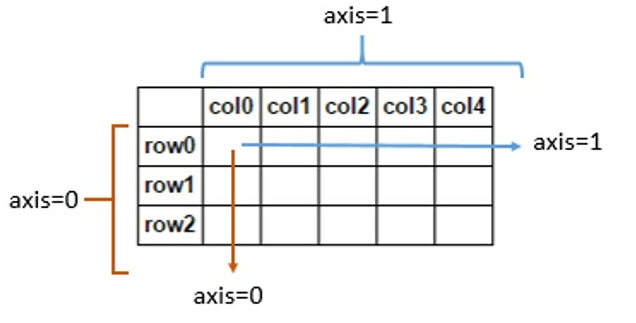
For those who are new to pandas, the pd.read_csv() method in the above code creates a tabular data-structure known as a Dataframe, where the first column contains the index which marks each row of data uniquely and the first row contains a label/name for each column, which are the original column names retained from the data set. The sales_data variable in the above code snippet will have a structure similar to the diagram represented below.
Source: Stack Overflow
In the above diagram the row0, row1, row2 are the index for each record in the data set and the col0, col1, col2 etc are the column names for each columns(features) of the data set.
Now that we have downloaded the data set from its source and converted that into a pandas Dataframe, let’s display a few records from this dataframe. For this we will use the head() method.
# Using .head() method to view the first few records of the data set
sales_data.head()| Opportunity Number | Supplies Subgroup | Supplies Group | Region | Route To Market | Elapsed Days In Sales Stage | Opportunity Result | Sales Stage Change Count | Total Days Identified Through Closing | Total Days Identified Through Qualified | Opportunity Amount USD | Client Size By Revenue | Client Size By Employee Count | Revenue From Client Past Two Years | Competitor Type | Ratio Days Identified To Total Days | Ratio Days Validated To Total Days | Ratio Days Qualified To Total Days | Deal Size Category | |
|---|---|---|---|---|---|---|---|---|---|---|---|---|---|---|---|---|---|---|---|
| 0 | 1641984 | Exterior Accessories | Car Accessories | Northwest | Fields Sales | 76 | Won | 13 | 104 | 101 | 0 | 5 | 5 | 0 | Unknown | 0.69636 | 0.113985 | 0.154215 | 1 |
| 1 | 1658010 | Exterior Accessories | Car Accessories | Pacific | Reseller | 63 | Loss | 2 | 163 | 163 | 0 | 3 | 5 | 0 | Unknown | 0.00000 | 1.000000 | 0.000000 | 1 |
| 2 | 1674737 | Motorcycle Parts | Performance & Non-auto | Pacific | Reseller | 24 | Won | 7 | 82 | 82 | 7750 | 1 | 1 | 0 | Unknown | 1.00000 | 0.000000 | 0.000000 | 1 |
| 3 | 1675224 | Shelters & RV | Performance & Non-auto | Midwest | Reseller | 16 | Loss | 5 | 124 | 124 | 0 | 1 | 1 | 0 | Known | 1.00000 | 0.000000 | 0.000000 | 1 |
| 4 | 1689785 | Exterior Accessories | Car Accessories | Pacific | Reseller | 69 | Loss | 11 | 91 | 13 | 69756 | 1 | 1 | 0 | Unknown | 0.00000 | 0.141125 | 0.000000 | 4 |
As can be seen from the above display, the head() method shows us the first few records from the data set. The head() method is a very nifty tool provided by pandas that helps us to get a feel of the content of a data set. We will talk more about the head() method in the next section.
Now that we have got the data set downloaded and converted into a pandas dataframe, lets do a quick exploration of the data see what stories the data can tell us so that we can plan our course of action.
Data exploration is a very important step in any Data Science or Machine Learning project. Even a quick exploration of the data set can give us important information that we might otherwise miss, and that information can suggest important questions we can try to answer through our project.
For exploring the data set, we will use some third party Python libraries to help us process the data so that it can be effectively used with scikit-learn’s powerful algorithms. But we can start with the same head() method we used in the previous section to view the first few records of the imported data set, because head() is actually capable of doing much more than that! We can customize the head() method to show only a specific number of records as well:
# Using head() method with an argument which helps us to restrict the number of initial records that should be displayed
sales_data.head(n=2)| Opportunity Number | Supplies Subgroup | Supplies Group | Region | Route To Market | Elapsed Days In Sales Stage | Opportunity Result | Sales Stage Change Count | Total Days Identified Through Closing | Total Days Identified Through Qualified | Opportunity Amount USD | Client Size By Revenue | Client Size By Employee Count | Revenue From Client Past Two Years | Competitor Type | Ratio Days Identified To Total Days | Ratio Days Validated To Total Days | Ratio Days Qualified To Total Days | Deal Size Category | |
|---|---|---|---|---|---|---|---|---|---|---|---|---|---|---|---|---|---|---|---|
| 0 | 1641984 | Exterior Accessories | Car Accessories | Northwest | Fields Sales | 76 | Won | 13 | 104 | 101 | 0 | 5 | 5 | 0 | Unknown | 0.69636 | 0.113985 | 0.154215 | 1 |
| 1 | 1658010 | Exterior Accessories | Car Accessories | Pacific | Reseller | 63 | Loss | 2 | 163 | 163 | 0 | 3 | 5 | 0 | Unknown | 0.00000 | 1.000000 | 0.000000 | 1 |
In the code snippet above, we used an argument inside the head() method to display only the first two records from our data set. The integer ‘2’ in the argument n=2 actually denotes the second index of the Dataframe Sales_data. Using this we can get a quick look into the kind of data we have to work with. For example, we can see that columns like ‘Supplies Group’ and ‘Region’ contain string data, while columns like Opportunity Result, Opportunity Number etc. contain integers. Also, we can see that the ‘Opportunity Number’ column contains unique identifiers for each record.
Now that we have viewed the initial records of our dataframe, let’s try to view the last few records in the data set. This can be done using the tail() method, which has similar syntax as the head() method. Let’s see what the tail() method can do:
# Using .tail() method to view the last few records from the dataframe
sales_data.tail()| Opportunity Number | Supplies Subgroup | Supplies Group | Region | Route To Market | Elapsed Days In Sales Stage | Opportunity Result | Sales Stage Change Count | Total Days Identified Through Closing | Total Days Identified Through Qualified | Opportunity Amount USD | Client Size By Revenue | Client Size By Employee Count | Revenue From Client Past Two Years | Competitor Type | Ratio Days Identified To Total Days | Ratio Days Validated To Total Days | Ratio Days Qualified To Total Days | Deal Size Category | |
|---|---|---|---|---|---|---|---|---|---|---|---|---|---|---|---|---|---|---|---|
| 78020 | 10089932 | Batteries & Accessories | Car Accessories | Southeast | Reseller | 0 | Loss | 2 | 0 | 0 | 250000 | 1 | 1 | 3 | Unknown | 0.0 | 0.0 | 0.0 | 6 |
| 78021 | 10089961 | Shelters & RV | Performance & Non-auto | Northeast | Reseller | 0 | Won | 1 | 0 | 0 | 180000 | 1 | 1 | 0 | Unknown | 0.0 | 0.0 | 0.0 | 5 |
| 78022 | 10090145 | Exterior Accessories | Car Accessories | Southeast | Reseller | 0 | Loss | 2 | 0 | 0 | 90000 | 1 | 1 | 0 | Unknown | 0.0 | 0.0 | 0.0 | 4 |
| 78023 | 10090430 | Exterior Accessories | Car Accessories | Southeast | Fields Sales | 0 | Loss | 2 | 0 | 0 | 120000 | 1 | 1 | 0 | Unknown | 1.0 | 0.0 | 0.0 | 5 |
| 78024 | 10094255 | Interior Accessories | Car Accessories | Mid-Atlantic | Reseller | 0 | Loss | 1 | 0 | 0 | 90000 | 1 | 1 | 0 | Unknown | 0.0 | 0.0 | 0.0 | 4 |
The tail() method in the code snippet above returns us the last few records from the dataframe sales_data. We can pass an argument to the tail() method to view only a limited number of records from our dataframe, too:
# Using .tail() method with an argument which helps us to restrict the number of initial records that should be displayed
sales_data.tail(n=2)| Opportunity Number | Supplies Subgroup | Supplies Group | Region | Route To Market | Elapsed Days In Sales Stage | Opportunity Result | Sales Stage Change Count | Total Days Identified Through Closing | Total Days Identified Through Qualified | Opportunity Amount USD | Client Size By Revenue | Client Size By Employee Count | Revenue From Client Past Two Years | Competitor Type | Ratio Days Identified To Total Days | Ratio Days Validated To Total Days | Ratio Days Qualified To Total Days | Deal Size Category | |
|---|---|---|---|---|---|---|---|---|---|---|---|---|---|---|---|---|---|---|---|
| 78023 | 10090430 | Exterior Accessories | Car Accessories | Southeast | Fields Sales | 0 | Loss | 2 | 0 | 0 | 120000 | 1 | 1 | 0 | Unknown | 1.0 | 0.0 | 0.0 | 5 |
| 78024 | 10094255 | Interior Accessories | Car Accessories | Mid-Atlantic | Reseller | 0 | Loss | 1 | 0 | 0 | 90000 | 1 | 1 | 0 | Unknown | 0.0 | 0.0 | 0.0 | 4 |
We can now view only the last two records from the dataframe, as indicated by the argument n=2 inside the tail() method. Similar to the head() method, the integer ‘2’ in the argument n=2 in the tail() method points to the second index from the last two records in the data set sales_data.
What story do these last two records tell us? Looking at the ‘Opportunity Number’ column of the trailer records from the dataframe, it becomes clear to us that a total of 78,024 records are available. This is evident from the ‘index’ number of the records displayed with the tail() method.
Now, it would be good if we could see the different datatypes that are available in this data set; this information can be handy in case we need to do some conversion later on. We can do that with the dtypes() method in pandas:
# using the dtypes() method to display the different datatypes available
sales_data.dtypes
Opportunity Number int64
Supplies Subgroup object
Supplies Group object
Region object
Route To Market object
Elapsed Days In Sales Stage int64
Opportunity Result object
Sales Stage Change Count int64
Total Days Identified Through Closing int64
Total Days Identified Through Qualified int64
Opportunity Amount USD int64
Client Size By Revenue int64
Client Size By Employee Count int64
Revenue From Client Past Two Years int64
Competitor Type object
Ratio Days Identified To Total Days float64
Ratio Days Validated To Total Days float64
Ratio Days Qualified To Total Days float64
Deal Size Category int64
dtype: objectAs we can see in the code snippet above, using the dtypes method, we can list the different columns available in the Dataframe along with their respective datatypes. For example, we can see that the Supplies Subgroup column is an object datatype and the ‘Client Size By Revenue’ column is an integer datatype. So, now we know which columns have integers in them and which columns have string data in them.
Now that we’ve done some basic data exploration, let’s try to create some nice plots to visually represent the data and uncover more stories hidden in the data set.
There are many python libraries that provide functions for doing data visualization; one such library is Seaborn. To use Seaborn plots, we should make sure that this python module is downloaded and installed.
Let’s set up the code to use the Seaborn module:
# import the seaborn module
import seaborn as sns
# import the matplotlib module
import matplotlib.pyplot as plt
# set the background colour of the plot to white
sns.set(style="whitegrid", color_codes=True)
# setting the plot size for all plots
sns.set(rc={'figure.figsize':(11.7,8.27)})
# create a countplot
sns.countplot('Route To Market',data=sales_data,hue = 'Opportunity Result')
# Remove the top and down margin
sns.despine(offset=10, trim=True)
# display the plotplt.show()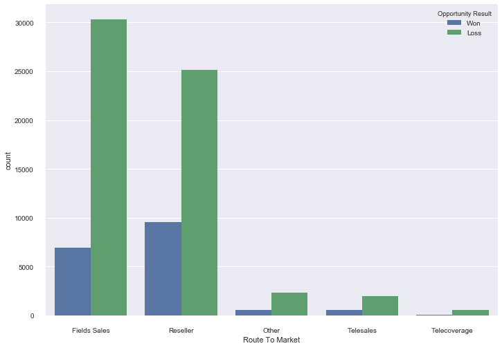
Now that we’ve got Seaborn set up, let’s take a deeper look at what we just did.
First we imported the Seaborn module and the matplotlib module. The set() method in the next line helps to set different properties for our plot, like ‘styles’, ‘color’ etc. Using the sns.set(style="whitegrid", color_codes=True) code snippet we set the background of the plot to a light color. Then we set the plot size with the sns.set(rc={'figure.figsize':(11.7,8.27)})code snippet, which defines the plot figure size to be 11.7px and 8.27px.
Next, we create the plot using sns.countplot('Route To Market',data=sales_data,hue = 'Opportunity Result'). The countplot() method helps us to create a countplot and it exposes several arguments to customize the countplot per our needs. Here, in the first argument of the countplot() method, we defined the X-axis as the column ‘Route To Market’ from our data set. The second argument is the data source, which in this case is the dataframe sales_data that we created in the first section of this tutorial. The third argument is the color of the barplots which we assigned to ‘blue’ for the label ‘won’ and ‘green’ for the label ‘loss’ from the ‘Opportunity Result’ column of the sales_data dataframe.
More details about Seaborn countplots can be found here.
So, what does the countplot tell us about the data? The first thing is that the data set has more records of the type ‘loss’ than records of the type ‘won’, as we can see from the size of the bars. Looking at the x axis and the corresponding bars for each label on the x axis, we can see that most of the data from our data set is concentrated towards the left side of the plot: towards the ‘Field Sales’ and ‘Reseller’ categories. Another thing to notice is that the category ‘Field Sales’ has more losses than the category ‘Reseller’.
We selected the Route To Market column for our plot because it seemed like it would provide helpful information after our initial study of the head() and tail() methods’ output. But other fields like ‘Region’ , ‘Supplies Group’ etc. can also be used to make plots in the same manner.
Now that we have got a pretty good visualization of what our overall data looks like, let’s see what more information can we dig out with the help of other Seaborn plots. Another popular option is violinplots, so let’s create a violin plot and see what that style of plot can tell us.
We will use the violinplot() method provided by the Seaborn module to create the violin plot. Let’s first import the seaborn module and use the set() method to customize the size of our plot. We will seet the size of the plot as 16.7px by 13.27px:
# import the seaborn module
import seaborn as sns
# import the matplotlib module
import matplotlib.pyplot as plt
# setting the plot size for all plots
sns.set(rc={'figure.figsize':(16.7,13.27)})
Next, we will use the violinplot() method to create the violinplot and then use the show() mehtod to display the plot –
# plotting the violinplot
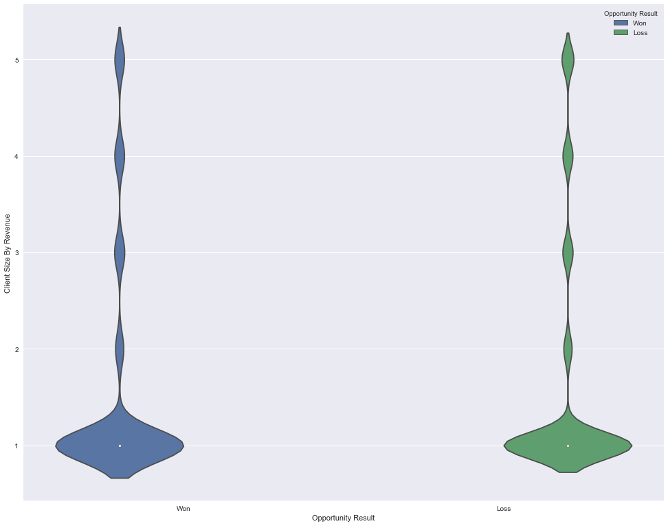
sns.violinplot(x="Opportunity Result",y="Client Size By Revenue", hue="Opportunity Result", data=sales_data);
plt.show()
Now, that our plot is created, let’s see what it tells us. In its simplest form, a violin plot displays the distribution of data across labels. In the above plot we have labels ‘won’ and ‘loss’ on the x-axis and the values of ‘Client Size By Revenue’ in the y-axis. The violin plot shows us that the largest distribution of data is in the client size ‘1’, and the rest of the client size labels have less data.
This violin plot gives us very valuable insight into how the data is distributed and which features and labels have the largest concentration of data, but there is more than what meets the eye in case of violin plots. You can dig deeper into the additional uses of violin plots via the official documentation of the Seaborn module
Now that we have a good understanding of what our data looks like, we can move towards preparing it to build prediction models using scikit-learn.
We saw in our initial exploration that most of the columns in our data set are strings, but the algorithms in scikit-learn understand only numeric data. Luckily, the scikit-learn library provides us with many methods for converting string data into numerical data. One such method is the LabelEncoder() method. We will use this method to convert the categorical labels in our data set like ‘won’ and ‘loss’ into numerical labels. To visualize what we are trying to to achieve with the LabelEncoder() method let’s consider the images below.
The image below represents a dataframe that has one column named ‘color’ and three records ‘Red’, ‘Green’ and ‘Blue’.
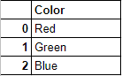
Since the machine learning algorithms in scikit-learn understand only numeric inputs, we would like to convert the categorical labels like ‘Red, ‘Green’ and ‘Blue’ into numeric labels. When we are done converting the categorical labels in the original dataframe, we would get something like this:
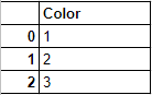
Now, let’s start the actual conversion process. We will use the fit_transform() method provided by LabelEncoder() to encode the labels in the categorical column such as ‘Route To Market’ in the sales_data dataframe and convert them into numeric labels similar to what we visualized in the above diagrams. The fit_transform() function takes user defined labels as input and then returns encoded labels. Let’s go through a quick example to understand how the encoding is done. In the code example below we have a list of cities i.e. ["paris", "paris", "tokyo", "amsterdam"] and we will try to encode these string labels into something similar to this – [2, 2, 1,3].
#import the necessary module
from sklearn import preprocessing
# create the Labelencoder object
le = preprocessing.LabelEncoder()
#convert the categorical columns into numeric
encoded_value = le.fit_transform(["paris", "paris", "tokyo", "amsterdam"])
print(encoded_value)[1 1 2 0]Voila! We have successfully converted the string labels into numeric labels. How’d we do that? First we imported the preprocessing module which provides the LabelEncoder() method. Then we created an object which represents the LabelEncoder() type. Next we used this object’s fit_transform() function to differentiate between different unique classes of the list ["paris", "paris", "tokyo", "amsterdam"] and then return a list with the respective encoded values, i.e. [1 1 2 0].
Notice how the LabelEncoder() method assigns the numeric values to the classes in the order of the first letter of the classes from the original list: “(a)msterdam” gets an encoding of ‘0’ , “(p)aris gets an encoding of 1” and “(t)okyo” gets an encoding of 2.
There are many more functions provided by LabelEncoder() that are handy under a variety of encoding requirements. We won’t need them here, but to learn more, a good place to start is the official page of scikit-learn where the LabelEncoder() and its related functions are described in detail.
Since, we now have a good idea of how the LabelEncoder() works, we can move forward with using this method to encode the categorical labels from the sales_data dataframe and convert them into numeric labels. In the previous sections during the initial exploration of the data set we saw that the following columns contain string values: ‘Supplies Subgroup’, ‘Region’, ‘Route To Market’, ‘Opportunity Result’, ‘Competitor Type’, and ‘Supplies Group’. Before we start encoding these string labels, let’s take a quick look into the different labels that these columns contain:-
print("Supplies Subgroup' : ",sales_data['Supplies Subgroup'].unique())
print("Region : ",sales_data['Region'].unique())
print("Route To Market : ",sales_data['Route To Market'].unique())
print("Opportunity Result : ",sales_data['Opportunity Result'].unique())
print("Competitor Type : ",sales_data['Competitor Type'].unique())
print("'Supplies Group : ",sales_data['Supplies Group'].unique())
Supplies Subgroup' : ['Exterior Accessories' 'Motorcycle Parts' 'Shelters & RV'
'Garage & Car Care' 'Batteries & Accessories' 'Performance Parts'
'Towing & Hitches' 'Replacement Parts' 'Tires & Wheels'
'Interior Accessories' 'Car Electronics']
Region : ['Northwest' 'Pacific' 'Midwest' 'Southwest' 'Mid-Atlantic' 'Northeast'
'Southeast']
Route To Market : ['Fields Sales' 'Reseller' 'Other' 'Telesales' 'Telecoverage']
Opportunity Result : ['Won' 'Loss']
Competitor Type : ['Unknown' 'Known' 'None']
'Supplies Group : ['Car Accessories' 'Performance & Non-auto' 'Tires & Wheels'
'Car Electronics']We have now laid out the different categorical columns from the sales_data dataframe and the unique classes under each of these columns. Now, it’s time to encode these strings into numeric labels. To do this, we will run the code below and then do a deep dive to understand how it works:
#import the necessary module
from sklearn import preprocessing
# create the Labelencoder object
le = preprocessing.LabelEncoder()
#convert the categorical columns into numeric
sales_data['Supplies Subgroup'] = le.fit_transform(sales_data['Supplies Subgroup'])
sales_data['Region'] = le.fit_transform(sales_data['Region'])
sales_data['Route To Market'] = le.fit_transform(sales_data['Route To Market'])
sales_data['Opportunity Result'] = le.fit_transform(sales_data['Opportunity Result'])
sales_data['Competitor Type'] = le.fit_transform(sales_data['Competitor Type'])
sales_data['Supplies Group'] = le.fit_transform(sales_data['Supplies Group'])
#display the initial records
sales_data.head()| Opportunity Number | Supplies Subgroup | Supplies Group | Region | Route To Market | Elapsed Days In Sales Stage | Opportunity Result | Sales Stage Change Count | Total Days Identified Through Closing | Total Days Identified Through Qualified | Opportunity Amount USD | Client Size By Revenue | Client Size By Employee Count | Revenue From Client Past Two Years | Competitor Type | Ratio Days Identified To Total Days | Ratio Days Validated To Total Days | Ratio Days Qualified To Total Days | Deal Size Category | |
|---|---|---|---|---|---|---|---|---|---|---|---|---|---|---|---|---|---|---|---|
| 0 | 1641984 | 2 | 0 | 3 | 0 | 76 | 1 | 13 | 104 | 101 | 0 | 5 | 5 | 0 | 2 | 0.69636 | 0.113985 | 0.154215 | 1 |
| 1 | 1658010 | 2 | 0 | 4 | 2 | 63 | 0 | 2 | 163 | 163 | 0 | 3 | 5 | 0 | 2 | 0.00000 | 1.000000 | 0.000000 | 1 |
| 2 | 1674737 | 5 | 2 | 4 | 2 | 24 | 1 | 7 | 82 | 82 | 7750 | 1 | 1 | 0 | 2 | 1.00000 | 0.000000 | 0.000000 | 1 |
| 3 | 1675224 | 8 | 2 | 1 | 2 | 16 | 0 | 5 | 124 | 124 | 0 | 1 | 1 | 0 | 0 | 1.00000 | 0.000000 | 0.000000 | 1 |
| 4 | 1689785 | 2 | 0 | 4 | 2 | 69 | 0 | 11 | 91 | 13 | 69756 | 1 | 1 | 0 | 2 | 0.00000 | 0.141125 | 0.000000 | 4 |
So what did we just do? First we imported the preprocessing module which provides the LabelEncoder() method. Then we created an object le of the type labelEncoder(). In the next couple of lines we used the fit_transform() function provided by LabelEncoder() and converted the categorical labels of different columns like ‘Supplies Subgroup’, ‘Region’, Route To Market’ into numeric labels. In doing this, we successfully converted all the categorical (string) columns into numeric values.
Now that we have our data prepared and converted it is almost ready to be used for building our predictive model. But we still need to do one critical thing:
A Machine Learning algorithm needs to be trained on a set of data to learn the relationships between different features and how these features affect the target variable. For this we need to divide the entire data set into two sets. One is the training set on which we are going to train our algorithm to build a model. The other is the testing set on which we will test our model to see how accurate its predictions are.
But before doing all this splitting, let’s first separate our features and target variables. As before in this tutorial, we will first run the code below, and then take a closer look at what it does:
# select columns other than 'Opportunity Number','Opportunity Result'cols = [col for col in sales_data.columns if col not in ['Opportunity Number','Opportunity Result']]
# dropping the 'Opportunity Number'and 'Opportunity Result' columns
data = sales_data[cols]
#assigning the Oppurtunity Result column as target
target = sales_data['Opportunity Result']
data.head(n=2)| Supplies Subgroup | Supplies Group | Region | Route To Market | Elapsed Days In Sales Stage | Sales Stage Change Count | Total Days Identified Through Closing | Total Days Identified Through Qualified | Opportunity Amount USD | Client Size By Revenue | Client Size By Employee Count | Revenue From Client Past Two Years | Competitor Type | Ratio Days Identified To Total Days | Ratio Days Validated To Total Days | Ratio Days Qualified To Total Days | Deal Size Category | |
|---|---|---|---|---|---|---|---|---|---|---|---|---|---|---|---|---|---|
| 0 | 2 | 0 | 3 | 0 | 76 | 13 | 104 | 101 | 0 | 5 | 5 | 0 | 2 | 0.69636 | 0.113985 | 0.154215 | 1 |
| 1 | 2 | 0 | 4 | 2 | 63 | 2 | 163 | 163 | 0 | 3 | 5 | 0 | 2 | 0.00000 | 1.000000 | 0.000000 | 1 |
OK, so what did we just do? First, we don’t need the ‘Opportunity Number’ column as it is just a unique identifier for each record. Also, we want to predict the ‘Opportunity Result’, so it should be our ‘target’ rather than part of ‘data’. So, in the first line of the code above, we selected only the columns which didn’t match ‘Opportunity Number’and ‘Opportunity Result’ and assigned them to a variable cols. Next, we created a new dataframe data with the columns in the list cols. This will serve as our feature set. Then we took the ‘Opportunity Result’ column from the dataframe sales_data and created a new dataframe target.
That’s it! We are all set with defining our features and target into two separate dataframes. Next we will divide the dataframes data and target into training sets and testing sets. When splitting the data set we will keep 30% of the data as the test data and the remaining 70% as the training data. But keep in mind that those numbers are arbitrary and the best split will depend on the specific data you’re working with. If you’re not sure how to split your data, the 80/20 principle where you keep 80% of the data as training data and use the remaining 20% as test data is a decent default. However, for this tutorial, we are going to stick with our earlier decision of keeping aside 30% of the data as test data. The train_test_split() method in scikit-learn can be used to split the data:
#import the necessary module
from sklearn.model_selection import train_test_split
#split data set into train and test setsdata_train, data_test, target_train, target_test = train_test_split(data,target, test_size = 0.30, random_state = 10)
With this, we have now successfully prepared a testing set and a training set. In the above code first we imported the train_test_split module. Next we used the train_test_split() method to divide the data into a training set (data_train,target_train) and a test set (data_test,data_train). The first argument of the train_test_split() method are the features that we separated out in the previous section, the second argument is the target(‘Opportunity Result’). The third argument ‘test_size’ is the percentage of the data that we want to separate out as training data . In our case it’s 30% , although this can be any number. The fourth argument ‘random_state’ just ensures that we get reproducible results every time.
Now, we have everything ready and here comes the most important and interesting part of this tutorial: building a prediction model using the vast library of algorithms available through scikit-learn.
There’s a machine_learning_map available on scikit learn’s website that we can use as a quick reference when choosing an algorithm. It looks something like this:
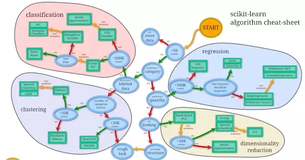
We can use this map as a cheat sheet to shortlist the algorithms that we can try out to build our prediction model. Using the checklist let’s see under which category we fall:
Based on the checklist that we prepared above and going by the machine_learning_map we can try out the below mentioned algorithms.
The real beauty of the scikit-learn library is that it exposes high level APIs for different algorithms, making it easier for us to try out different algorithms and compare the accuracy of the models to see what works best for our data set.
Let’s begin trying out the different algorithms one by one.
Scikit-learn provides a set of classification algorithms which “naively” assumes that in a data set every pair of features are independent. This assumption is the underlying principle of Bayes theorem. The algorithms based on this principle are known as Naive-Bayes algorithms.
On a very high level a Naive-Bayes algorithm calculates the probability of the connection of a feature with a target variable and then it selects the feature with the highest probability. Let’s try to understand this with a very simple problem statement: Will it rain today? Suppose we have a set of weather data with us that will be our feature set, and the probability of ‘Rain’ will be our target. Based on this feature set we can create a table to show us the number of times a particular feature/target pair occur. It would look something like this:
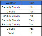
In the table above the feature (column) ‘Weather’ contains the labels (‘Partially Cloudy’ and ‘Cloudy’) and the column ‘Rain’ contains the occurrence of rain coinciding with the feature ‘Weather’ (Yes/No). Whenever a feature lcoincides with rain, it’s recorded as a ‘Yes’ and when the feature didn’t lead to rain it is recorded as a ‘No’. We can now use the data from the occurrence table to create another table known as the ‘Frequency table’ where we can record the number of ‘Yes’ and the number of ‘No’ answers that each feature relates to:
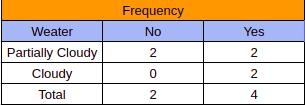
Finally, we combine the data from the ‘occurrence table’ and the ‘frequency table’ and create a ‘likelihood table’. This table lists the amount of ‘Yes’ and ‘No’ for each feature and then uses this data to calculate the probability of contibution of each feature towards the occurrence of rain:
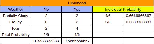
Notice the ‘Individual Probability’ column in the table above. We had 6 occurrences of the features ‘Partially Cloudy’ and ‘Cloudy’ from the ‘Occurrence table’ and from the ‘Likelihood table’ it was clear that the feature ‘Partially Cloudy’ had 4 occurrences (2 for ‘No’ and 2 for ‘yes’). When we divide the number of occurrences of ‘No’ and ‘Yes’ of a particular feature with the ‘total’ of the ‘occurrence table’, we get the probability of that particular feature. In our case if we need to find out that which feature has the strongest probability of contributing to the occurrence of Rain then we take the total number of ‘No’ of each feature and add it to their respective number of ‘Yes’ from the ‘frequency table’ and then divide the sum with the ‘Total’ from the óccurances table’. This gives us the probability of each of these features coinciding with rain.
The algorithm that we are going to use for our sales data is the Gaussian Naive Bayes and it is based on a concept similar to the weather example we just explored above, although significantly more mathematically complicated. A more detailed explanation of ‘Naive-Bayes’ algorithms can be found here for those who wish to delve deeper.
Now let’s implement the Gaussian Naive Bayes or GaussianNB algorithm from scikit-learn to create our prediction model:
# import the necessary module
from sklearn.naive_bayes import GaussianNB
from sklearn.metrics import accuracy_score
#create an object of the type GaussianNB
gnb = GaussianNB()
#train the algorithm on training data and predict using the testing data
pred = gnb.fit(data_train, target_train).predict(data_test)
#print(pred.tolist())
#print the accuracy score of the model
print("Naive-Bayes accuracy : ",accuracy_score(target_test, pred, normalize = True))Naive-Bayes accuracy : 0.759056732741Now let’s take a closer look at what we just did. First, we imported the GaussianNB method and the accuracy_score method. Then we created an object gnb of the type GaussianNB. After this, we trained the algorithm on the testing data(data_train) and testing target(target_train) using the fit() method, and then predicted the targets in the test data using the predict() method. Finally we printed the score using the accuracy_score() method and with this we have successfully applied the Naive-Bayes algorithm to build a prediction model.
Now lets see how the other algorithms in our list perform as compared to the Naive-Bayes algorithm.
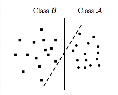
LinearSVC or Linear Support Vector Classification is a subclass of the SVM (Support Vector Machine) class. We won’t go into the intricacies of the mathematics involved in this class of algorithms, but on a very basic level LinearSVC tries to divide the data into different planes so that it can find a best possible grouping of different classes. To get a clear understanding of this concept let’s imagine a data set of ‘dots’ and ‘squares’ divided into a two dimensional space along two axis, as shown in the image below:
Source:StackOverflow
In the image above a LinearSVC implementation tries to divide the two-dimensional space in such a way that the two classes of data i.e the dots and squares are clearly divided. Here the two lines visually represent the various division that the LinearSVC tries to implement to separate out the two available classes.
A very good writeup explaining a Support Vector Machine(SVM) can be found here for those who’d like more detail, but for now, let’s just dive in and get our hands dirty:
#import the necessary modules
from sklearn.svm import LinearSVC
from sklearn.metrics import accuracy_score
#create an object of type LinearSVC
svc_model = LinearSVC(random_state=0)
#train the algorithm on training data and predict using the testing data
pred = svc_model.fit(data_train, target_train).predict(data_test)
#print the accuracy score of the model
print("LinearSVC accuracy : ",accuracy_score(target_test, pred, normalize = True))
LinearSVC accuracy : 0.777811004785Similar to what we did during the implementation of GaussianNB, we imported the required modules in the first two lines. Then we created an object svc_model of type LinearSVC with random_state as ‘0’. Hold on! What is a “random_state” ? Simply put the random_state is an instruction to the built-in random number generator to shuffle the data in a specific order.
Next, we trained the LinearSVC on the training data and then predicted the target using the test data. Finally, we checked the accuracy score using the accuracy_score() method.
Now that we have tried out the GaussianNB and LinearSVC algorithms we will try out the last algorithm in our list and that’s the K-nearest neighbours classifier
Compared to the previous two algorithms we’ve worked with, this classifier is a bit more complex. For the purposes of this tutorial we are better off using the KNeighborsClassifier class provided by scikit-learn without worrying much about how the algorithm works. (But if you’re interested, a very detailed explanation of this class of algorithms can be found here)
Now, let’s implement the K-Neighbors Classifier and see how it scores:
#import necessary modules
from sklearn.neighbors import KNeighborsClassifier
from sklearn.metrics import accuracy_score
#create object of the lassifier
neigh = KNeighborsClassifier(n_neighbors=3)
#Train the algorithm
neigh.fit(data_train, target_train)
# predict the response
pred = neigh.predict(data_test)
# evaluate accuracy
print ("KNeighbors accuracy score : ",accuracy_score(target_test, pred))
KNeighbors accuracy score : 0.814550580998The above code can be explained just like the previous implementations. First we imported the necessary modules, then we created the object neigh of type KNeighborsClassifier with the number of neighbors being n_neighbors=3. Then we used the fit() method to train our algorithm on the training set, then we tested the model on the test data. Finally, we printed out the accuracy score.
Now that we have implemented all the algorithms in our list, we can simply compare the scores of all the models to select the model with the highest score. But wouldn’t it be nice if we had a way to visually compare the performance of the different models? We can use the yellowbrick library in scikit-learn, which provides methods for visually representing different scoring methods.
In the previous sections we have used the accuracy_score() method to measure the accuracy of the different algorithms. Now, we will use the ClassificationReport class provided by the Yellowbrick library to give us a visual report of how our models perform.
Let’s start off with the GaussianNB model:
from yellowbrick.classifier import ClassificationReport
# Instantiate the classification model and visualizer
visualizer = ClassificationReport(gnb, classes=['Won','Loss'])
visualizer.fit(data_train, target_train) # Fit the training data to the visualizer
visualizer.score(data_test, target_test) # Evaluate the model on the test data
g = visualizer.poof() # Draw/show/poof the data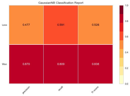
In the code above, first we import the ClassificationReport class provided by the yellowbrick.classifier module. Next, an object visualizer of the type ClassificationReport is created. Here the first argument is the GaussianNB object gnb that was created while implementing the Naive-Bayes algorithm in the ‘Naive-Bayes’ section. The second argument contains the labels ‘Won’ and ‘Loss’ from the ‘Opportunity Result’ column from the sales_data dataframe.
Next, we use the fit() method to train the visualizer object. This is followed by the score() method, which uses gnb object to carry out predictions as per the GaussianNB algorithm and then calculate the accuracy score of the predictions made by this algorithm. Finally, we use the poof() method to draw a plot of the different scores for the GaussianNB algorithm. Notice how the different scores are laid out against each of the labels ‘Won’ and ‘Loss’; this enables us to visualize the scores across the different target classes.
Similar to what we just did in the previous section, we can also plot the accuracy scores of the LinearSVC algorithm:
from yellowbrick.classifier import ClassificationReport
# Instantiate the classification model and visualizer
visualizer = ClassificationReport(svc_model, classes=['Won','Loss'])
visualizer.fit(data_train, target_train) # Fit the training data to the visualizer
visualizer.score(data_test, target_test) # Evaluate the model on the test data
g = visualizer.poof() # Draw/show/poof the data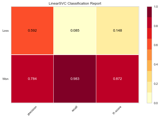
In the code above, first we imported the ClassificationReport class provided by the yellowbrick.classifier module. Next, an object visualizer of the type ClassificationReport was created. Here the first argument is the LinearSVC object svc_model, that was created while implementing the LinearSVC algorithm in the ‘LinearSVC’ section. The second argument contains the labels ‘Won’ and ‘Loss’ from the ‘Opportunity Result’ column from the sales_data dataframe.
Next, we used the fit() method to train the ‘svc_model’ object. This is followed by the score() method which uses the svc_model object to carry out predictions according to the LinearSVC algorithm and then calculate the accuracy score of the predictions made by this algorithm. Finally, we used the poof() method to draw a plot of the different scores for the LinearSVC algorithm.
Now, let’s do the same thing for the K-Neighbors Classifier scores.
from yellowbrick.classifier import ClassificationReport
# Instantiate the classification model and visualizer
visualizer = ClassificationReport(neigh, classes=['Won','Loss'])
visualizer.fit(data_train, target_train) # Fit the training data to the visualizer
visualizer.score(data_test, target_test) # Evaluate the model on the test data
g = visualizer.poof() # Draw/show/poof the data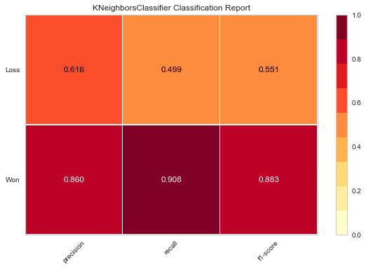
Once again, we first import the ClassificationReport class provided by the yellowbrick.classifier module. Next, an object visualizer of the type ClassificationReport is created. Here the first argument is the KNeighborsClassifier object neigh, that was created while implementing the KNeighborsClassifier algorithm in the ‘KNeighborsClassifier’ section. The second argument contains the labels ‘Won’ and ‘Loss’ from the ‘Opportunity Result’ column from the sales_data dataframe.
Next, we use the fit() method to train the ‘neigh’ object. This is followed by the score() method which uses the neigh object to carry out predictions according to the KNeighborsClassifier algorithm and then calculate the accuracy score of the predictions made by this algorithm. Finally we use the poof() method to draw a plot of the different scores for the KNeighborsClassifier algorithm.
Now that we’ve visualized the results, it’s much easier for us to compare the scores and choose the algorithm that’s going to work best for our needs.
The scikit-learn library provides many different algorithms which can be imported into the code and then used to build models just like we would import any other Python library. This makes it easier to quickly build different models and compare these models to select the highest scoring one.
In this tutorial, we have only scratched the surface of what is possible with the scikit-learn library. To use this Machine Learning library to the fullest, there are many resources available on the official page of scikit-learn with detailed documentation that you can dive into. The quick start guide for scikit-learn can be found here, and that’s a good entry point for beginners who have just started exploring the world of Machine Learning.
But to really appreciate the true power of the scikit-learn library, what you really need to do is start using it on different open data sets and building predictive models using these data sets. Sources for open data sets include Kaggle and Data.world. Both contain many interesting data sets on which one can practice building predictive models by using the algorithms provided by the scikit-learn library.
[출처] https://www.dataquest.io/blog/sci-kit-learn-tutorial/

명실상부 데이터 분석 분야의 최고 자격증은 ADP(데이터분석 전문가)입니다. 그다음으로는 빅데이터 분석가들이 따는 빅데이터 분석기사가 있죠. ADP(데이터분석 전문가)란 데이터 이해 및 처리 기술에 대한 기본 지식을 바탕으로 데이터분석 기획, 데이터분석, 데이터 시각화 업무를 수행하는 사람들을 말합니다. ADP는 이를 통해 프로세스 혁신 및 마케팅 전략 결정 등의 과학적 의사결정을 지원하는 직무를 수행하는 전문가들입니다.
이제는 자격증 취득자가 2만 명이 넘는 ADsP가 아닌, 이제는 나만의 ‘한 방’이 더 필요한 시점입니다. ADP 합격률은 겨우 2.5%에 불과합니다. 그만큼 ADP를 가지고 있으면 취업시장에서 유리한 위치를 차지할 수 있습니다. 어디에서도 쉽게 알려주지 않는 ADP 자격증 수업을 클래스101에서 만나보세요.
ADP 시험과
빅데이터 분석가 실기를 한 번에!

금융권과 대기업 등 많은 회사에서 이미 데이터 분석 능력을 원하고 있습니다. 유명 대기업 채용 공고에서도 ADP를 우대한다는 내용은 쉽게 찾아볼 수 있습니다. ADsP 자격증을 가지고 있다면 이제는 ADP 자격증으로 나의 커리어를 한 단계 올릴 시간입니다. ADP 합격률은 2.5%에 불과하지만 어렵기에 그만큼 더 공신력 있는 자격증입니다.
합격률만 본다면 ‘과연 내가 할 수 있을까?’라는 생각이 덜컥 들 수 있습니다. 하지만 ADP 자격증은 어려운 만큼 취득하기만 한다면 확실한 보상이 따라오는 자격증이기도 합니다.
하지만 현재 ADP를 위한 강의와 실기 시험을 위한 Python 교재 또한 없는 게 현실입니다. 응시자 수는 점점 늘어나고 있는데 말입니다. 많은 기업에서 우대해 주는 자격증인 만큼, 앞으로 응시자 수는 계속해서 높아질 것으로 보입니다.

시험에 대한 정보가 부족했을 당시 직접 책을 만들어 시험에 합격한 전문가에게 ADP 자격증 실기 수업을 들어보세요. 합격 노하우를 모두 담아낸 ADP 실기 요약집과 ADP 실기에 맞게 재구성한 커리큘럼으로 가장 빠른 ADP 합격의 길을 열어드리겠습니다.
ADP 시험은 크게 데이터 기획, 데이터 분석, 데이터 시각화로 나뉩니다. ‘데이터를 보고 기획할 수 있는가?’, ‘데이터를 보고 모델링, 검증 및 테스트, 적용을 할 수 있는가?’, ‘시각화를 할 수 있는가?’ 등을 묻는 시험입니다. 이 모든 것을 암기하기에는 방대한 양을 감당할 수 없습니다. 그래서 이번 클래스에서는 ADP 출제 경향을 분석해 수험생이 최대한 효율적으로 공부할 수 있도록 최적의 ADP 실기 커리큘럼을 구성했습니다.

ADP 실기는 오픈북 시험입니다. 그럼에도 외워야 할 것과 외우지 말아야 할 것은 분명히 정해져 있습니다. 효율적인 시험 준비를 위해 꼭 숙달해야 하는 부분과 자료로 준비해야 하는 부분을 구분해서 가르쳐 드리겠습니다.
실기 시험에서는 문제를 보고 어떠한 알고리즘을 적용해서 풀어야 하는지에 관한 데이터 기획 문제도 있습니다. 어떤 분석 기법을 언제 적용해야 하는지는 데이터에 따라 달라집니다. 그렇기에 비전공자도 문제에 접근할 수 있도록 이론 설명을 커리큘럼에 포함했습니다.
또한 시험에는 분석 결과를 시각적으로 표현하는 것이 많습니다. 분석 결과를 보여주면서 설명을 할 수 있게 알려드립니다.

최근에 시행된 빅데이터 분석가(빅데이터 분석기사) 시험도 ADP와 함께 준비하면 좋습니다. 빅데이터 분석가 시험은 ADP 실기 공부와 방향이 같습니다. 다만 시험 스타일이 조금 다를 뿐입니다. ADP는 오픈북이며 이론에 대한 설명까지 원한다면, 빅데이터 분석가는 모델을 구현할 수 있는지를 물어봅니다. 시험 난이도는 데이터분석 전문가 시험에 비해 훨씬 쉽습니다. 하나의 클래스로 ADP 실기와 빅데이터 분석가 실기까지 한 번에 준비해 보세요.
독학으로 따는
SQLD 자격증!

데이터 관련 자격증은 ADP뿐만 아니라 다양합니다. 특히 비전공자라도 SQLD 자격증은 얼마든지 독학으로 가능합니다.
SQLD 자격증을 소지하면 다양한 업무를 보다 효율적으로 처리할 수 있습니다. SQLD 자격증을 소지하면 SQL로 데이터를 직접 다룰 수 있습니다. 업무에 필요한 대부분의 데이터는 회사 DB에 저장돼 있습니다. 그 DB에서 꺼내서 활용하기만 하면 되는데, 대부분의 사람들이 그 방법을 몰라 제대로 데이터를 활용하지 못하고 있습니다.
이때 필요한 것이 SQL입니다. SQL를 할 줄 안다는 것은 회사 보고서, 회의 자료를 사내 데이터 기반으로 쓸 수 있다는 것을 의미합니다. 꼭 보고하는 용도가 아니더라도, 언제든 내가 필요할 때 원하는 형태로 데이터를 꺼내서 업무에 활용할 수 있습니다. 이제 SQLD 자격증을 통해 데이터 역량을 갖출 시간입니다.

SQLD 자격증을 가지게 되면 DB에 저장된 수많은 데이터를 업무에 자유자재로 활용할 수 있게 됩니다. 내 주장에 힘을 실어줄 근거 데이터를 찾거나, 번뜩이는 아이디어를 데이터로 검증할 수 있게 되는 거죠. 예전에는 엑셀만으로 충분했고, 취업을 할 때도 엑셀 사용 능력 정도를 중요하게 봤지만 요즘은 더 정확한 의사결정을 위해 업무에 필요한 데이터를 직접 추출하고 가공하는 SQLD 자격증이 더 요구되고 있는 상황입니다.
실제로 기존 대기업 및 중견기업들의 디지털 트랜스포메이션이 가속화되면서, 이제는 대부분의 문과 직종이라 불리는 기획, 마케팅, 영업, 사업 관리, 서비스 운영 등에서 SQLD 자격증을 우대하곤 합니다.

비전공자를 위해 생소한 용어는 이해하기 쉽게 사례로 설명해 드립니다. 단순히 줄줄 읽는 것이 아닌 실제 데이터가 처리되는 과정을 도식화해서 알려드립니다. 특히, 실무에서 자주 일어나는 실수를 미리 배워서 시행착오를 줄이고 실무 능력을 갖출 수 있도록 도와드리겠습니다. 이번 클래스 하나면 SQLD 독학을 혼자서 해낼 수 있을 뿐만 아니라 실무 능력까지 덤으로 갖추실 수 있습니다.
비트코인, 주식, 부동산에 써먹는
실용적인 데이터 분석!

데이터 분석은 자격증 뿐만 아니라 우리 실생활에서도 깊이 스며들어 있습니다. 주식, 부동산, 비트코인 등 실생활에 밀접한 주제들로 데이터 분석을 배워보세요. 내가 원하는 주제로 데이터를 분석하다 보면 어렵지 않게 데이터 분석을 공부할 수 있습니다.
파이썬을 익히면 어렵지 않게 코드 몇 줄로 빠른 데이터 분석을 할 수 있습니다. 엑셀로는 불가능한 일도, 파이썬이라면 가능합니다. 원하는 데이터를 뽑고, 분석하고, 마지막으로 그래프로 시각화하는 능력까지 만들어드리겠습니다.

수익화에 활용할 수 있는 실용적인 데이터 분석을 알려드리겠습니다. 15년 치 부동산 매매가 분석을 단 몇 줄의 코드로 한 번에 끝낼 수 있습니다. 직장에서도 투자에서도 이제는 데이터 분석을 활용해 보세요. 이전과는 다른 새로운 시각으로 세상을 읽게 됩니다.
[출처] https://m.post.naver.com/viewer/postView.naver?volumeNo=32969657&memberNo=47129033
오픈소스는 특히 AI와 같은 최첨단 영역에서 코드와 데이터를 공유해 혁신적인 소프트웨어를 더 쉽게 구축할 수 있게 한다. IT전문지 ‘인포월드(InfoWorld)’가 26일 소개한 13개의 주요 오픈소스 프로젝트를 살펴본다.
텐서플로우(TensorFlow)와 파이토치(PyTorch)

텐서플로우는 구글이 개발한 오픈소스 소프트웨어 라이브러리로, 각종 신경망 학습에 사용된다. 대규모 예측 모델 구성에 강점을 보이기 때문에 베타 테스트 단계부터 실제 서비스 구현까지 거의 모든 딥러닝 프로젝트에서 활용도가 높다.
메타가 개발한 파이썬 기반 오픈소스 라이브러리인 파이토치는 절차가 간단한 편이며 코드 자체도 파이썬과 유사해 초보자들도 쉽게 시작할 수 있다. 파이토치는 신경망 크기도 최적으로 동작시킬 수 있고 학습 속도가 빠르다.
실제로 이 기사에서 등장하는 프로젝트 중 일부는 텐서플로우나 파이토치를 사용 중이다.
폭스파일럿(FauxPilot)
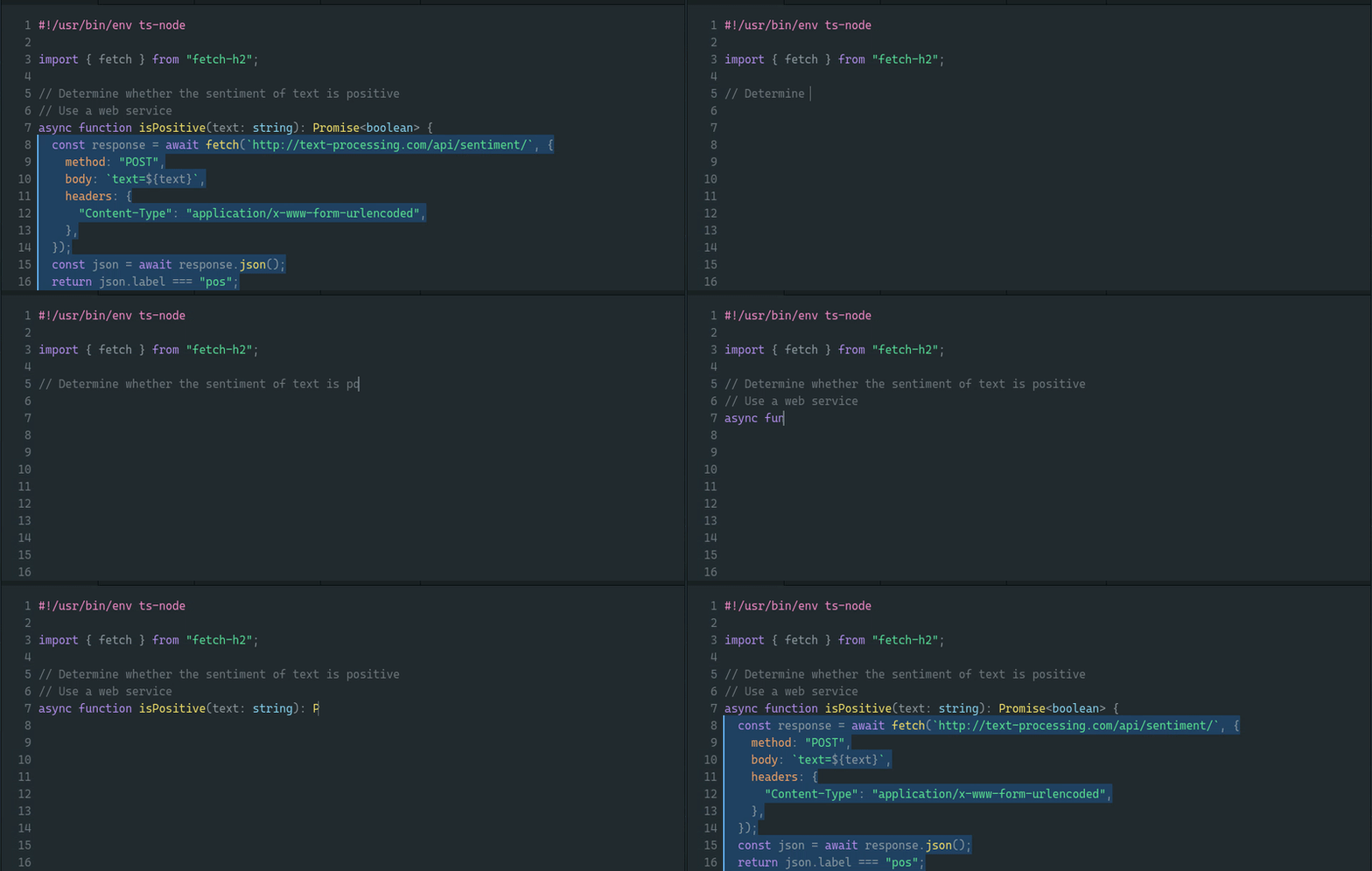
코딩 도움이 필요한 프로그래머는 폭스파일럿을 사용할 수 있다. 폭스파일럿은 AI 모델의 도움으로 프로그래밍 코드를 생성한다.
개발 중인 코드를 분석하고 이해한 후 코드를 자동으로 만들어 주거나, 주석으로 설명을 쓰면 그에 맞는 코드를 자동으로 생성해준다. 또 반복되는 코드를 자동으로 채워주며, 복잡한 알고리즘을 제공하고, 구현된 코드에 대한 테스트를 자동으로 생성해주는 기능도 있다.
세일즈포스의 코드젠(CodeGen)에 기반한 폭스라일럿은 라이선스와 보안에 문제가 있는 GPT-3 기반의 코파일럿(Copilot)의 대안으로 활용된다.
달리2(DALL-E 2)

달리2는 오픈AI(OpenAI)가 이미지를 텍스트로 설명하면 디지털 이미지로 생성해 주는 AI 모델이다. 고해상도 이미지를 짧은 시간 안에 생성하고, 포토샵이나 디지털 아트 기술 없이 간단한 도구와 텍스트 수정으로 이미지를 쉽게 편집할 수 있다.
달리 플레이그라운드(DALL-E Playground)나 달리 미니(DALL-E Mini)와 같은 오픈 소스 프로젝트를 통해 더 쉽게 실험할 수 있다.
욜로v7(YOLOv7)
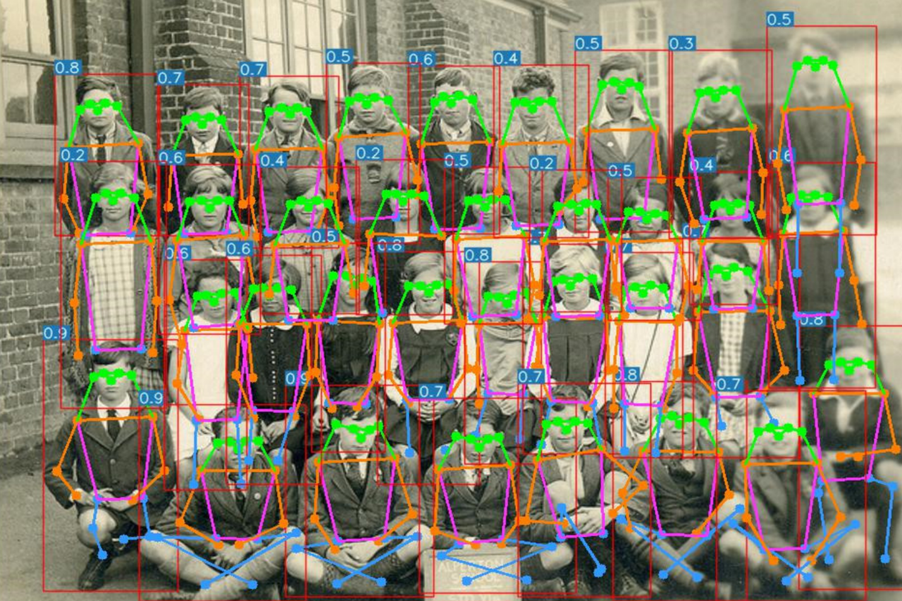
실시간 개체 탐지 또는 이미지에서 개체를 찾는 것은 AI의 까다로운 영역이다. 또 주변 정보를 정확하게 수집하고 전달해야 하는 자율주행 자동차나 로봇, 보조 장치 등과 같은 분야에서도 중요하다.
욜로v7은 가장 빠르고 정확한 오픈소스 개체 탐지 도구 중 하나다.
딥페이스렙(DeepFaceLab)
딥페이크는 딥 러닝의 도움으로 생성, 변경, 합성된 비디오 및 이미지다.
가장 잘 알려진 예는 유명인이나 정치인의 얼굴을 기존 동영상이나 이미지에서 바꾸는 것이다. 일반적으로 유머를 목적으로 하지만 때로는 악의적 목적으로 사용된다.
딥페이스랩은 파이썬(Python)에서 실행되는 오픈소스 딥페이크 기술이다. 한 얼굴을 다른 얼굴로 바꾸는 것 외에도 주름이나 다른 특징을 제거하는 데 사용할 수 있다.
패들NLP(PaddleNLP)
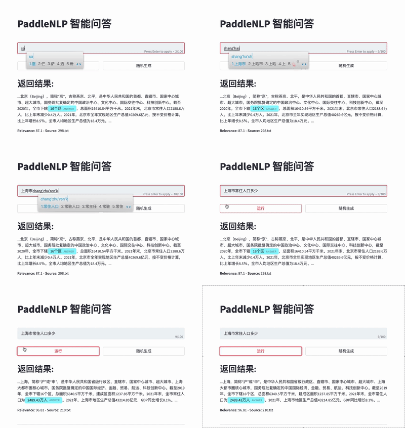
자연어 처리(NLP) 엔진은 신경망을 이용해 검색이나 감정 분석을 수행한 다음 정보를 추출해 사용자에게 제공한다. 아마존의 알렉사(Alexa)와 같이 때로는 서툰 경우가 있지만, 이 기술은 다양한 애플리케이션과 도메인에서 사용할 수 있을 정도로 정교해지고 있다.
패들NLP는 검색, 감정 분석, 질의응답, 음성 명령 분석 등에 사용할 수 있는 오픈소스 NLP 라이브러리다.
마인드DB(MindsDB)
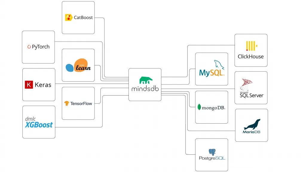
AI를 위한 전통적인 방법은 데이터를 데이터베이스에 저장한 다음 추출해 별도의 AI 알고리즘으로 보내는 것이다. 마인드DB는 AI 알고리즘을 데이터베이스에 직접 통합하는 SQL 서버다.
데이터베이스 내에서 기계학습이나 저장된 데이터를 분석하는 것은 AI 워크플로의 속도를 높이는 빠르고 효율적인 방법이다.
ISR(Image Super-Resolution)
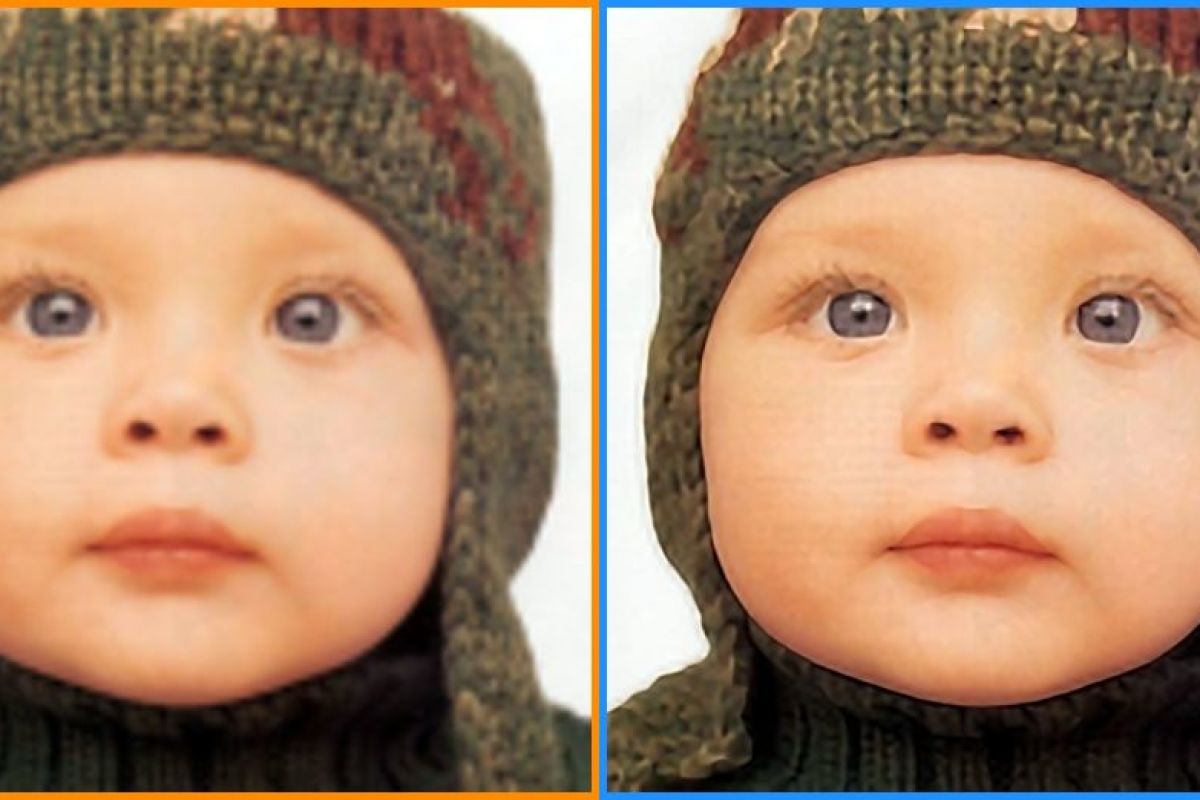
ISR은 사진의 이미지 해상도를 높여 더 많은 디테일을 추가할 수 있는 도구다. 저해상도 이미지의 세부 사항을 추측하도록 훈련할 수 있는 AI 모델을 사용한다.
좋은 훈련 세트를 사용하면 모델이 정확한 세부 사항과 더 선명한 이미지를 생성할 수 있다.
딥파블로프(DeepPavlov)
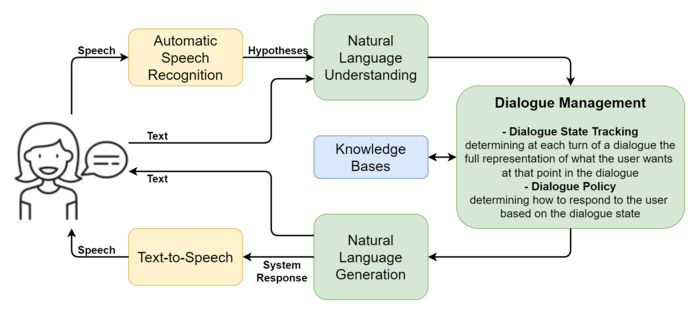
많은 기업과 대기업이 고객 서비스를 챗봇으로 대체하고 있다. 이는 기계가 대화하는 법을 배우고 있음을 의미한다. 딥파블로프는 텐서플로우, 파이초치 및 케라스(Keras)와 같은 기본 AI 프레임워크를 결합해 배울 수 있는 챗봇을 만든다. 결과는 기발하고 때로는 이상하지만 올바른 교육을 받으면 유용하다.
블렌더(Blender)

3차원 모델을 풍부하게 렌더링된 장면으로 변환하는 가장 좋은 방법은 블렌더를 실행하는 것이다. 많은 사람들이 블렌더를 애니메이터를 위한 도구로 생각하지만, 블랜더는 엄연하게 AI가 적용된 3D 제작 도구다.
풍부한 인터페이스와 수많은 플러그인을 통해 복잡한 모션 그래픽이나 영화 같은 장면을 만들 수 있다.
오픈CV(OpenCV)
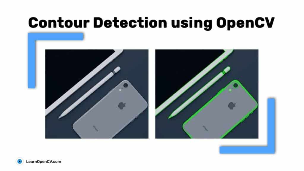
머신 비전 탐구를 위한 가장 중요한 기반 중 하나는 다양한 영상 처리에 사용할 수 있는 오픈소스 컴퓨터 비전 라이브러리인 오픈CV다. 오픈CV는 이미지에서 개체를 식별하기 위한 윤곽선 검출이나 노이즈 제거 또는 이미지 보정 등의 기능을 제공한다.
디지털 이미지에서 개체를 식별하기 위한 많은 알고리즘과 자동차의 번호판을 찾아 읽을 수 있는 것과 같은 특수 루틴을 포함한다.
로보코드(Robocode)
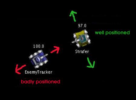
로보코드는 자바 프로그램 교육을 위한 도구로 개발된 것으로, 개발자들이 커스터마이징한 소스에 의해 움직이고 공격하는 탱크들의 전투를 시뮬레이션하는 환경을 제공한다. 탱크의 움직임, 레이더의 동작 방식, 포탄 발사 등을 제어해 더 나은 전투방식을 프로그램, 다른 탱크와 겨루어 볼 수 있다.
로보코드는 재미있는 게임이자 자율 주행 차량에 대한 새로운 전략을 테스트하는 도구로도 유용하다.
박찬 위원 cpark@aitimes.com
[출처] http://www.aitimes.com/news/articleView.html?idxno=147021
김형준(컴퓨터공학부·18)
하나의 유령이 대한민국을 떠돌고 있다. 코딩이라는 유령이. 대학가 역시 예외는 아니다. 당장 지난 학기 수강한 컴퓨터공학부 전공과목들만 보더라도 주전공생보다 복·부전생의 수가 월등히 많았던 기억이 있다. 몇몇 전공의 경우 서울대 간판을 달고도 취업이 요원한 반면, 컴퓨터공학 전공자는 비싼 값에 날개 돋친 듯 팔려나가는 탓이다. 이와 같은 수요와 공급의 불균형으로 인해 심화된 편중 현상은 소프트웨어 분야의 인력난 해결에 기여하고 있다. 그럼에도 이를 마냥 긍정적으로 바라볼 수만은 없는데, 적잖은 수의 사람들이 ‘코딩을 위한 코딩’의 구렁텅이에 빠지고 있기 때문이다. 남들에게 뒤처질 수 없다는 불안은 평생 뒤처진 적 없이 살아온 명문대생의 영혼을 어렵지 않게 잠식한다.
이런 불안감은 코딩을 공부하는 주변인과 언론에 의해 촉발되기도 하나, 무엇보다도 코딩 학원에 의해 확대·재생산된다. 분명 코딩 교육 시장은 성장 일로를 걷고 있으며 앞으로도 그래야 마땅한 분야다. 그럼에도 불구하고 과대광고로 무장한 대다수 학원의 작태를 보고 있자면 헛웃음이 나온다. 이들은 소위 ‘네카라쿠배’(네이버, 카카오, 라인, 쿠팡, 배달의민족)에 입사한 수강생들을 전시하며 평균 연봉을 과시적으로 내세운다. 소수의 고액 연봉자들로 인해 부풀려진 수치는 대다수의 수강생이 만족스럽지 않은 연봉을 수령하고 있음을 애써 숨긴다.
한술 더 떠 ‘90일 속성 머신 러닝’, ‘6개월 AI 전문가 코스’ 등의 허무맹랑한 카피를 보고 있자면 정신이 아득해진다. 누군가는 코딩 학원이 단언한 기간 내에 전공생 이상의 실력을 갖출 것이다. 대학생 때 본격적으로 농구에 입문해 이후 NBA MVP를 수상한 선수가 있는 것 혹은 고졸 출신으로 사법고시 수석을 차지한 사람이 있는 것과 같은 이치다. 드문 일이기에 우리는 그들을 ‘아웃라이어’라 일컫는다. 실상 학부 4년은커녕 석박사 과정까지 끝마쳐도 이들이 홍보하는 분야에서 전문가가 되기는 역부족이다. 가령 ‘변호사 3개월 완성’ 내지는 ‘180일 외과 의사 코스’였다면 반응이 같았을 리 없다. 그러니 작금의 열풍은 다소간 개발 직군에 대한 무시 내지는 무지에 기반하는 듯 보일 따름이다. 아웃라이어가 아닌 이상 고작 수개월을 투자하는 것만으로 업계가 요구하는 고급 개발자가 되기란 불가능에 가깝다.
이쯤에서 이 글이 당연하게도 비전공자의 코딩에 대한 관심을 억누르기 위해 쓰이지 않았음을 짚고 넘어갈 필요가 있겠다. 오히려 그 반대에 가깝다. 정확히 말하면 모두가 코딩을 할 필요는 없지만 모두가 코딩을 알 필요는 있다. (다른 모든 분야가 그렇겠지만) 물론 소프트웨어 분야는 극소수의 천재가 지대한 영향력을 행사하는 분야다. 예컨대 (모두 컴퓨터공학을 전공한) 마크 저커버그, 세르게이 브린, 래리 페이지, 리드 헤이스팅스는 우리의 삶에 얼마나 큰 영향을 미쳤는가?
그럼에도 불구하고 모두가 코딩을, 컴퓨터공학을 이해해야 하는 이유는 자명하다. 추상화를 위시한 논리적 사고를 훈련하기에 최적의 방법일 뿐만 아니라 개발자와의 협업에서 큰 이점을 얻을 수 있기 때문이다. 또한 어떤 학문을 공부하든 코딩은 해당 분야와 세상을 잇는 가교로 기능한다. 다행히도 세상은 이에 발맞춰 변화하고 있다. 말하자면 컴퓨터공학은 제2의 수학이 돼가는 중이고, 이는 비단 대한민국만의 유행이 아니며 전 세계적인 추세에 해당한다. 따라서 초중고에서 교양으로서의 코딩을 교육하는 것이 가장 효율적일 텐데 이런 맥락에서 지금의 20대는 저주 받았다고 볼 수 있겠다. 응당 코딩을 알아야 하는 세상에 너무 일찍 도착했으니 말이다.
관련 학과의 정원을 확대하고 비전공자에게도 학습의 기회를 주는 편이 최선이겠으나 현실적인 어려움이 산재해 있다. 그러니 교양으로서의 코딩을 학습한 이들이 대거 사회에 진출할 때까지는 대학 외부의 교육에 얼마간 빚질 필요가 있다는 결론이 도출된다. 상술한 코딩 학원들의 행태가 대폭 개선되거나 문제의식을 지닌 양심적인 사업자의 진입을 기대해야만 하는 상황에 놓였다. 일말의 희망. 나는 이 자그마한 희망에 억지로라도 기대를 걸어보려 한다.
출처 : 대학신문(http://www.snunews.com)
점점 더 많은 기업이 워크로드의 대부분 또는 전부를 클라우드로 이동하면서 서버 랙을 직접 설치 및 운영해야 할 이유는 줄어들고 있지만 (이는) 여전히 중요하다.
클라우드로 인해 데이터센터가 서서히 빛을 잃고 있다. IT의 핵심 구성요소인 데이터센터에서 멀어지는 실질적인 이유가 있다. 클라우드 업체가 놀라운 코드를 간단하게 작성할 수 있는 놀라운 제품과 시간을 절약하는 서비스를 계속해서 선보이고 있기 때문이다. 그 편의성은 경이롭다.
하지만 클라우드로 전환해야 하는 명백한 이유에도 불구하고, 이 트렌드에 역행하여 자체 데이터센터를 계속 운영해야 하는 몇 가지 이유가 있다(아마도 모든 워크로드는 아니더라도 일부에 해당될 수 있다). 여기서는 자체 랙에서 온프레미스로 코드를 실행해야 하는 이유 10가지를 살펴본다.

로컬 속도(Local speed)
클라우드는 전 세계에 퍼져 있는 기업에 적합한 자산이다. 먼 곳 또는 집에서 근무하는 직원들을 지원할 때도 적합하다. 하지만 직원들이 같은 건물에 있고, 같은 서버를 사용한다면 서버를 멀리 떨어진 곳에 두는 것은 그다지 적합하지 않다. 기업의 자산이 (이를테면) 우편번호도 모르는 먼 곳의 클라우드 기반 기기까지 가로질러 이동할 수 있어서다. 로컬 서버는 다른 곳에 있는 서버보다 빠르다. 게다가 네트워크 홉이 적기 때문에 장애 지점도 적다. 데이터가 건물 밖으로 나갈 일이 없다면 작은 인터넷 파이프로도 충분하다. 이게 바로 서버를 가까이 둬야 하는 이유다. 직원들이 한 곳에 있다면 필요한 서버를 가까이 두는 게 낫다.
기술적 균형(Technical tradeoffs)
일각에서는 눈에 보이지 않는 클라우드가 서버 운영, 기기 구매, 소프트웨어 설치 등 모든 일을 처리하기 때문에 이를 선호한다. 분명 클라우드는 부담을 덜어줄 수 있다. 하지만 때로는 이 모든 책임을 스스로 지는 것이 더 편안할 수 있다. 진짜? 물론 때에 따라 다르다. 중요하지 않은 작업이고, 클라우드 업체의 접근을 허용할 수 있다면 클라우드 업체가 알아서 하도록 하고 (이에 따라) IT를 조정하는 것만으로 충분하다. 그러나 자체적인 방식이 있다면 클라우드로의 이동에 수반되는 마찰로 인해 절약되는 시간만큼의 가치가 없을 수 있다.
이전 버전의 파이썬을 기반으로 한 레거시 코드를 사용했던 프로젝트를 예로 들어보자. 하지만 클라우드 업체는 최신 버전의 우분투와 새로운 버전의 파이썬을 사용하고 있었다. 다른 버전과 씨름하거나 연구실의 컴퓨터에 쓰고 있는 버전의 파이썬을 설치할 수 있었지만 코드를 다시 작성하는 것보다 컴퓨터를 구매하는 것이 더 간단했다.
이웃(Neighbors)
클라우드 업체는 모든 고객을 만족시켜야 한다. 그리고 서비스를 구매하는 기업(혹은 사용자)은 수없이 많다. 따라서 클라우드 서비스 가입은 개인 소유의 섬에 사는 것과는 다르다. 이웃과 잘 지내야 한다. 클라우드의 이웃이 악의적일 수 있다는 게 가장 극단적인 사례다. 이를테면 로우해머(Rowhammer) 공격은 같은 하드웨어의 다른 사용자에게 침입할 수 있다. 심각한 문제가 될까? 해커가 다른 클라우드 인스턴스를 자주 공격하는가? 아마 그렇지는 않을 것이다. 하지만 자체 하드웨어를 구매하는 가장 큰 장점은 데이터센터의 이웃을 걱정하지 않아도 된다는 것이다.
통제(Control)
오늘날의 계약은 돌판 위에 새겨지지 않는다. 심지어 종이에도 작성되지 않는다. 문제가 발생하면 클라우드 업체는 서비스 약관에 명시되지 않은 일부 조항을 위반했다는 모호한 주장을 하면서 사용자를 차단하는 경우가 많다. 서비스 업체에게 이러한 이메일을 받게 된 개발자와 기업의 슬픈 사연이 많다. 심지어 때로는 클라우드 업체가 이메일조차 보내지 않는다. 그리곤 모든 것이 작동을 멈춘다.
어쩌면 (이러한 문제에 대응할) 믿을 만한 변호사가 있을 수 있다. 어쩌면 이 모든 이야기가 과장됐으며, 남의 일이라고 생각할 수도 있다. 허나 클라우드 업체가 비합리적으로 행동하고, 매출을 날려버릴 가능성은 높아 보인다. 그러나 하드웨어를 통제하면 법적 장애 지점이 줄어든다는 건 확실하다.
권력(Power)
때때로 클라우드 업체는 서비스가 엉망이라는 비난을 받는다. 일부는 의도적으로 전화번호를 공개하지 않는 것 같다. 일부는 이메일에 절대 답신하지 않는 것 같다. 게시판엔 고생하는 클라우드 업체 직원에 관한 이야기도 있지만 이름을 밝히지 않은 정체불명의 악당에 관한 불평불만도 있다. 데이터센터에서 보고한다면 훨씬 더 쉽게 답변을 받을 수 있다. 물론 사라진 IT 직원에 관해 분노하는 이야기가 많은 것도 사실이다. 내부 기술 지원 인력이 멸종위기종인 것처럼 잘 보이지 않는다는 농담도 있다. 하지만 기업이 (내부 기술 지원 인력에게) 급여를 지급한다는 점에서 이는 더 나은 서비스를 확보하는 방법 중 하나다.
비용(Price)
최신 하드웨어는 항상 비싸다. 만약 (작업에서) 성능이 중요하다면 클라우드를 활용하는 게 가장 합리적일 수 있다. 하지만 다소 반복적이고 예측 가능한 작업이라면 구형 서버를 사용하여 비용을 절약할 수 있다. 물론 잠재적으로 숨겨진 비용이 있다. 구형 기기는 더 자주 고장 난다. 워크로드가 예상치 못한 다운타임을 처리할 수 있는가? 직원들이 기기를 수리할 수 있는가? 그렇게 할 수 있다면 구식 하드웨어를 사용하는 게 훨씬 더 저렴하다.
일정한 부하(Steady loads)
클라우드에 적합한 기업은 컴퓨팅 부하가 매우 가변적이면서도 일반적으로 예측할 수 있는 곳이다. 예를 들면 스트리밍 비디오 서비스는 금요일과 토요일 밤에 대부분의 연산을 수행한다. 다시 말해, 몇 시간 동안 사용한 후 모두가 잠자리에 드는 즉시 전원을 끈다. 하지만 이 반대라면 자체 데이터센터를 운영하는 게 더 합리적일 수 있다. 할인을 받더라도 클라우드 기기를 하루 24시간, 주 7일 동안 실행하면 비싸기 마련이다. 기기를 계속 가동한다면 비용 경쟁력이 있는 로컬 데이터센터 예산을 책정하는 것이 낫다.
여분의 부동산(Extra real estate)
팬데믹으로 인해 상업용 부동산 세계가 요동쳤지만 일부 기업에는 쉽게 없앨 수 없는 여분의 공간이 있을 것이다. 이를테면 몇 년 동안 임대료가 발생하지 않는 건물을 소유하고 있을 수 있다. 클라우드 비용의 일부는 하드웨어를 보관하는 건물이다. 부동산 비용으로 인한 수익이 낮거나 심지어 없다면 빈 공간에 몇 개의 랙을 설치하는 것이 예산 대비 효과가 있을 수 있다.
저렴한 지역 전기 요금(Cheaper local power)
전기 요금은 데이터센터 운영의 큰 부분을 차지하며, 대부분의 경우 전력 비용이 하드웨어 비용보다 크다. 일부 주 또는 지방자치단체에서 로컬 비즈니스를 유치하려고 할 때 일부는 세제 혜택을 활용하지만 지역 전기 요금을 할인하여 신규 기업에 간접적으로 보조금을 지급하는 곳도 있다. 이에 따라 기존의 전기 요금이 이미 매우 저렴할 수 있으며, 그렇다면 자체 데이터센터를 운영하는 게 더 합리적일 수 있다.
할인을 받을 필요 없이 전기가 저렴한 지역도 있다. 풍부한 바람 또는 끝없는 햇빛 때문에 신재생 에너지를 더 쉽게 생산하는 곳도 있다. 비용이 저렴한 이유는 중요하지 않다. 기업의 전기 요금이 합리적인 경우 자체 시스템을 호스팅하여 클라우드 컴퓨팅 비용을 크게 절약할 수 있다는 게 중요하다.
지역 인재(Local talent)
몇몇 기업은 데이터센터 관리 인력을 최소화하고 싶어 한다. 하지만 인적 자본을 중시하는 곳도 있다. 한 기업은 일반적으로 예측할 수 없는 시기에 필요한 데이터센터 관리 인력을 확보할 수 있도록 여유 있게 채용하는 것을 선호했다. 그리고 비상사태가 발생했을 때 이 회사는 준비가 돼 있었다.
물론 자체 데이터센터 인력을 확보하는 일은 비용이 많이 들 수 있으며, 이는 CIO들이 정당화하기 가장 어려운 비용 가운데 하나다. 하지만 데이터센터를 운영하면서 효과적으로 수행할 수 있는 다른 역할이 있지 않을까? 지역 인재를 원하고 스마트한 인력을 채용하고 싶다면 컴퓨팅 예산의 일부를 투입해 (데이터센터) 인력을 유지하는 게 바람직하다. 몇몇 클라우드 업체는 휴게실에서 소통하거나 7월 4일(편집자 주: 미국 독립기념일) 소풍을 계획하거나 회사 소프트볼장을 청소하거나 인적 자본이 기업에 제공할 수 있는 다른 일을 하지 않을 것이다. ciokr@idg.co.kr
원문보기:
https://www.ciokorea.com/news/231169#csidx609d036e3dc76bc91a1d44d46762ecd 
먼저, 대부분의 오픈소스 라이선스는 준수해야 할 의무 사항을 ‘재배포’시 부여한다. 이 말은 오픈소스를 ‘재배포’하지 않는다면 고지, 소스 코드 공개 등의 의무사항이 발생하지 않고, 자유롭게 사용이 가능하다는 의미이다.
여기서 재배포란 오픈소스의 소스 코드 또는 바이너리의 복사본을 다른 사람에게 제공하는 행위를 의미한다. 앱스토어 배포, 판매, 3rd party 제공, 고객사 납품 등이 재배포에 해당한다. 사내 개발 환경 구축, 테스트 도구 등 사내 용도로만 오픈소스를 사용하는 경우는 재배포에 해당하지 않는다.
CC0, Public Domain과 같이 아무런 제한 없이 무료로 사용할 수 있는 라이선스가 있다.
| Full name | Identifier | 사용 사례별 가이드 |
|---|---|---|
Creative Commons Zero v1.0 Universal |
CC0-1.0 |
|
The Unlicense |
Unlicense |
단, Public Domain이라고 선언된 소프트웨어라도 사례별로 법적 검토가 필요한 복잡한 문제가 내재되어 있을 수 있다. 사용하려는 코드가 Public Domain인지 확인이 필요하다면 OSPOOpen Source Program Office에 문의하라.
Permissive License라고 분류할 수 있는 아래의 오픈소스 라이선스는 고지 의무를 요구한다. 오픈소스 라이선스의 고지 의무는 비교적 수월하게 준수할 수 있다.
GPL(GNU General Public License)은 오픈소스를 재배포 시 소스 코드 공개를 요구한다. 오픈소스 자체의 소스 코드 뿐만 아니라 결합한 소스 코드까지 함께 동일한 라이선스 조건으로 공개할 것을 요구해서 Copyleft 성격의 라이선스라고도 한다. Copyleft 라이선스 유형은 오픈소스 라이선스 중에 요구하는 의무사항이 가장 많은 라이선스 유형이기 때문에 이 유형의 라이선스로 배포되는 오픈소스는 사용 시 주의가 필요하다.
대표적인 의무 사항은 이 라이선스로 배포되는 오픈소스를 제품에 포함하여 배포하려면 해당 오픈소스의 소스 코드의 공개가 필요하다. 또한 이 오픈소스와 결합하는 소스 코드까지도 동일한 오픈소스 라이선스를 적용하여 공개해야 한다.
따라서, Copyleft 라이선스 유형의 라이선스가 적용된 오픈소스는 SK텔레콤이 배포하는 제품에 포함 시 주의해야 한다.
이러한 오픈소스는 설계 단계에서부터 Build 시 자사 소프트웨어와 통합되지 않고 Runtime에도 독립된 프로세스로 동작되도록 해야 한다.
Copyleft 라이선스 유형으로 분류할 수 있는 오픈소스 라이선스는 다음과 같다.
GPL-3.0/LGPL-3.0하의 오픈소스가 설치된 사용자 제품(User Product)을 배포하기 위해서는 소스 코드 뿐만 아니라 설치 정보를 함께 제공해야 한다. 이는 기업이 준수하기 어려운 조건이기 때문에 일반적으로 GPL-3.0/LGPL-3.0의 오픈소스는 사용자 제품(User Product) 개발 시 사용할 수 없음에 주의하라.
같이 소스 코드 공개 의무를 요구하는 Copyleft 라이선스 하의 오픈소스를 포함하는 소프트웨어를 배포할 경우, 사용자에게 소스 코드를 직접 제공하거나, 사용자가 요청시 소스 코드를 제공하겠다는 서면 약정서를 제공해야 한다. 이에 대한 세부 절차 및 방법은 다음 가이드를 참고하라. : internal_link
Weak Copyleft 유형의 라이선스는 이와 같이 소스 코드 공개는 요구하지만, 공개 범위가 Copyleft 유형의 라이선스에 비해 약하다는 특성이 있다.
LGPL (Lesser GPL)도 역시 재배포 시 소스 코드 공개를 요구하는 등 GPL과 동일한 조건을 요구한다. 단, Library 형태의 LGPL하의 오픈소스를 Link 형태로 결합할 경우, LGPL Library 부분만 소스 코드를 공개하면 되고, 결합하는 코드는 공개 의무가 없다는 점이 GPL과 다르다.
LGPL이 적용된 컴포넌트를 dynamically-linked 형태로 사용할 경우, 자사 코드를 공개하지 않는 방식으로 사용할 수 있다.
Weak Copyleft 라이선스 유형으로 분류할 수 있는 오픈소스 라이선스는 다음과 같다.
다음의 라이선스는 SK텔레콤의 제품/서비스에 사용하기에 적합하지 않은 조건을 포함하고 있다. 따라서, 이러한 라이선스 하의 오픈소스는 사용하지 말아야 한다.
연구, 학습만을 위해서라고 해도 SK텔레콤 내에서 사용한다면 상업적인 활동으로 간주될 수 있다. 따라서 비상업적으로만 사용할 수 있도록 제한하는 라이선스에 따라 공개된 오픈소스는 SK텔레콤에서 사용할 수 없다. 이러한 비상업용 (Non-Commercial) 라이선스는 다음과 같다.
AGPL, SSPL은 Network 서비스도 배포로 간주하여 의무사항 준수를 요구하는 조항을 포함한다. 이에 따라 Network 서비스를 제공하는 서버에 AGPL로 공개된 오픈소스가 포함되어 있다면, 소프트웨어를 배포하지 않아도, AGPL 오픈소스 뿐만 아니라 함께 링크되어 동작하는 다른 소프트웨어의 소스코드 까지 AGPL로 공개해야 하는 의무가 발생한다. 이 경우, SK텔레콤의 핵심 서버 프로그램까지도 AGPL로 공개해야 하는 위험이 있다. 따라서, SK텔레콤의 제품 및 서비스 개발 시, AGPL 및 SSPL 등의 오픈소스 라이선스가 적용된 오픈소스는 사용할 수 없다.
이러한 Network 서비스 시 조건을 부여하는 라이선스는 다음과 같다.
| Full name | Identifier | 사용 사례별 가이드 |
|---|---|---|
GNU Affero General Public License v3.0 |
AGPL-3.0 |
AGPL-3.0 가이드 |
Server Side Public License, v 1 |
SSPL-1.0 |
BSD-4-Clause 라이선스는 오픈소스의 기능 / 활용을 언급하는 모든 광고에 특정 문구 (“This product includes software developed by the .”)의 포함을 요구한다. 이러한 “advertising clause”의 요구사항을 준수하는 것은 쉽지 않기 때문에 사용을 제한한다.
| Full name | Identifier | 사용 사례별 가이드 |
|---|---|---|
BSD 4-Clause "Original" or "Old" License |
BSD-4-Clause |
BSD-4-Clause 가이드 |
이러한 라이선스 하의 오픈소스를 반드시 포함해야 하는 경우라면 OSPOOpen Source Program Office에 포함할 수 있는 방법을 문의하라. : Support (opensource@sktelecom.com)
위에서 분류되지 않은 라이선스가 적용된 오픈소스를 SK텔레콤의 제품에 사용하기 위해서는 사전 검토가 필요하다. OSPOOpen Source Program Office에 사용 가능 여부를 문의하라. : Support (opensource@sktelecom.com)
Free Software Foundation은 2007년 AGPL-3.0을 공개하였다. AGPL-3.0은 GPL-3.0에 네트워크로 상호 작용하는 소프트웨어의 소스 코드도 공개해야 한다는 조항을 추가한 라이선스이다.
Apache-2.0은 Apache Software Foundation에서 만든 오픈소스 라이선스이며, 소스 코드 공개를 요구하지 않는 Permissive 형태의 라이선스이다.
BSD-2-Clause 라이선스는 BSD 2-Clause “Simplified” License 라고도 불리며 소스 코드 공개를 요구하지는 않는 Permissive한 라이선스이다. BSD-3-Clause보다 간략해졌다.
BSD-3-Clause 라이선스는 BSD 3-Clause “New” or “Revised” License 라고도 불리며 소스 코드 공개를 요구하지는 않는 Permissive한 라이선스이다. BSD-4-Clause에서 문제가 된 “advertising clause” 이 삭제되었다.
BSD-4-Clause 라이선스는 BSD “Original” or “Old” License 라고도 불리는 BSD 라이선스의 원형이로써, 소스 코드 공개를 요구하지는 않지만, 광고 조항 (advertising clause)를 포함하고 있어서 사용하는데 문제가 된다.
CDDL-1.0은 Common Development and Distribution License 1.0이라고도 불리며, 파일 단위의 소스 코드 공개를 요구하는 Weak Copyleft 성격의 라이선스이다.
EPL-2.0은 Eclipse Public License 2.0이라고도 불리며, 모듈 단위의 소스 코드 공개를 요구하는 Weak Copyleft 성격의 라이선스이다.
1991년 Free Software Foundation에서 만든 대표적인 Copyleft 라이선스인 GPL-2.0은 재배포 시 소스 코드 공개를 요구하기 때문에 사용에 주의가 필요하다.
Free Software Foundation은 2007년 GPL-3.0을 공개하였다. GPL-3.0은 GPL-2.0과 유사한 의무사항을 갖지만, 추가로 User Product 배포 시, 설치 정보(Installation Information) 제공을 요구한다.
Free Software Foundation에서 만든 대표적인 Weak Copyleft 라이선스인 LGPL-2.1은 재배포 시 소스 코드 공개를 요구하지만, LGPL Library를 Dynamic Link하여 사용하면 자사의 코드는 공개 대상에 포함되지 않는다.
Free Software Foundation은 2007년 LGPL-3.0을 공개하였다. LGPL-3.0은 LGPL-2.1과 유사한 의무사항을 갖지만, 추가로 User Product 배포 시, 설치 정보(Installation Information) 제공을 요구한다.
MIT 라이선스는 Massachusetts Institute of Technology (MIT)에서 만들었으며, 소스 코드 공개를 요구하지 않는 대표적인 Permissive한 라이선스이다.
MPL-2.0은 Mozilla Public License 2.0이라고도 불리며, 파일 단위의 소스 코드 공개를 요구하는 Weak Copyleft 성격의 라이선스이다.
[출처] https://sktelecom.github.io/guide/use/obligation/